Home 3D Art Showcase & Critiques

Exiled Shade from Adventures in Purgatory

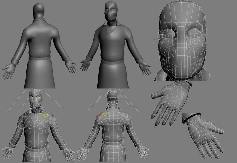
This is from a game I was writing and developing last year. I decided to make a next gen version of all the characters from the game to get me out of my slump. Right now I am at the stage where I am going to start adding the asymmetrical parts of the model, and wanted to get some topology crits from you guys before pushing onward.

Concept art by Ian MacLean (http://nvisionillustration.com/):
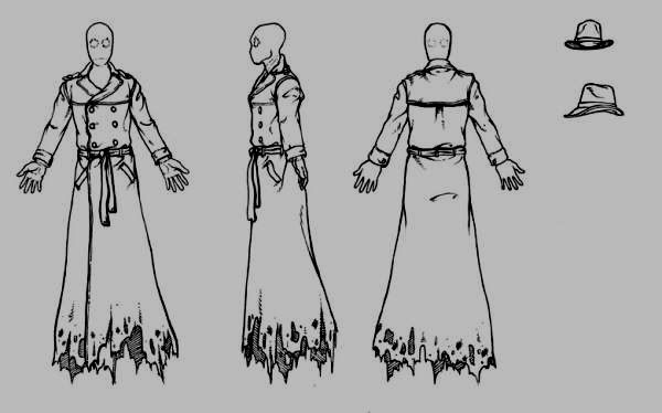
shadesheet.jpg

The model so far:
Shade.jpg

Sitting at about 3000 polys. Right now my biggest issue is with the back of the hands. They look wonkly, and my poly flow is all over the place. I don't see anything outright wrong with the model thus far, but that's why I am here, because I have stared at it for too long and need some other eyes on it.

Replies

  • stimpack
    Offline / Send Message
    stimpack polycounter lvl 10
    interesting idea. I think your on the right path with the poly flow of the coat and face so far. The hands dont need that much information in them...i guess im tryin to say remove the cuts in the palm and just make it simple. If your going "next gen" then the normal map will do all the work your trying to do with geo there. Also unless you purposly try to force your hand flat it will never be stiff like that. your better off making it in more of a relaxed pose and put the curves of the hand in there. just hold your hand next to this one on your screen and you will notice obvious differences right away. like for example all the fingers you modeled start at the exact same spot on the hand. now look at yours...the first joint of the fingers will make an arch on your palm. also try to keep tri's and stretched quads away from parts of the model that will need to animate.

    I think this sufferes from extremly stiff syndrom more than anything. Its an organic creature, give it some rythm.
  • The Umbrella Man
    Ok did this before the forums were back up.

    Shade-1.jpg

    I need to rework the belt entirely, but so far so good. It's at 3800 tris.

    @Stimpack: Going to fix the curvature of the joints on the hands, I didn't think about where the joints for the fingers are actually placed on the hand, good eye. The thumb is what bothers me the most, I am double jointed, so my thumb can go all the way to the back of my wrist without pain, so I need to use references of other peoples hands because mine can do weird shit. Years of Jiu Jitsu and what have you frown.gif

    I'm going for next gen, so by the time this model is finished, it should be about 5k - 7k. I just need to figure out where I want to add more detail.
  • The Umbrella Man
    Heres the modified hand, still need to fix some of the loops after moving things around. Do they look any better?

    Hand.jpg

    I'll get on optimizing them and lowering the polys once all the details are in.
  • The Umbrella Man
    Well heres the final wire before I move on to unwrapping. If anyone has anything to add to the critique please do, I would like to fix any deficiencies in the model before I start unwrapping.

    Shade-2.jpg
  • dj snyder
    Offline / Send Message
    dj snyder polycounter lvl 14
    I really like the design.

    But compared to the hat, head, and hands, the coat itself seems to be very smooth and geometrical, which doesn't seem to fit with the gnarled look of the other parts.
  • The Umbrella Man
    [ QUOTE ]
    I really like the design.

    But compared to the hat, head, and hands, the coat itself seems to be very smooth and geometrical, which doesn't seem to fit with the gnarled look of the other parts.

    [/ QUOTE ]

    Good point, I'll add some cuts in to add some folds and whatnot, I was shooting for a 5000 - 6000 poly limit anyway. Question is though, is it considered good practice to do that for a game model (adding folds in cloth and what not), even if it is next gen, I mean I have seen some crazy high poly game models up in the upper 7ks, so I would assume yes. Just wondering.
  • PolyPutty
    I think he is more referring to how your whole coats silhouette seems very tubular where detail hasn't been fleshed out with the points you have. Your spans seem pretty geometrical, your coat could use a little more weight in the arms and around the belt.
  • The Umbrella Man
    Gotcha, taking all that advice, I took out some mundane details, and added some more important ones, and I tried my best to get rid of the packaged sausage look of the arms and bottom part of the coat.

    Shade-4.jpg

    I'm still not happy with the damn belt yet, can't quite visualize it in my head. Probably do a high poly of the knot, and then sculpt a low poly around it.
  • The Umbrella Man
    Heres the work on the high poly version so far. Just adding more cuts in max, then thinking about moving it into mudbox to add wrinkles, and whatnot. Am I on the right track so far?

    Shade-5.jpg
  • The Umbrella Man
    I'm liking this so far, this is my first real sculpt so I likey. Did I overdo the wrinkles? Anything weird going on? Anything would help.

    Shade-9.jpg
  • fogmann
    Offline / Send Message
    fogmann polycounter lvl 17
    The wrinkles don't look too convincing, but I otherwise love the design - I'm a sucker for fedoras and trench coats cool.gif. I did one such coat about a year ago, maybe it can help you with your wrinkles, here. The best thing you can do is to look at plenty of reference and I'm sure you will be able to find lots of relevant photos, and study them and try to replicate the wrinkling. Also a piece of advice on sculpting - try to add as much form to the lowest subdivisions as you can, and refine the shape gradually as you go up; don't jump too high up the subd levels, because your surface will get blobby and will be hard to control.

    Looking forward to see this complete, keep it coming.
  • The Umbrella Man
    Good idea about starting low and going high later. I'll try that. What I did with this was exactly what you said, jumped up to the highest level and started sculpting, and that's probably what's been distracting me about it, the blobbyness.

    So counter question, do the wrinkles need to be less deep, more subtle?

    Long live Rick smile.gif

    EDIT: by the way, that detective is frickin awesome.
Sign In or Register to comment.