The BRAWL² Tournament Challenge has been announced!
It starts May 12, and ends Oct 17. Let's see what you got!
https://polycount.com/discussion/237047/the-brawl²-tournament
It starts May 12, and ends Oct 17. Let's see what you got!
https://polycount.com/discussion/237047/the-brawl²-tournament
New dude for demo reel
Hey guys whats up...So it has been a while since I posted, I had a very weird break, I ended up moving, getting into a car accident and just all sorts of weird haps.
But enough rambling-I bring thee Dead-life
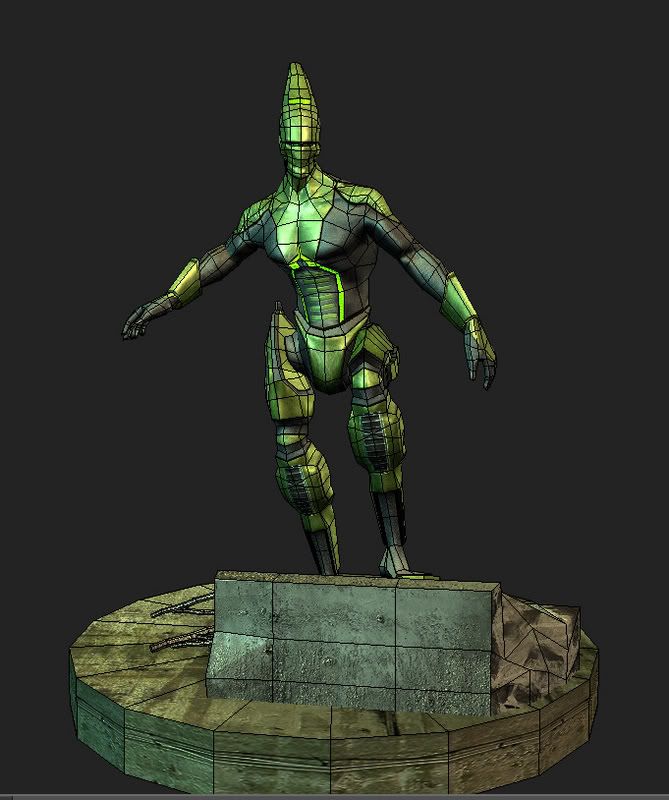
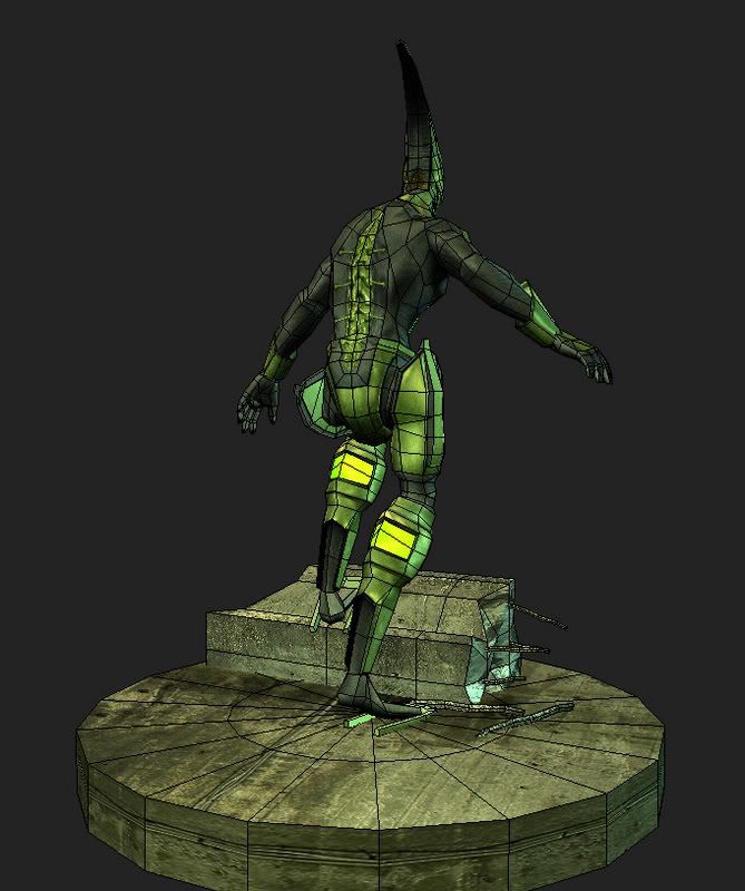
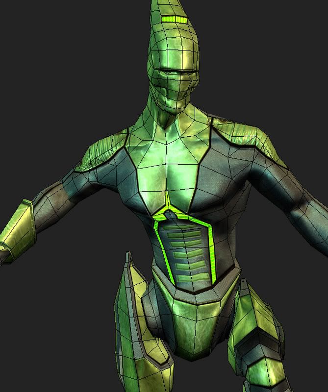
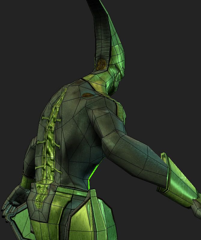
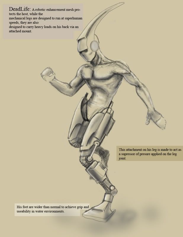
So this is a concept I made during break cause I had planned to make my own model for a challenge during break, it ended up taking a little longer. But it is finally finished.
But enough rambling-I bring thee Dead-life


So this is a concept I made during break cause I had planned to make my own model for a challenge during break, it ended up taking a little longer. But it is finally finished.
Replies
Can we get some non-wire frame shots?
So far he's pretty interesting. Would like to see some better grabs or renders though.
Anyone have tutorials on self illumination maps.?
Cheers!!
I'd try to work out a more logical material scheme, make it clear what things are made of what. Right now that's the most confusing part for me.
perhaps drop the spec on the darker bits of the suit to emphasise the shininess of the metal parts\ would make the bluey grey of the suit a little darker also
Mike: my man, lol, yeah dude I learned my lesson on calling things done recently.
Poop: whats up man,UAT was good, I was there with mike. Anyways yeah I saw your tutorial on the texturing of things...It helped me tons I think the part that makes it not look like its made of something is the specular right now, I should be able to fix that easily. Thanks for the crit man...
Ruz-Hey whats up dude. yeah I agree with what you're saying, I do have some lighting in there and its all same basic colors in the suit that are making it too yellow and green. Easy fix. thanks for the crit very valid.