hexbot
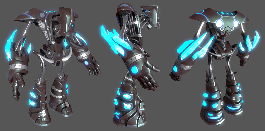
Finally posting this guy. He's been "done" for at least a few weeks now. I was hoping to wait and post him with some other assets for the mod he's part of, but because of real-job related delays, it's gonna be a while before much else is showable. I'm also going to go back in a month or two and do a LOT of revision on this guy, so crits may actually make their way into the model despite the fact that it's currently "finished".
I need to move on to something else now though... most of the garbage in my portfolio is of my design, in my style, and doesn't really seem to fit with any "established" styles in the industry, and so isn't doing much to get me a job. I need something that shows employers I can take THEIR designs and reproduce them perfectly in 3d. After I post this, I'm surfing over to conceptart.org to find something that has a better chance of landing me a job making art. I'm testing games right now. Arg.
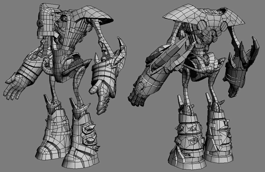
He's sitting at a little over 10k polies right now, and was designed to be the only character model in a multiplayer mod. High poly count, I know, but the game won't have many assets so we're pushing the ones we do have a little further than we normally could.
Any crits would be very welcome. Design, model, texture... any or none. This was very much a learning experience for me, but I can see things that need changing already, and I'm sure a lot of your guys can see even more.
The textured shot here is from unreal3. I have him rigged and imported, setup with ragdoll etc. No animations though. The glow texture on the crystals is animated with a slow flowing pulse effect. The wrist chain things are setup to spin when a certain ability is used, that's why they're separate geometry and not entirely normal mapped into the forearm.
"low poly" wires...
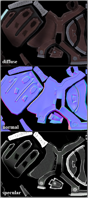
Here's the texture sample I threw up on my portfolio. The complete layout is pretty ugly (he was originally unwrapped without any uv mirroring... so you can imagine the kind of mess the entire layout is), so I tried to choose a sample region that represented the rest of it pretty well.
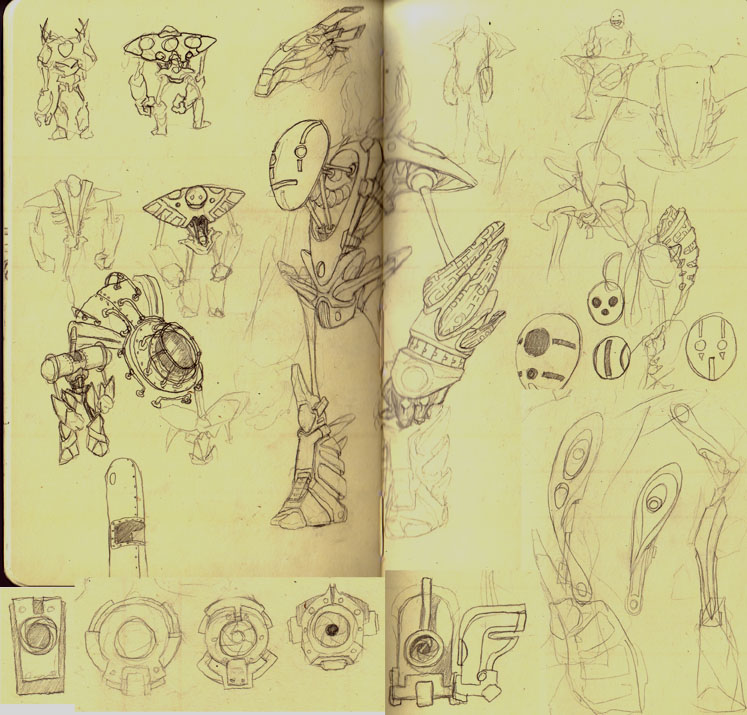
Original doodles in the sketchbook that spawned him...
and lastly... kids... let me pass on some advice... dont model a mechanical character unless you have a lot of patience. They are a fucking bitch and a half to unwrap.
Thanks for taking a look
I need to move on to something else now though... most of the garbage in my portfolio is of my design, in my style, and doesn't really seem to fit with any "established" styles in the industry, and so isn't doing much to get me a job. I need something that shows employers I can take THEIR designs and reproduce them perfectly in 3d. After I post this, I'm surfing over to conceptart.org to find something that has a better chance of landing me a job making art. I'm testing games right now. Arg.
He's sitting at a little over 10k polies right now, and was designed to be the only character model in a multiplayer mod. High poly count, I know, but the game won't have many assets so we're pushing the ones we do have a little further than we normally could.
Any crits would be very welcome. Design, model, texture... any or none. This was very much a learning experience for me, but I can see things that need changing already, and I'm sure a lot of your guys can see even more.
The textured shot here is from unreal3. I have him rigged and imported, setup with ragdoll etc. No animations though. The glow texture on the crystals is animated with a slow flowing pulse effect. The wrist chain things are setup to spin when a certain ability is used, that's why they're separate geometry and not entirely normal mapped into the forearm.

"low poly" wires...

Here's the texture sample I threw up on my portfolio. The complete layout is pretty ugly (he was originally unwrapped without any uv mirroring... so you can imagine the kind of mess the entire layout is), so I tried to choose a sample region that represented the rest of it pretty well.

Original doodles in the sketchbook that spawned him...

and lastly... kids... let me pass on some advice... dont model a mechanical character unless you have a lot of patience. They are a fucking bitch and a half to unwrap.
Thanks for taking a look


Replies
If your mod needs some to make an animation set for that guy, I'd be up for it, mainly cause that model kicks ass
for your portfolio a few things to add.
Something easy to do and worth it would be to add a few overlays on the spec map to break up the flow of the shine.
When dealing with metal objects its all up to the spec map to make it really shine as metal.
Other things to do would be a very quick upping of the contrast in the diffuse and bit more grime and grit. And maybe try upping the value of the normal map so it makes things pop more and add an overlay normal map with some random big and small noise details on it for that its been around the block once look.
All and all very nice work!
Great work
Good job though man.
TGZ - Thanks, good crit. Will definitely keep that in mind when re-doing the spec map.
Neo_god - Thanks mang
Armanguy - Thanks, yah he's been on my site for a while. A month? ish? longer? One loses track of time in the monotony of game testing. Anyway, thanks
spacemonkey - Not running per se... but I do have him falling into large piles of useless junk:
Lupus - good crit, thanks
Jesse - many thanks green apple man
Feel free to throw me the biped with the current model and I'll send you back some .bip files anytime.
Only thing i have to crit is that the head should stand out more from the rest of the body, the hands and foots are nicely seperated because of the shiny crystals stuff but the head looks somehow very unimportantly. Maybe makeing the eye red or putting some stickers or stripes in another color on the head would be enough.