Home 3D Art Showcase & Critiques

3d doodle

polycounter lvl 18
Offline / Send Message
richkid polycounter lvl 18
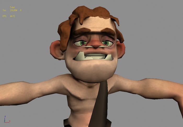
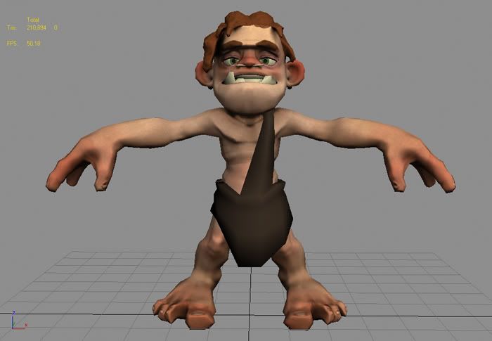
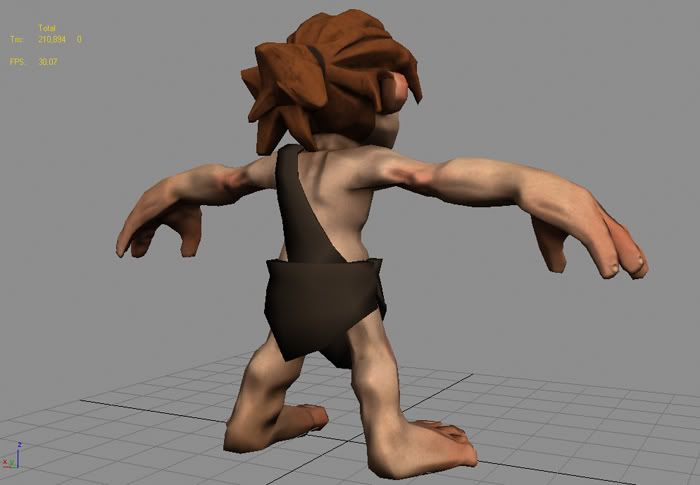
sooo, its been a while...i...ive missed you all, i did a quick doodle at a coffee shop the other night and decided i should model it while i still liked it
screen.jpg
screen2.jpg
screen3.jpg
there is still much work and detailing to be had, but i thought i would get some input from the masses. i think im gonna model a yheti i painted to go with him, maybe a fight scene for the turn around.

oh yeah, and the poly count in the corner is cause the highpoly is hidden on a layer, he is sitting around 3k right now

Replies

  • Japhir
    Offline / Send Message
    Japhir polycounter lvl 17
    sweet! love the style! hair looks great too! can we see the doodle you did?
  • StJoris
    hehe nice big toe:)
  • BeatKitano
    Offline / Send Message
    BeatKitano polycounter lvl 16
    Ahah awesome, would love to see this guy animated laugh.gif
  • thnom
    Offline / Send Message
    thnom polycounter lvl 18
    Whilst I love the model, I dislike the normal map on it, it just ruins it for me. Still nice job getting stylisation looking so good smile.gif
  • Jaco
    Offline / Send Message
    Jaco polycounter lvl 17
    Nice, I love his proportions and style. I agree with thnom though, the normals aren't doing much. Do you paint your normals or bake them from a highpoly mesh?
  • dfacto
    Offline / Send Message
    dfacto polycounter lvl 18
    Looking cool man, it's got a neat style to it. smile.gif

    Have to complain about the nose bone thing though. In my opinion it's far too thin to really have an impact on the overall look of the character unless you get a closeup of the face. A larger more elaborate bone would do a lot for the character I think.

    http://www.nma-fallout.com/forum/album_page.php?pic_id=2043
    URL goes to some inspiration.
  • Spark
    Offline / Send Message
    Spark polycounter lvl 18
    Yeah, have to agree on the toothpick in his nose, would rather see him carrying a huge bone club to the point where he could not almost lift it. I would go with what dfacto is saying about a larger bone in the nose, but I think that would detract after a point to the characters face, which I really like. Diggin this.

    Spark
  • MAUL0r
    Offline / Send Message
    MAUL0r polycounter lvl 18
    nice one gavin, you should rig him up like crazy and donate him to the rigging class so we don't have to look at that bald underwear guy anymore :P
  • Jesse Moody
    Offline / Send Message
    Jesse Moody polycounter lvl 17
    Hey buddy. So this is what you have been doing lately.

    -Bone in nose. TOO SMALL
    -The normal maps look soft and squishy. I would love to see some muscles on this guy and some definition.
    -I'm sure the textures still a wip so i won't say anything about that.
    - I would add some smoother shapes to his clothing around the crotch area. Right now it looks really hard.


    Hmmm thats it for now...Talk to you later my friend
  • Zephir62
    Offline / Send Message
    Zephir62 polycounter lvl 12
    front of the forearms lack the major bumps and anatomy, and the back of his legs... well, it needs some major reworking. The heels are too big and stretch too high up the leg, and the Gastrocnemius(the big muscle on the back of the leg) and the heel tendon look deformed. Overall I'm really digging the style though so keep it up!
  • Joao Sapiro
    Offline / Send Message
    Joao Sapiro sublime tool
    one thnig i see in your works is taht the normals are very muddy/undefined, its a nice style since you make an ok diffuse, but it can read as simply "sloppy" i would try to actually define more stuff with the sculpting program you are using, you have unlimited polys to play around with, try to achieve more interesting forms.

    keep going !
  • stimpack
    Offline / Send Message
    stimpack polycounter lvl 10
    yaaay he has a septum piercing like me!! i like this lil bugger, keep goin with him! does he have a side kick?
  • richkid
    Offline / Send Message
    richkid polycounter lvl 18
    jesus, i wake up mid afternoon to more replys than i have time to read. but thank you for the kind words and crits.

    ok so, the anatomy, im actually taking out most of the details on the anatomy, he is supposed to be adolescent so muscle definition isnt going to really start showing on him. the legs and back make him look older because of the defintions that i did give him.

    the normals, this is a pretty quick pass on the normals, i havnt gone in yet and sharpened up some of the stylizations and creases, but i do have problems with making normals as johny stated, so if anyone has some good tips for making them, shoot them my way. right now im doing a highpoly in zbrush and exporting it over to max and baking. i dont want the normal to do that much on the body, it is gonna be mainly apparent on the face, hands and hair. he is a child so the body is going to be squishy and soft.

    the septum piercing, i just kind of tossed it in there for fun, im either gonna make it a chicken bone or take it out, most likely take it out though, its another thing that makes him look too old.

    and the loin cloth deal, thats just a rough block out, just testing different styles and i liked that one the most, so im gonna continue refining it.

    hopefully tonight i will have an update.

    thanks
  • richkid
    Offline / Send Message
    richkid polycounter lvl 18
    oh yeah, here is the doodle he is based off of, i had 4 things in my mind at the time...
    in the rough by blur studios
    tarzan as a kid
    tak, or rather the concept artists like adam woods that worked on tak
    and jesse, i think you know the other one, he is in the bottom corner of the doodle...
    DSCN3589.jpg
    thanks again guys
  • Jesse Moody
    Offline / Send Message
    Jesse Moody polycounter lvl 17
    yeah buddy. Thats good ole POP POP CLICK CLICK. I came up with that guy back in the day. My guy wasn't so tall but I can easily see who you were going with.

    Hmmm I haven't done any characters in a while...
  • richkid
    Offline / Send Message
    richkid polycounter lvl 18
    FaceCLose.jpg
    front-1.jpg
    back-1.jpg
    i knocked back the parts that i thought were too muscular, and sharpened up some parts that i thought were too dull. so around the face there are some sharper details, and the chest has some better lines in it. its a fresh bake, so some of the missed spots are still in there

    hope you likes
  • Joao Sapiro
    Offline / Send Message
    Joao Sapiro sublime tool
    add a bit more details in the arm , it might not have muscle, but the wayyou made the lowpoly and the structure of the arm suggest there is;)
  • conte
    Offline / Send Message
    conte polycounter lvl 18
    make darker nails, brown nipples and such.
    i do really like that character haha=)
  • Pavel
    Offline / Send Message
    Pavel polycounter lvl 10
    hahah...vice cute char...
    he looks like son of that dude from Blur studies animation "in the Rough" wink.gif

    Intherough.jpg
    home_page.jpg

    anyway cool! thumbup.gif
  • cyborgguineapig
    Offline / Send Message
    cyborgguineapig polycounter lvl 14
    Hey Gavin, great work man. Has a lot of character. I agree with whats already been suggested by others. Also you should be able to get away with adding one more cut down the center of the big toe without messing the UV's to make it more organic shaped.
  • Por@szek
    Offline / Send Message
    Por@szek polycounter lvl 18
    Haha that's wicked. Great style, I;m in love laugh.gif
  • frettchen
    I reckon you should get him rigged and give him to the animators to play with crazy.gif
  • Jesse Moody
    Offline / Send Message
    Jesse Moody polycounter lvl 17
    Hey Gavin... Can we see the high poly sculpt?
  • richkid
    Offline / Send Message
    richkid polycounter lvl 18
    highback.jpg
    higharm.jpg
    high.jpg
    here are those high shots, the last low i posted doesnt go with these, so i will grab some new shots to post up that match these.

    and yes, he will end up rigged and for dl, so dont you worry your pretty little heads

    peace out
  • Keg
    Offline / Send Message
    Keg polycounter lvl 18
    in that middle shot it looks like he has a wang :P
  • richkid
    Offline / Send Message
    richkid polycounter lvl 18
    haha, yeah, it kind of does, a wang with a nail on it...
    here are some shots of the model with the normal from above sculpt.


    screen-1.jpg
    screen2-1.jpg
  • Xaltar
    Offline / Send Message
    Xaltar polycounter lvl 17
    Haha, too cool.

    Why can I see this guy running arround hollywood with a club chasing Paris Hilton around....

    Or is it just me tongue.gif
  • Joao Sapiro
    Offline / Send Message
    Joao Sapiro sublime tool
    yeah the highpoyl is too muddy/undefined so that is screwing your normals, right now the model isnt beneficting of the normals , i would try to improve that aspect frown.gif
  • richkid
    Offline / Send Message
    richkid polycounter lvl 18
    so where do you think i should shapen up details, cause he is already more chiseled than a kid should be, all i ever get on this subject is the line...it looks muddy.
  • Joao Sapiro
    Offline / Send Message
    Joao Sapiro sublime tool
    because its what it actually look like, one of those starter meshes from mudbox that look blobby and inconsistent, you dont need to chisel everything, you can give subtle hints of where muscle structure is, make it more interesting, im not saying to beef him up.

    ill post further, but iv got to go sleep.
  • richkid
    Offline / Send Message
    richkid polycounter lvl 18
    i dig what you're saying, time to bust out some of those pictures of kids i keep hidden away and do some "reference"

    i will be back, hopefully with a dope sculpt.
  • richkid
    Offline / Send Message
    richkid polycounter lvl 18
    here is a little shot of him posed, i havnt given up yet, just been a little busy.

    posedbackground.jpg

    i havnt had a chance to play with the high res, im kind of doing that and the rig in tandum at the moment, ill post again when i have more.
  • Jaco
    Offline / Send Message
    Jaco polycounter lvl 17
    That's looking awesome, real cute. I love the expression on his face, like he just farted or saw a nice stick.
  • frettchen
    I want to animate him crazy.gif
  • Joe March
    Offline / Send Message
    Joe March polycounter lvl 17
    I like a lot of the things ya did with him, but I guess watch out with some of the normals, it makes him feel a little like a gumby clay thing than a cave man, but great stuff!
  • richkid
    Offline / Send Message
    richkid polycounter lvl 18
    Posed.jpg
    Posed2.jpg

    here is a little update on the rig,the forearms and the hands are the only part left, ouside of some minor weighting issues here and there.
  • Joao Sapiro
    Offline / Send Message
    Joao Sapiro sublime tool
    i dunno, theres something that bothers me alot in this piece, i guess its the mix of styles, you seem to have tried to mix realistic with cartoony, and that doesnt work much in this .

    I dont see many problems in the rig , keep going man, make a kickass animationof him clubbing flys or somethingeheh , you have any plans for a short ?
  • MAUL0r
    Offline / Send Message
    MAUL0r polycounter lvl 18
    lookin good gavin.

    for some reason I see him as sort of the "Dennis the menace" of cave people... not sure why, that's just what I'm gettin from it.
  • Zephir62
    Offline / Send Message
    Zephir62 polycounter lvl 12
    Cartoon or not, the muscle anatomy and especially the structure of the legs barely resembles anything human :P I like the texture style and all that and the rig is pretty solid too, but the anatomy just slowly progressed from bad to worse as you began finishing the piece. I personally feel you put the cartoonish exaggerations in odd places(such as the thumb muscles on the wrist) that detract rather than build character and it'd be best if you tried him over from the start.
  • D4V1DC
    Offline / Send Message
    D4V1DC polycounter lvl 18
    Addressing Johny's comments: I think it's the lack of actual color on the skin and hair color in general if your going for 3D cartoony I think Ice age would work as a reference to this style. I love the art work done there (Ice Age) and I assume it would work on this model. If you some how just projected the idea/style that this character came from that movie would make this design pop that much more.

    Just my comments u can ignore them. wink.gif I still like the design.
Sign In or Register to comment.