Home 3D Art Showcase & Critiques

Mythic character

polycounter lvl 17
Offline / Send Message
culturedbum polycounter lvl 17
Hey guys I havent posted here in while, since the dominance war actually, here is a character im doing to apply at EA Mythic. I know its not done yet but it should be done before the weekend is over. Comments and suggestions are very welcome.
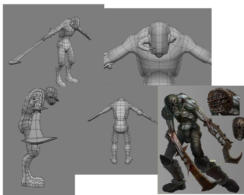
MYTHIC_DUDE02.jpg

Visit the AIPX forum it has great student stuff, here is mine http://www.sgda-aipx.org/index.php/topic,927.0.html

Replies

  • zenarion
    Offline / Send Message
    zenarion polycounter lvl 17
    The concept has more forearm and less blade. Nice otherwise.
  • culturedbum
    Offline / Send Message
    culturedbum polycounter lvl 17
    Hey guys, sorry I havent posted much in this forum. here is an update on the character...
    concept01.jpg
    concept03.jpg
    concept04.jpg
    concept05.jpg
    I'm pretty much done with the modeling phase, Crits and comments are very welcome and needed. See ya!
  • Japhir
    Offline / Send Message
    Japhir polycounter lvl 17
    this looks awesome! great character!
  • dom
    Offline / Send Message
    dom polycounter lvl 18
    very cool. i like the painted style in your textures.
  • Matabus
    Offline / Send Message
    Matabus polycounter lvl 19
    [ QUOTE ]
    very cool. i like the painted style in your textures.

    [/ QUOTE ]

    ??
  • dom
    Offline / Send Message
    dom polycounter lvl 18
    oww. i thought that concept art was 3d. oops, my bad.
  • Rhinokey
    Offline / Send Message
    Rhinokey polycounter lvl 18
    concept is by Ted Beargeon one of out concept doods here at Mythic
  • Jeremy Lindstrom
    Offline / Send Message
    Jeremy Lindstrom polycounter lvl 18
    I think you need some more edge flow and edge loops around the arms, legs area... no?
  • culturedbum
    Offline / Send Message
    culturedbum polycounter lvl 17
    Hey guys thanks for the comments.
    -Dom- yeah dude it is a character I picked off of the mythic concept page, lol. Sorry I forgot to mention that.
    -Rhinokey- yeah I didnt know that name of the artist, I admire his work.
    -Dekard- I talked talked to some people and they told me the flow there was fine...I also had a 2500 tri limit so thats basically all I could fit in its around 2490 right now.

    Thakns again guys, more updates coming soon.....
  • mvelasquez
    OMG youve exposed our humble student forum to a larger audience!

    I think you could spend some tris for some alpha fur on the lower legs.

    textures!
  • Baddcog
    Offline / Send Message
    Baddcog polycounter lvl 9
    Pretty cool.

    I agree that there should be more forearm and less blade to match concept art. The concept looks about half and half. Your's looks like 1/3 and 2/3's (maybe that's exagerated a little)

    I think you need to pull out his shins too. They curve in way too much, and with pads on top of em they'd need to be out even further.
    The concepts are pretty much straight down from knee with only the slightest curve and look very realistic to me.
  • culturedbum
    Offline / Send Message
    culturedbum polycounter lvl 17
    Hey guys, I adressed the arm problem with the blade and fixed the shins. Here is an update on the texture work for ya!!!

    head_shot.jpg
    frntoshot2.jpg
    backshot.jpg
    legs.jpg
    These are all screen captons of max with flat shaded mode on so they might seem a little bright. Im still working on the back side, crits and comments please...
  • Spark
    Offline / Send Message
    Spark polycounter lvl 18
    Culturedbum, I would rework the set of polys that you have from the chest and continues down the inner arm. That is alot of polys that you could reuse to help the silohette of the body. As at the moment they are not adding to the form at all, a good thing to try is put a black material onto your mesh, and reduce polys with it on, if you do not see a silohette change, then you need to take out those polys or use them in a better way. Also, I would say that the back of the knee to the calf is seriously sharp and I would suggest adding a few polys to help the form there some. Hope that helps, and its looking good.

    Spark
  • culturedbum
    Offline / Send Message
    culturedbum polycounter lvl 17
    Hey spark thanks for your reply. I absolutely love your work, especially the character work for age of empires. You were totally right I went in and reworked chest and inner arm and it made no difference at all on the silhouette. I also went in and reworked the calf; thanks again man, Keep rockin!!
  • tofugorilla
    I would take all the black on the texture and level shift it to a dark dark grey. Vary up the mask with some painted light, grime and scratches. Paint some light on the muscles as well, tint parts of them with a color or 2. Paint in shadows where geometry meets (i.e. horns to head & mask to face, etc...) and change the shape of the horn to something more interesting than just a tube.

    I really like the character so far, keep on.
    Paintover.jpg

    @spark- I've never heard the black shader/silohette tip, I'm pretty much gonna go use it now smile.gif thanks!
  • PolyPutty
    Just be carefull where and how many cast shadows you stick in it if you do that. Cast shadows can look wierd if they stay stationary in a spot that is moved a lot in animation. I agree with the mask to face, but don't know about the horn to head. could I possibly see a wire fram of the ankles I am interested how you did it, are you duplicating the same fur texture everwhere accrossed the ankle fur planes?
  • Spark
    Offline / Send Message
    Spark polycounter lvl 18
    Hey Culturedbum, glad that was a help to you, and thanks for the kind words. I am looking forward to your updated post to see how it's turning out. Tofugorilla, glad you also could find a use for it, but just wanted to give props to TheBird for telling me about that fun little trick in the first place. Always good to pass on the knowledge, especially if it works:)

    Spark
  • Xeto
    Offline / Send Message
    Xeto polycounter lvl 17
    I like your texture work so far. I feel like the arms could stand to be just a tiny tiny bit longer and the right forearm feels a little skinny for having a big blade stuffed in it in addition to the bone and muscles. Good goin so far though.

    [edit] Whats with the sudden uprise of AIPX students interested in Mythic? Good to see more Phoenix folk though.
  • sinistergfx
    Offline / Send Message
    sinistergfx polycounter lvl 18
    It's cause you guys keep hiring them! :P
  • culturedbum
    Offline / Send Message
    culturedbum polycounter lvl 17
    Hey guys,
    -Tofugorilla- yeah due I heard about the black being too black twice already, I will stay away from true black and add some more scratches. I want to finish the main painting before going into further detail.
    -Polyputty- I'll definitely watch out for those shadows because of the animation reason. Yeah, I duplicated the same hair texture, I'm not really satisfied with the look right now so I will probably squeeze in another fur in my texture somewhere for variation, What do you think?
    -Spark- Thanks again, Yeah I'm still working on the update, its finals week in school so I'm kind of swamped with homework but I'll definitely post soon.
    -Xeto- Actually I think the forearm is just a small piece of bone at the top, the rest is just a piece of flesh tied to the blade. Maybe just the top of the forearm a little fatter would help. :P http://www.warhammeronline.com/english/media/conceptArt/full/WAR_CA_00806_05.jpg
  • Baddcog
    Offline / Send Message
    Baddcog polycounter lvl 9
    Looking good. I noticed the belly is rounder and sticks out more in the concept. An easy fix and would help give him more shape.

    That black material thing does sound like a good trick, might have to try it smile.gif
  • culturedbum
    Offline / Send Message
    culturedbum polycounter lvl 17
    Hey guys, here is an update on the character with some better baked light and some ultra-cool-butt-blood.

    new2.jpg
    new1.jpg

  • Keg
    Offline / Send Message
    Keg polycounter lvl 18
    The flesh looks off to me. Everything has a solid realistic look while the flesh looks somewhat under detailed and monochromatic. Granted I understand the flesh is meant to be grey-ish that doesn't mean there can't be levels of subtle color. Plus I feel the muscles are over defined.
  • StJoris
    I like it, has a nice painterly touch in the textures just like the concept, only the pants stand out a bit too noisy or sharp.
  • Zephir62
    Offline / Send Message
    Zephir62 polycounter lvl 12
    His skin has a very nice touch to it, but everything else is so noisy that it contrasts very harshly with it. IMO that contrast looks bad. If the art direction for Warhammer follows this suit it might not end up looking that bad at all, but standing alone I don't find it very pleasing to the eye.
  • Xaltar
    Offline / Send Message
    Xaltar polycounter lvl 17
    I agree with Keg, it could use some colour variation on the flesh, some subtle greens, blues and purples with some touches of yellow here and there and it will make all the difference. Dead flesh is actually more colourfull than living flesh.
  • tofugorilla
    The vertebrae sticking out the spine look weird. I think you could take him a lot further, but if your done, your done! laugh.gif
  • culturedbum
    Offline / Send Message
    culturedbum polycounter lvl 17
    Oh no's tofu gorilla, Im not done with it just yet, just got to put him away for a little while I finish this quarter in school.:}
  • zenarion
    Offline / Send Message
    zenarion polycounter lvl 17
    Damn,it looks awesome. I think i recognize the concept from the Chaos army book somewhere.
  • killingpeople
    Offline / Send Message
    killingpeople polycounter lvl 18
    aipx woot woot
  • Xeto
    Offline / Send Message
    Xeto polycounter lvl 17
    I feel like the skin doesn't look done. I feel you could take it a lot farther right now it feels like you have outlined the anatomy and done some shading. You have a higher quality of texture work on the pants and boots than the torso. I like the peice a lot, I just think it would be cool to work out the skin a little more. But, thats just me, up to you.
  • culturedbum
    Offline / Send Message
    culturedbum polycounter lvl 17
    KP- whats up maing, AIPX in the house. Never met your but I'm familiar with your work.
    Xeto- yeah dude I'm still working on that skin texture, I had to put it away for a little bit, its finals weeks in school and I'm ready to kill myself.lol. But yeah the skin texture will definitely get some red/purple/yellows in there.
    ......Thanks for the comments guys.
  • culturedbum
    Offline / Send Message
    culturedbum polycounter lvl 17
    Hey guys!!!
    So here is the update on the skin, I did a little redening, and some purpling, and some bluing. I also redid the fur, ....
    LOOKEE_HERE.jpg
    LOOKEE_HERE_OH_MY.jpg
    ..I had to put it away cause finals at school were killing me. But I'm calling it finished now.
    -Cheers!!!
  • Keg
    Offline / Send Message
    Keg polycounter lvl 18
    the texture still lacks continuity as the skin still looks overly cartoon-ish. everything is too high contrast and each shaped is defined too harshly.
  • Mike_Carlyle
    Offline / Send Message
    Mike_Carlyle polycounter lvl 17
    That looks like its going to get infected crazy.gif

    the edits are lookin good, keep it up
  • Por@szek
    Offline / Send Message
    Por@szek polycounter lvl 18
    I'm not a character artist so U won't get much feedback from me, but i need to say that I like texture of the helmet and pants. I dig it:)
  • culturedbum
    Offline / Send Message
    culturedbum polycounter lvl 17
    A rigged update, working on a base now.\mythic_final.jpg
Sign In or Register to comment.