The BRAWL² Tournament Challenge has been announced!
It starts May 12, and ends Oct 17. Let's see what you got!
https://polycount.com/discussion/237047/the-brawl²-tournament
It starts May 12, and ends Oct 17. Let's see what you got!
https://polycount.com/discussion/237047/the-brawl²-tournament
Warhammer Desk
Had to jump on the I *heart* Warhammer/Mythic bandwagon, saw this concept and just had to model it.
Still working on the textures and adding details like the book sitting on top.
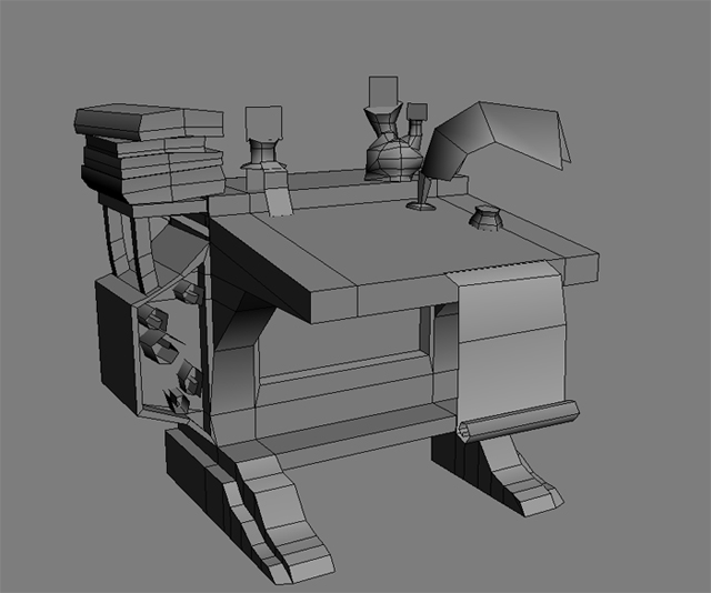
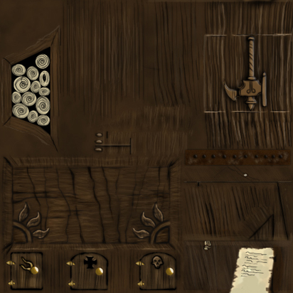
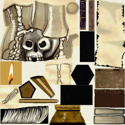
The desk/props are 950 tris, x2 512 diffuse textures.
Crits and comments welcome, of course, thanks in advance.
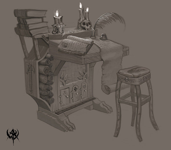
EDIT:: forgot the concept..whoops
Concept::
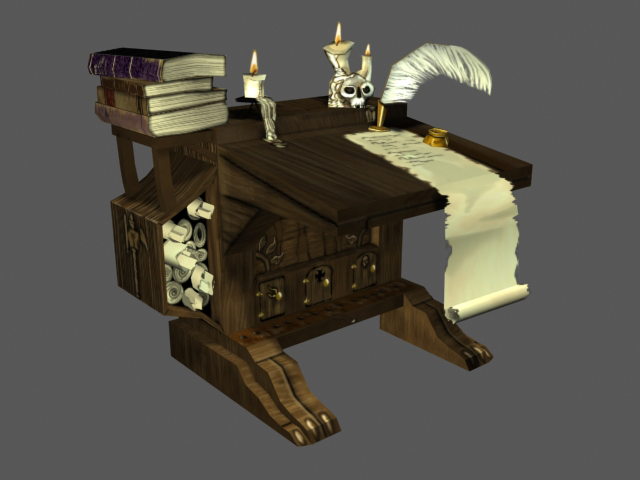
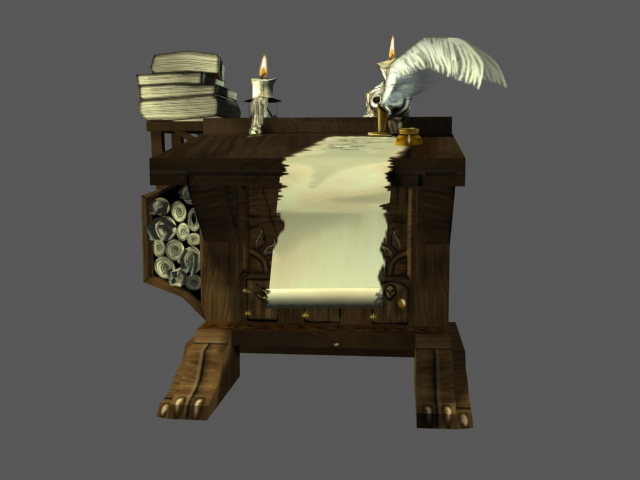
Textures::
Still working on the textures and adding details like the book sitting on top.
The desk/props are 950 tris, x2 512 diffuse textures.
Crits and comments welcome, of course, thanks in advance.
EDIT:: forgot the concept..whoops

Concept::


Textures::


Replies
Don't do anything else until you make that skull the best looking warhammer skull ever. You must realize the importance of the skull before you can give the same quality to the rest of the piece.
STOP!...hammertime!
Don't do anything else until you make that skull the best looking warhammer skull ever. You must realize the importance of the skull before you can give the same quality to the rest of the piece.
[/ QUOTE ]
Quoted for absolute truth.
Will update with a better skull soon.
Everything else look good, save to say you may need to tone down the shadows on the wax.
Stretch the model upwards and shorten the feet to match the concept. Always try to match the concept as much as you can.
[/ QUOTE ]
definitely. current proportions are off by quite a bit.
make love to that skull until it is your wife! do it! WAAAAAGH!
Justin:: Thanks for pointing that out, I knew something was off, just couldn't see it.
Sectaurs:: Skull sexification in progress.
Made adjustments to model proportions, and a little more work on the skull, more updates later. Thanks everyone for the crits, keep em' comin'. : )
Here's another small update before I leave town for the rest of the day. More edits to the skull and wax, wear and tear to the desk and proportion editing. Next I'll be making the book that sits on the desk, more texturing, and some UV adjustments. Thanks again for the crits.
Woodgrain overpowers the wood's shape, enhancing the highlights/shadows can fix this, and be sure your grain all runs a direction that makes sense.
Finally, that skull still needs a lot of work, it's just too distorted and cartoony. Think more realistic, with a painted look and slightly wonky/whimsy.
Screencap::
Textures::
but now that you've revealed your abilities, you need to bring the rest up to the same level. The wax/candle texture especially stands out, sitting on top of that skull. Try faking some sss on it and get some warm tones in the shading. Right now its kind of grey and muddy and very 'drawn'.
The grain needs to curve and form knots like these:
http://www.primatestudios.com/images/articles/painting_wood_grain/fig_12.jpg
http://www.kitchendoorsonline.net/images/royal-oak.jpg
http://www.fotosearch.com/comp/CRT/CRT248/009315IL.jpg
You'll be hard pressed to find wood that has perfectly straight grain all along one axis...
One thing I'd change, and I'm surprised that nobody else has mentioned it, is the rolled-up scrolls in the left shelf. They look very flat, like they're just floating there right now. Try adding better shadows to them.
How about putting some weak omnis where the candles are and baking in their lights? Your concept seems to have a really wel-defined lightsource/sources.
the grain is way overpowering, I actualy would have found a nice wood overlay to use as a base to start with and worked with it. you may can fix it a lot just by taking your wood grain layer and lowering the opacity on it by.. 50% at least.
Lighting. The lighting on the wood now.. seems to be a clouds layer of some sort. think about your light (actualy in making warhammer we would not paint in much lighting since we will be using lightmaps. but in this piece its fine if you want to make it look pretty) I would suggest baking your lites in from a couple of omnis simulating the candles, plus one or 2 simulating ambient light. Or you could do it the hand painted way, i'd make a layer then lay down some solid colors for light untill you get them placed where it looks real, then fade it out and paint it up to look nice.
watch wood grain direction, on the feet part you have the grain going one way on the top, then it sudenly goes the other way where the foot swoops down think of how wood works, the grain is fibres flowing up the tree, the darker grain is the rings in the tree cut as a crossection. tehy should go in a certain direction
Screencap::
Textures::
The candledrip is looking really thin, it is nothing at all like the waterfall of wax in the concept.
The open book would benefit from some unique uvs so you can match the frazzled look of the paper in the concept. Map its black cover to one of the others and use that space for the paper.
The inkwell and "featherstand" needs to be shinier, if you can't use a specmap, try painting some fake reflections and highlights similar to what you have done on the candels.
Will you bake shadows? The wood right below the stack of books is just a confusing mass of brown right now without the defining shadows of the concept. All of the surfaces could do with some shadows to help with readability. This would fit with the art-direction ingame too, since from what I can tell by looking at screenshots, everything seems to have shadows and highlight baked and no specmaps, but I'm sure that one of the polycounters working at Mythic can correct me on this.
Thanks for the crits, John and Cubik, very good points that I've implemented this pass(minus baking shadows). I'm still tweaking the wax "waterfall" coming off the candle.
Screencap::
Textures::