Home 3D Art Showcase & Critiques

Business Card Pimp

polycounter lvl 17
Offline / Send Message
Nate Broach polycounter lvl 17
Took me forever to finally decide on a design and I'm still not sold on it, but I printed them anyway. Would've been really helpful to have been able to look through a whole bunch of them to get some ideas. So post yours here if you got one!

Heres mine
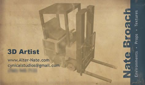
businesscard2.jpg

Replies

  • Joao Sapiro
    Offline / Send Message
    Joao Sapiro sublime tool
    this business card is pretty recent right ? i cant remember ever hearing about them until recently ( in the cg area )

    I like the business card, but the background image doesnt quite appeal , and the business card has a too much aging look imo, but looks cool i guess wink.gif

    good luck !
  • notman
    Offline / Send Message
    notman polycounter lvl 18
    Yeah, the card looks nice, but I think the background doesn't work. The problem I have with it is it makes it look like you're selling forklifts wink.gif I would go with a different piece, or something that presents more like an artist's card (other than the text).
  • Rhinokey
    Offline / Send Message
    Rhinokey polycounter lvl 18
    you don't need any of your work on your card, thats what a portfolio is for.
  • Jesse Moody
    Offline / Send Message
    Jesse Moody polycounter lvl 17
    hmmm... yeah i'll buy a forklift. Nate you should have posted a few different designs and got some feedback. I think you have some better pieces that really could have made better choices on this and you should have went with a color render of this thing as well.

    My card was black and white but it was a complete sillouette of my mosul environment. So thats a bit different.

    It's not ugly just think it could look better.

    By the way hit me up on aim, yahoo, or msn. I need to chat with you.
  • Nate Broach
    Offline / Send Message
    Nate Broach polycounter lvl 17
    Yea I hear you guys, when I run out of these Ill do something different. I just mostly was hoping some of you would post your cards just to see what the polycount majority is sporting. Help give me and other ideas when making theirs.

    Yea Jesse, been real busy, Ill sign on AIM when I get a chance.
  • Ghostscape
    Offline / Send Message
    Ghostscape polycounter lvl 13
    Here's my current one.
    ghostmountaindo2.gif
  • Steve Schulze
    Offline / Send Message
    Steve Schulze polycounter lvl 18
    Does the design of a business card actually matter? I mean sure its nice to have an attractive card but its not like people are going to judge you on it. Unless you're a colleague of Patrick Bateman.
  • Ramj
    The first one does look like you're selling forklifts, if you're going to put some props work on it, I'd stick a more complex scene, if not, I'd move the forklift over to the left a bit more. and take off that kinda... inner shadow you have going on on the edge, it make it look dog-eared

    personally I think we should be thinking outside the box, maybe getting those little weeny cds that are business card sized and stick your portfolio on that...

    otherwise...

    carry around a brand, and burn you contact details into someones flesh, that always works...

    train hamsters to spell out your contact details in formation, and then...

    I haven't really thought these through
  • Xaltar
    Offline / Send Message
    Xaltar polycounter lvl 17
    I like it, simple looking yet artistic. But yeah, it does bring to mind a forklift salesman rather than a 3d artist...

    Best idea, get your details tatooed on a bunch of "escorts" asses that only deal with high class clients or better yet strippers in a classy part of town. Bound to get noticed by the right people there laugh.gif

    Joking asside, the forklift is good but if you plan on using it again you will need to add some other details to make it clear that you are an artist (other than text).
  • Quickel
    Offline / Send Message
    Quickel polycounter lvl 12
    i like the look of the card personally; i'd just remove the forklift all together and be done with it. unless your freelancing, a lot of people aren't tossing traditional business cards around anyway.
  • Emil Mujanovic
    Offline / Send Message
    Emil Mujanovic polycounter lvl 18
    The forklift with the faded/worn paper and text makes it looks like you're a builder/contractor or something. Unfortunately I don't really have a business card but I've designed a fair few (funnily enough mostly for builders or people in the building industry).
    You want something simple, plain and to the point. The design you went for leads the eye everywhere and doesn't seem to flow in any real direction. For the next batch, lose the forklift, just put your name, title, and contact information. If you want to push the whole 3D thing, maybe use a wireframe model for the feature. Even a few cubes positioned well could even work.

    -caseyjones
  • Ghostscape
    Offline / Send Message
    Ghostscape polycounter lvl 13
    [ QUOTE ]

    personally I think we should be thinking outside the box, maybe getting those little weeny cds that are business card sized and stick your portfolio on that...

    otherwise...

    [/ QUOTE ]
    I made a whole bunch of those for GDC and they were pretty awesome - I could just hand off my CD business card to someone instead of giving them a regular business card and they'd have my portfolio right at their finger tips. I also carried around a binder with a printed version of my stuff which was nice to show to folks, I got a lot more interest and feedback by being able to go "hey I make this stuff right here" rather than going "yeah I make video game art you could see it on the internet when you finally have access to a computer and aren't drinking heavily into the night (which is the whole point of GDC imho)."
Sign In or Register to comment.