The BRAWL² Tournament Challenge has been announced!
It starts May 12, and ends Oct 17. Let's see what you got!
https://polycount.com/discussion/237047/the-brawl²-tournament
It starts May 12, and ends Oct 17. Let's see what you got!
https://polycount.com/discussion/237047/the-brawl²-tournament
snake
Alright I thought I'd rather give it it's own thread instead of polluting the w.a.y.w.o.
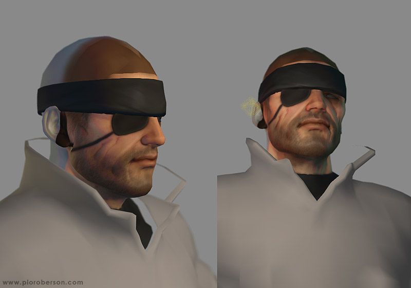
I'm doing some MGS3 fan/copycatart, basically making a normalmapped Snake with all the classic gear from the third episode and also trying to keep it on the boudary between stylized and realistic. I find it allows to avoid the uncanny valley somehow...
A bit of an image dump then. But new pics also!
Early sculpt, an ape and some progress pics :
123456
Just started on the texturing. I still have all the gear pieces to nmap but I could't bother yet ha!
That one is taken in maya. I have an okay shader that works in high quality rendering mode. It's very coarse and unforgiving hence I find it useful when texturing since it's somehow an equivalent to self illumination. Right side is taken in Xnormal.
Some more Xnormal tests. The cast shadows system rules! but I find the shading to be a bit soft. Oh I used Xn for generating the maps btw, it was a real breeze, thankyou Santiago!
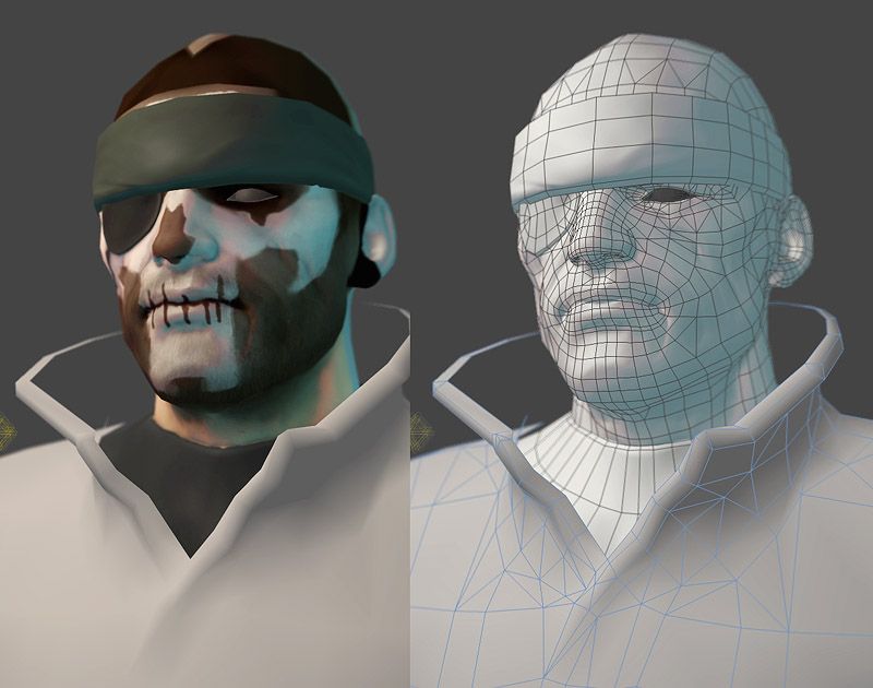
Lowpoly
In the end I decided to go for JStyle's skinshader because it allows funky colors overlay that give that slight moody Shinkawa look!

And a quick mockup of the classic Zombie camo pattern:

Feel free to crit away. Still many things to do...
[edit] Reduced image overload!
I'm doing some MGS3 fan/copycatart, basically making a normalmapped Snake with all the classic gear from the third episode and also trying to keep it on the boudary between stylized and realistic. I find it allows to avoid the uncanny valley somehow...
A bit of an image dump then. But new pics also!
Early sculpt, an ape and some progress pics :
123456
Just started on the texturing. I still have all the gear pieces to nmap but I could't bother yet ha!
That one is taken in maya. I have an okay shader that works in high quality rendering mode. It's very coarse and unforgiving hence I find it useful when texturing since it's somehow an equivalent to self illumination. Right side is taken in Xnormal.
Some more Xnormal tests. The cast shadows system rules! but I find the shading to be a bit soft. Oh I used Xn for generating the maps btw, it was a real breeze, thankyou Santiago!
Lowpoly
In the end I decided to go for JStyle's skinshader because it allows funky colors overlay that give that slight moody Shinkawa look!

And a quick mockup of the classic Zombie camo pattern:

Feel free to crit away. Still many things to do...
[edit] Reduced image overload!

Replies
here's a couple of things:
under the lip, where it shifts to the chin, feels too abrupt. should be more curve-in before the chin pops out, no?
also his head feels too "tucked in". maybe push the stretch the bottom place of the jaw out a little?
http://img.photobucket.com/albums/v242/pior_ubb/wip_018.jpg
But the colored full body and the back look very chubby. I think snake should be quite agile.
one thing- his mouth is welded, strange that in such polycount he don't have in-mouth space
some crits... i guess bitmap pretty much nailed it down with the stuff on the face + (additional crit) i guess in the end he may look a bit unbalanced, let me call it "detail/feature distribution - issue" (dont know if that description make sense?). in my eyes maybe some bigger stuff on his back (rucksack, gun, blablabla... ) could work around that.
Anyways, incredible work, I'm a fan
A little under detailed/designed on the body, especially the back. The face is executed with your usual style & ability, but it looks like you phoned in the body.
I have all the gear ready for normalmapping (gun, holster, water supply and such) and also the body is not rendered at all yet. I have plenty of texture shots I took recently (I have a sort of baggypants pair of trousers with a material similar to what snake is wearing) that *should* help.
As fur the chubiness of him I don't know, I always saw the snake eater version as a buffier character (him being the bigboss daddy of all), esp since he is wearing that old school gear of his. Ha well!
Head is also not finished at all (touchups needed as mentionned, thanks Shotty). As for the mouth I prefer to split it later - I'd rather focus on the more important bits first, and I already have inside mouth parts ready from another model. Oh and I have the collar to fold also.
Per that's one interesting point. I don't really see it that way atm but I guess it's the sort of thing that could jump at me after a few weeks with a fresh eye so to speak.
Tricky! But fun.
FINISH HIM!
A PRETTY SOLID MODEL
I'm sure that Pior has got some surprise in the end (texture).
(Pior's snake is maybe a little bit more round in the face then the original, ... how I say - maybe and probably it's not important , cause I suppose that's "PIOR'S TOUCH" .
waiting for the texture
didn't pior say he was going for the kurt russell look, (who snake was based off of)
As for the model, I don't see him as Solid Snake, why has already been pointed out... if you never showed me what Big Boss looked like in MGS3, though, I'd think this was an excellent version of him!
recently snake kinda looks different.
GOGOGO PIOROU!!!
I think pior's interpretation takes that idea much further and i really like it
i do think, however, that his body looks somewhat too wide and too thin, proportionally to the head. its good stuff tho, post some updates whydontcha
pior sucks...
that is all!
Looking forward to seeing the rest of him pior. I like how you injected your style into him. He's recognizable but with a different spin. Always fun to see someone ELSES take on a character!
Odiums critiques should come with a grain of salt! He's always been a stickler for consistancy.
anyway, i think it's only fair that you go and re-accentuate this character's inherent russell-ness. my brother and i just watched "The Thing" again on DVD and wow is he just a big beautiful beardy man in that movie... fantastic movie as well, it goes without saying. don't leave us hanging pior!
Yeah I'm definately not trying to exactly reproduce the head as seen in MGS3. It wouldn't be too hard to make it look like it tho, I think it's mostly because of the upper lip shape being quite pinched on the real Big Boss. Also when I was sculpting the head I was not really looking at MGS3 captures but mostly at actors reminding me of Snake : Kurt Russel obviously but also Tom Selleck and the guy from The Terminator since the MG1 cover art was traved over him!
Yoshi Shinkawa sketches leave a lot of room for interpretation... but yeah in the end he somehow looks like a MGS1 Snake with camo :P
Anyways, interesting points everyone! I'll try to not overwork the head from now on and jump to the body instead. I spent way too much time trying to build a decent realtime eye shader even i it won't make much impact ultimately. Also photoshopped in some longer hair on the back of the neck for previsualisation purpose and darkened/emphasized the beard to make it look more like a growing beard instead of a shaved look.
Far from done! But I expect the body and gear to go faster. Thanks for the crits guys (Shotty, I asked for them hence I had what I deserved
Awesome stuff, can't wait to see more PiorGoodness (tm)
i find it interesting you've given the headband frowny wrinkles.
http://i9.photobucket.com/albums/a56/Uneek_K/MGS4-Snake.jpg
Maybe it's a bit stupid, not sure... Hmm it would be easy to smudge out anyway.
Hey Poop know what, the french flag is actually one of the camo pattern availlable in MGS3. Guess what? It has the same camo value as the american flag!!
http://www.poopinmymouth.com/wip/freedom_map.jpg
i really like those eyes.
those last shots are with JIStyles shaders too? the sss looks really good there.
Where can I find this Jstyle skinshader pior?
[/ QUOTE ]
http://www.jistyles.com/main.php?id=doc&page=hlsl
i'm refering to the .fx file and i'm using maya 8.5
Final gun as posted earlier :
Start on the gear texturing and shader tests:
Top image is a classic normalmapped preview, below is the same shader except it has a fresnel added and botom uses the same shader again with stronger parameters which works well in fully overbright scenes (ala matrix). I think I will use this in the end since I want to display the character backlit in a bunker corridor - that I just started to work on actually.
!
The gun looks amazing, as well. Very photo-realistic, and the FOX logo is a great touch. Keep it up, man!
i really like that you've got the speculars going nice and bright on the metal, seems a lot of people are afraid of that.
also the text on the side of the gun is fun
only thing not nice in this page is something political involving a certain indian state, so screw that.
what's the shader ur using on the gear?
always a fan of ur work man.
oh and poop, do i have to pay a fees if i say PiorGoodness in a sentence?
make it more interesting
maybe it doesn't look like u've found one style u'r going with,
but that may help you better focus your efforts nonetheless
Also I plan to add plenty little details on the gear, like a che guevarra stencil, that kind of things :P
Updates soon! I'm growing a bit tired of that project, it's time to finish it ha!
haha, really cool stuff, looks much more like the awesome concept art than the real models did. you get a winners prize.