WIP - Pirate Chick
I'm in the process of learning Maya so I'm taking Steven Stalberg's Cybergirl v6.0 workshop over at http://www.CGworkshops.com
I thought I'd kill a couple birds with one stone. In addition to the workshop, Im putting together a website for the artists of 38Studios. This website will be similar to what the Ensemble guys are doing with http://www.SixFatNinjas.com in that we will be choosing themes every other month. For the first challenge we chose to go with Pirates (Check out Josh Singh's thread for his entry).
As you can see Im in the conceptual phase at the moment. I plan to post my work in progress as I go.
Digital rough:
http://www.bobotheseal.com/temp/WIP/MangyPirate_WIP01.jpg
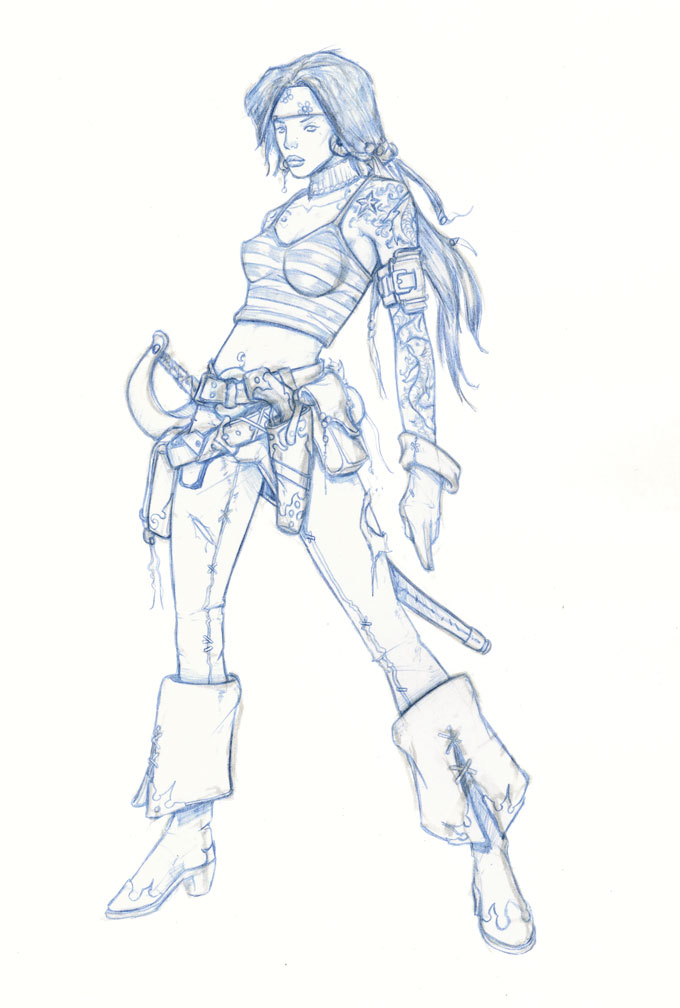
Penciled concept:

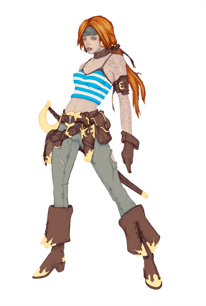
Color WIP01:

I hope to finish the painting this weekend and start on the model.
- BoBo
I thought I'd kill a couple birds with one stone. In addition to the workshop, Im putting together a website for the artists of 38Studios. This website will be similar to what the Ensemble guys are doing with http://www.SixFatNinjas.com in that we will be choosing themes every other month. For the first challenge we chose to go with Pirates (Check out Josh Singh's thread for his entry).
As you can see Im in the conceptual phase at the moment. I plan to post my work in progress as I go.
Digital rough:
http://www.bobotheseal.com/temp/WIP/MangyPirate_WIP01.jpg
Penciled concept:

Color WIP01:

I hope to finish the painting this weekend and start on the model.
- BoBo
Replies
of course, it won't look as good. aaarrrggghhh!!!!
looks AWESOME bobo!!!!
(Didn't 38studios used to be Green Monster games? When'd the name change?)
nice start, but that shirt looks a bit out of design.
and maybe some jacket with torned sleeves could help too.
keep up!
can't wait can't wait can't wait can't wait!
oh, and YES at cleverly placed tears on them pants! i wanna see her knees baby w00t w00t! [lol]
I guess you've done it often enough that it could be called your "style", and it doesn't really hurt the overall pieces of work, but maybe it's something you could look into further for this?
Edit: I asked Tully to do a quick paintover (I tried myself and didn't do a very good job :P ), here it is:
Basically I think the main things you're missing are the lack of overlapping elements like the nose bridge in front of the eye, and the shape of the lips on the far side.
It almost seems like you've just copied her left eye, flipped it horizontally and scaled it down to get a right eye (I assume you didn't do this though!), which would give an inaccurate perspective, and makes it appear like each element has been placed individually on a flat plane, rather than relating to each other in depth as well as positioning like they would in a real face.
As Tully points out in the image, a bit more shading to show the planes of the face would help. A lack of shading is partly what's flattening it out, but I think even if you refined the shading in your current image until it was as accurate as possible, the basic forms would still be off.
Hope you don't mind this
It still illustrates the point though.
BoBo, I like how this is going, and I'm sure the final result (if you get there, oh yeah I went there!) will be awesome as usual. I just can't help but look at it and feel like you've done this exact character before. Those pants, the leg proportions, the over the top straps around the waist, random straps on the arms, even the color palette seems similar to past stuff. I guess I'd just like to see in a piece done for a class, something new and a push to go someplace not gone before in previous stuff.
and bobo, if you want paintovers, you're going to have to post in the concept tag thread like everyone else. and then there will be no end of second opinions!
so I know you didn't ask for this, but y'knaw, I'm unemployed so here we go:
she hates all of you....
Freedom for chick!!!
looking forward to seeing that model coming together! gogogo
/cry
very good point there Eric.
Bobo will probably make up his mind over something decent for the head, i like the pose a lot, there's lots of great idea for facial features floating around this thread. Waiting is the hardest part.
I completely agree with what everyone has said. There are a few things that are stylistic choices but for the most part I do see a lot of issues that I'm going to try and fix along the way. One thing I'm trying with this one is to keep everything on the lighter side. I have a tendency to work really dark.
Color WIP02:
I've been doing a few studies for the butterfly koi tatoos:
Oh and Im going to make her freckled
- BoBo
It'd be like tossing a barbed-wire band tattoo on her or something. I like the idea of a big colourful tattoo on her but would think something more original would be fitting (large colourful octupus, etc.)
-2cents
Otherwise, rad design.
Looking great, BoBo. Can't wait to see the final product.
(large colourful octupus, etc.)
[/ QUOTE ]