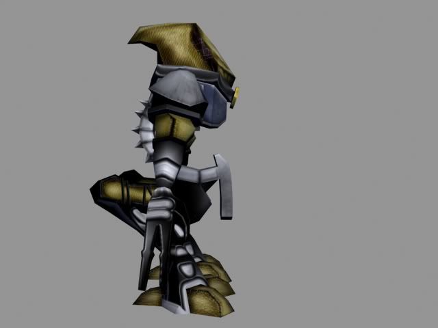
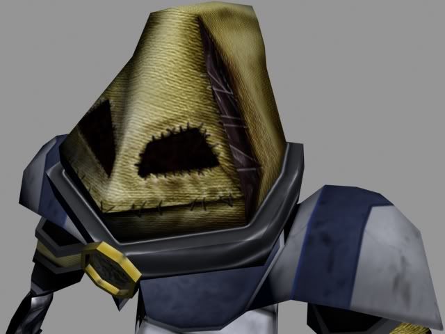
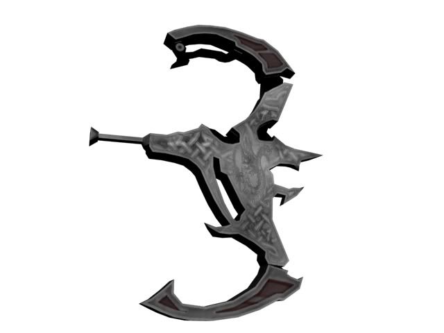
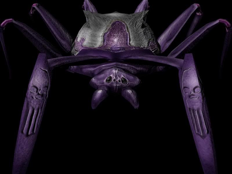
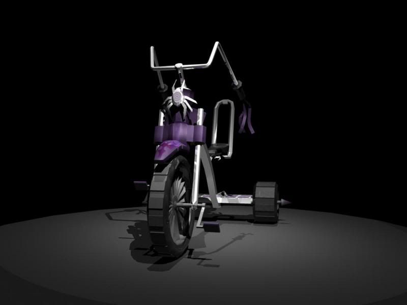
I used to come here a long time ago (think early high school), but never posted anything. Now that I have had some time to learn a few programs, I figured it is time I try to join the ranks of Polycount.
So, years in the making, i present to you. My first post:
Welcome to polycount man--certainly better than my first post was, back in the day
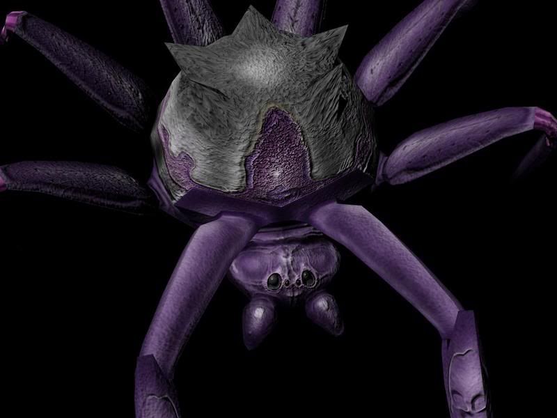
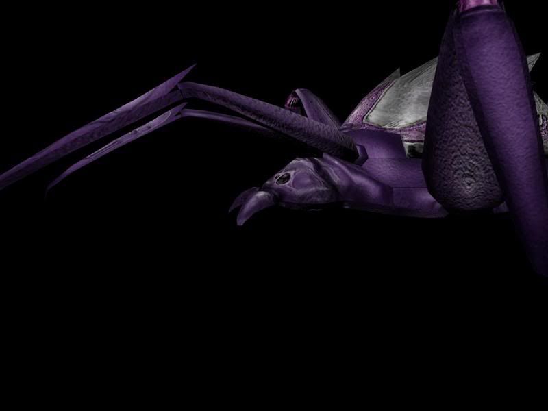
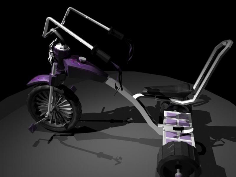
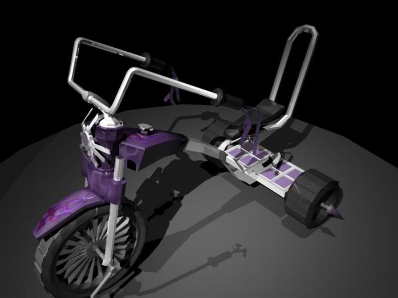
Something that I notice about your texture work is that there's very little saturation to the colors--are you shading with black almost exclusively? Try to avoid making shadows that way, as it tends to suck the life out of all your colors--shade with different colors, not black. Granted the desaturated look is alright for that tricycle, but for that first character model and the spider, you'd be in better shape getting some saturated tones in there.
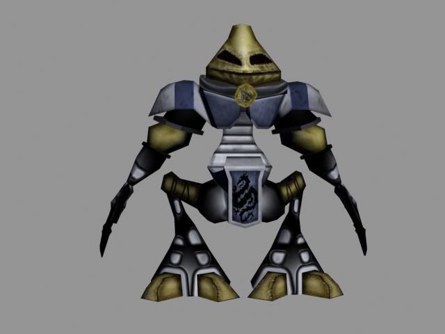
Along with color issues, that first guy is a pretty confused design overall. You've got the canvas sack-looking covered head, but most of the rest of the robot (?) is metal and more futuristic. And you've just got some elements that are tired--particularly the pauldrons/shoulder pads. everyone and their mothers has shoulder pads so when you're concepting (or finding a concept to work from), you ought to try and find something a little or lot different from what you've seen out there.
For a concrete illustration of what i'm talking about, here's a completely unasked-for paintover of that first character. I'm not trying to steal your thunder here, so if you want it out of your thread, just say the word; but I figured you might appreciate my point better with an image.
Because I was interested in the sack-head, that's what I decided to tweak the rest of the design around--getting rid of most of the overtly robot/scifi undertones and instead making him more of an animated scarecrow/golem type character.
So that's one of the first big things to think about, a unity and uniqueness to materials. There's nothing wrong with using metal, but if you capitalize on a more interesting selection for your model, then it'll help it stand out in a crowd. And character modeling is definitely a more and more crowded field. To that end I got rid of most of the metal bits and narrowed it down to the rough canvas cloth, a finer, blue cloth, wood, and brass. The materials help define this character as a fantasy character, and place him more concretely within a certain place and time.
And now look at the colors and you'll see my point about saturation: on the original character, the color is there, but its still very gray looking. Not all colors need to be super-saturated, and the desaturated look can really work (see models from Resident Evil, Silent Hill), but you need to know what you're doing.
I just did the drawing as a hopefully helpful illustration to my point. Learning to model and improve your abilities can be a tough road, so be sure to ask questions and use the resources available to you to improve. And to that end, if you ever need a concept, just private message me and I should be able to help you out. After this I won't come barging into your threads and posting them unbidden
Hey thanks I actually appreciate the constructive criticism. The models I posted are actually about a year and a half old, and I have improved since then. Unfortunately most of my ZBrush work has managed to disappear, and my better remains on a jump drive that i never seem to have the time to plug in.
I just wanted to make a post with the first set of models I was ever proud of. The first character was completed a few weeks after first touching 3DSMax. This was more of a nostalgic post. After attending a keynote by a certain member of the game designing community and hearing the name "polycount" mentioned, I had to at least come back and see the progression of this site.
Anyway, thanks for the crit. I hope to be posting some more recent work in the coming weeks.
you're quite welcome. now comes the part where you get lectured on abhorrent artwork storage practices--a jump drive? Z-Brush work "disappearing" ?
aside from the fact that you should buy a nicely sized USB key and keep a backup of your work on it, here's a foolproof plan: start a gmail account and simply mail yourself copies of your work. gmail can backup huge files for you and you'll never lose them--in fact, there's a handy app that you can find that does this for you--allows you to use gmail as a file backup.
anyway, looking forward to your more current work, and shame on you for losing some of it
good advice. I still get upset thinking about one particular z-brush model that I have misplaced. This was during that full-time student meets new dad phase of my life about 6 months ago. Now I'm full-time dad meets senior who needs to create a portfolio. I'm going to try that g-mail backup for sure.
While we are on the subject of criticizing me (haha) here is a quick model im working on right now.
After hearing that story, it reminded me to go and backup my recent models
Anyway, on your models I am seeing a little bit of maybe a struggle to know what to put on your models as far as texturing goes. Don't know if it's already been said, but references from life can really help you in the long term.
Your spider for instance would have probably been alot easier to texture if you had a good reference of a spider to see how they are built, Probably a good measure easier to model as well.
Can't really tell how good you have gotten over the past year or so until we see some finished work from a recent project, so looking forward to seeing the new stuff.
Anyway, a solid first post and welcome to Polycount.
Replies
quite a few things can be improved on in the examples, like the texture warping and the bad flow of the first characters arms.
Something that I notice about your texture work is that there's very little saturation to the colors--are you shading with black almost exclusively? Try to avoid making shadows that way, as it tends to suck the life out of all your colors--shade with different colors, not black. Granted the desaturated look is alright for that tricycle, but for that first character model and the spider, you'd be in better shape getting some saturated tones in there.
Along with color issues, that first guy is a pretty confused design overall. You've got the canvas sack-looking covered head, but most of the rest of the robot (?) is metal and more futuristic. And you've just got some elements that are tired--particularly the pauldrons/shoulder pads. everyone and their mothers has shoulder pads so when you're concepting (or finding a concept to work from), you ought to try and find something a little or lot different from what you've seen out there.
For a concrete illustration of what i'm talking about, here's a completely unasked-for paintover of that first character. I'm not trying to steal your thunder here, so if you want it out of your thread, just say the word; but I figured you might appreciate my point better with an image.
Because I was interested in the sack-head, that's what I decided to tweak the rest of the design around--getting rid of most of the overtly robot/scifi undertones and instead making him more of an animated scarecrow/golem type character.
So that's one of the first big things to think about, a unity and uniqueness to materials. There's nothing wrong with using metal, but if you capitalize on a more interesting selection for your model, then it'll help it stand out in a crowd. And character modeling is definitely a more and more crowded field. To that end I got rid of most of the metal bits and narrowed it down to the rough canvas cloth, a finer, blue cloth, wood, and brass. The materials help define this character as a fantasy character, and place him more concretely within a certain place and time.
And now look at the colors and you'll see my point about saturation: on the original character, the color is there, but its still very gray looking. Not all colors need to be super-saturated, and the desaturated look can really work (see models from Resident Evil, Silent Hill), but you need to know what you're doing.
I just did the drawing as a hopefully helpful illustration to my point. Learning to model and improve your abilities can be a tough road, so be sure to ask questions and use the resources available to you to improve. And to that end, if you ever need a concept, just private message me and I should be able to help you out. After this I won't come barging into your threads and posting them unbidden
I just wanted to make a post with the first set of models I was ever proud of. The first character was completed a few weeks after first touching 3DSMax. This was more of a nostalgic post. After attending a keynote by a certain member of the game designing community and hearing the name "polycount" mentioned, I had to at least come back and see the progression of this site.
Anyway, thanks for the crit. I hope to be posting some more recent work in the coming weeks.
aside from the fact that you should buy a nicely sized USB key and keep a backup of your work on it, here's a foolproof plan: start a gmail account and simply mail yourself copies of your work. gmail can backup huge files for you and you'll never lose them--in fact, there's a handy app that you can find that does this for you--allows you to use gmail as a file backup.
anyway, looking forward to your more current work, and shame on you for losing some of it
While we are on the subject of criticizing me (haha) here is a quick model im working on right now.
very very WIP
Anyway, on your models I am seeing a little bit of maybe a struggle to know what to put on your models as far as texturing goes. Don't know if it's already been said, but references from life can really help you in the long term.
Your spider for instance would have probably been alot easier to texture if you had a good reference of a spider to see how they are built, Probably a good measure easier to model as well.
Can't really tell how good you have gotten over the past year or so until we see some finished work from a recent project, so looking forward to seeing the new stuff.
Anyway, a solid first post and welcome to Polycount.