Mythic WAR tomb
polycounter lvl 18
Hi everyone,
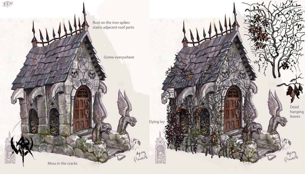
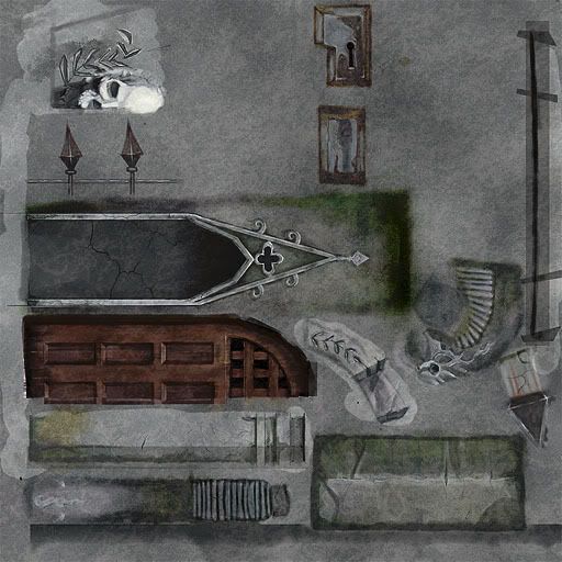
So this is my first post here on polycount. I've looked over the forums quite a bit and finally got some work to post for critique. I included the image I worked from off of Mythics concept on their upcoming Warhammer online game, let me know what you think and any suggestions on how to make it better. Thanks in advance.
-Bird
Replies
Here are a few things I feel you should address:
-Why are the only variations in the stone foundation horizontal? The concept had some awesome height variation that really , I think, sells the piece.
-Why no piling skulls in the sides? Looks like one of the key elements of the original concept
- Why is the only ivy in the tiling wall texture? Get some alpha planes on the sides for the thicker stuff; the concept made particular note of the detail and it'll bulk up the silhouette rather nicely.
Aside from that, good painting. I'm sure one of the mythic guys will give you a much better critique pretty soon.
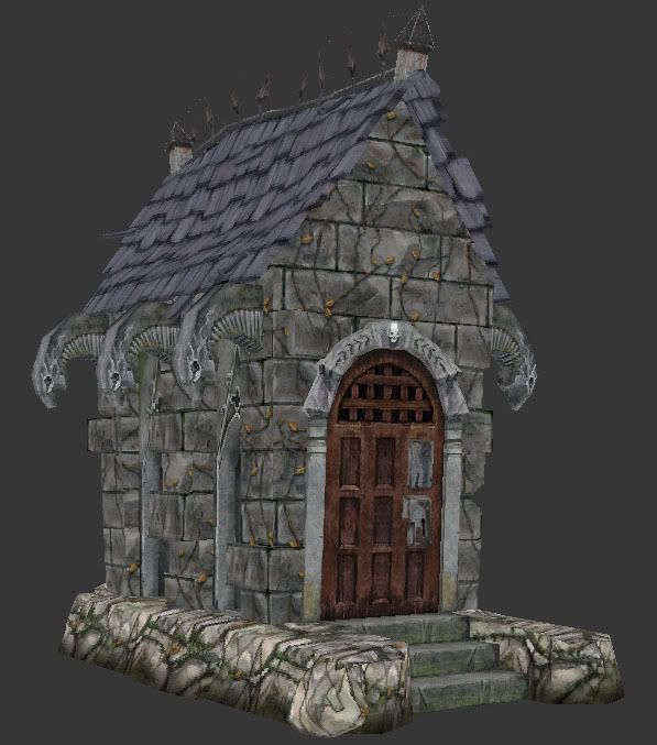
The roofing sticks out too far on the front and back, with nothing seemingly holding them there. It just looks awkward.
Unless you are trying to follow the concept art directly, I'm going to have to disagree with Suprore on this one. While variations in height on the stone foundation might look nice, it definitely isn't the highlight of the piece.
The textures could use some extra detail/wear and tear abuse. Particularly on the roof.
I digg the statueettes to the front of the building, why didn't you include that in the model?
The ivy is very abundant in your concept and sets a good mood, but it is too globally applied in your textures, to make in impact. I'd say more, more! But use alpha planes instead to locally apply them.
The roof texture needs to be broken up more, the wood grains are running over to the neighboring tiles.
-Bird
quick paintover: upped the contrast, darkened a few spots, upped the saturation:
good work! keep it up!
how about baking some shadows into that?
Aim for the concept more. Specifically, the proportions look way off.
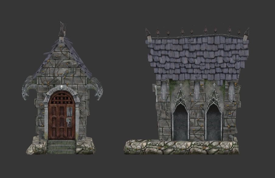
Your bricks are a tiling brick wall, but you can plainly see in the concept its more of a stacked brick (from the side). The base stone doesnt match at all, repaint this one and match colors.
Add more depth to the roof. The transition seen in the concept from roof to stone isnt there at all.
Overall, your modeling looks pretty good, has a nice wonky shape too it, and I like your brick texture, its just wrong.
second is nice but a little bit blury on the stone, third is really nice, 4th is ok. bu the verticle streakin on the tiles just are an obvious over lay and just go across the whole thing independant of the tile shapes.
i don't know how you took these screen shots but the quality of your textures do not show up, and makes the piece look bad. the model itself looks pretty good. tho i'd prefer to see the roof sag in the middle rather than hump out. also as cholden mentioned the brick is a good texture, but is not what is in the concept.
keep going and good lucks
Overall I think the peice would be better if you stuck to the concept and unwrapped the whole thing instead of using tileables.
I think I am going to move on to a new model to keep practicing, But any suggestions or critiques are still very welcomed and please let me know if theres anything more I should fix on this in the future. Thanks again for all the help.
-Bird
My opinion:
One thing that can bring your screenshots down on quality (and I don´t really want to say that there would be something wrong about the model or texture) is the userview you used on your latest pics (I guess). Maybe if you showed us some perspective view grabs from the same angle like the one on the concept, it could give us a better idea of how similar is your model (and the applied texture) to the concept.
Really good work!
How's your UV pixel density? Looks a bit uneven in spots.
Now you just gotta stop working in USER view