Home 3D Art Showcase & Critiques

Advice on my Bard Character

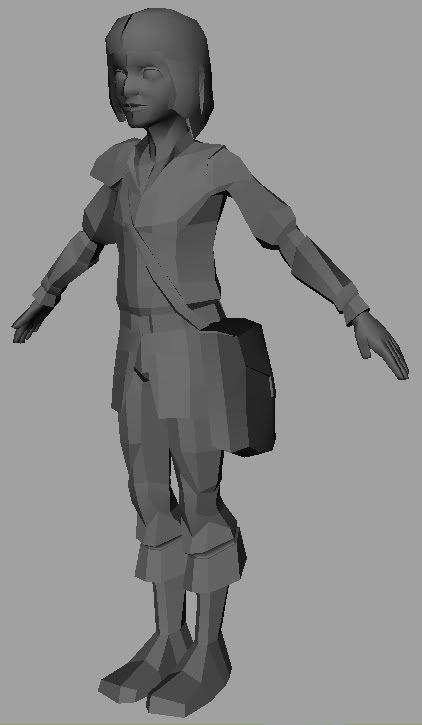
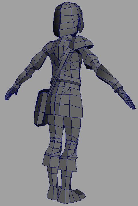
Would be nice if some people could offer me some comments and advice on my current model I am working on. I have stayed out of the forums for awhile and this is the first time I am displaying my models publicly. I have realized if I want to get any better I need to be around other artist. I will soon be moving onto UV Mapping and Texturing After I finish stitching him up.
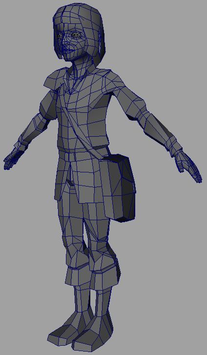
Bard_Front.jpg

Bard_back.jpg

Bard_Front_Shade.jpg

Replies

  • poopinmymouth
    Offline / Send Message
    poopinmymouth polycounter lvl 19
    Nice job, it has a good flow and weight to it. Please add smoothing groups to it http://www.poopinmymouth.com/process/tips/smoothing_groups.jpg (3dsmax, but it shows the gist).

    Looking forward to the texture map.

    poop.gif
  • PolyPutty
    well its a maya model and I am going to smooth my edge normals after I finish stitching him up. I did the face, but yah the body need the smoothing. :P thanks for the comment I admire your work so it means a lot coming from you.
  • diZzyWalnut
    Offline / Send Message
    diZzyWalnut polycounter lvl 18
    Hi,
    looks nice ,
    my only crits is about the head. I've found his head little bit big in proportions to the rest of body.
    Maybe I'm wrong but I'd scale his head little bit down. wink.gif
  • MoP
    Offline / Send Message
    MoP polycounter lvl 18
    Looks nice to me. My only real critiques are that he seems to be leaning forward too much (seems unbalanced), and the backs of his feet are very sharp and low-poly around the heels, too blocky.
    I think it'll look great when the normals are smoothed properly and you put a texture on there smile.gif
  • PolyPutty
    Yah I have a friend who is really good at figure and he always says my character lean a little forward, its a habit I am trying to break. he doesn't lean forward that much, just looks that way from the shots. The reason the head is a little big I am trying to make him look like a kid. I will add some poly's to the heel, I am below count sitting at 2995 tri Poly so I will see what I can do.
  • PolyPutty
    so how do I know if I need 2 image maps or just one?
  • PolyPutty
    Ok this is my first attempt at texturing one of my models, so I need lots of critiques to make sure I did everything right. The green around the hair and the Pure Black on the boots represent where the image will be transparent since I had problems with my depth sorting. That is why it is visible in the shots. I would also like someone to explain to me what a diffuse mape is, should I make one for this character, and how do I go about creating one? I hear a lot about them yet know nothing about them. Let the Roast begin...

    BardTexture_TextureMap.jpg

    BardTexture_Wires.jpg

    BardTexture_Front.jpg
  • Daz
    Offline / Send Message
    Daz polycounter lvl 18
    [ QUOTE ]
    Ok this is my first attempt at texturing one of my models, so I need lots of critiques to make sure I did everything right. The green around the hair and the Pure Black on the boots represent where the image will be transparent since I had problems with my depth sorting. That is why it is visible in the shots. I would also like someone to explain to me what a diffuse mape is, should I make one for this character, and how do I go about creating one?

    [/ QUOTE ]

    Seriously, first attempt? That looks fantastic to me If so. The only thing I'd suggest, even considering the fact that this is somewhat stylized is a slight darkening of the top of the eyeball to get away from that stark starey eyed look.

    What version of maya are you on? Transparency sorting in the viewport all just works now in 8.0.

    *edit*, looking at simplicity of the use of tranparency on the model, you shouldn't have problems with the alpha. It's not like you have a ton of alpha sorting to do. What exactly is the problem that you're having? You can't get transparency to work at all, or you can't get it to sort correctly?
    That said, I think some people go overboard with trying to cleverly use alpha on a low polygon model. For the boots, just cut polys in. Im confident its more efficient to render that extra handful of polygons in a game engine than it is to add another draw call to the model by using a new material with alpha.

    As for the diffuse map, you've made it already smile.gif
  • PolyPutty
    guess I made it without knowing I did, so what is a diffuse map exactly then? I am running 7.0 right now. When I apply the transparency you can see that the arms and bag get rendered ontop of the body as well as other body parts. I will darken the top of the eye. I am very pleased I achieved so much on my first attempt. I would like to know is their sudtle things you can do to a texture to make it look more realistic versus painted, for future projects I mean. I achieved the style I wanted so I don't plan making it look real just would like the info. I am a sponge here to absorb all the info you guys give. laugh.gif

    Edit: I also did what you suggested with the boots guess I missed the obvious, just lowered my count laugh.gif
  • Daz
    Offline / Send Message
    Daz polycounter lvl 18
    If you want a more realistic feel to his skin tone, you want more color variation and detail. Purples under eyes, redder nose and ears, freckles, etc etc, and a bit more shading. Check out some of b1ll's work
  • PolyPutty
    I already added color variation to the skin let me post the flat. should I increase the amount of color I tried to keep it soft and light.

    UV_Map_512_BFlat.jpg
  • Daz
    Offline / Send Message
    Daz polycounter lvl 18
    It's really up to you and what style you're going for. I don't actually see a lot of variation in skin color there really. Is that a metal armor plate? That isn't reading too well, you might try knocking back the white hi-lights somewhat.
  • Vylaroth
    [ QUOTE ]
    guess I made it without knowing I did, so what is a diffuse map exactly then?

    [/ QUOTE ]

    Diffuse map is the texture you've made. They reflect the colour of the surface.

    Looks awesome, especially for a first try.
  • allyx
    Offline / Send Message
    allyx polycounter lvl 17
    Great work considering this is your first attempt. The shadows on the side of the head might seem rather dark if the hair moves around exposing those parts.
    How many diffuse/color maps did you use?
  • PolyPutty
    just 2 one for the body and one for the head and other parts. I am not sure if I did it the most efficent laying them out. Yah I keep lightening the shadows maybe I will do it again.
  • StJoris
    Wow this looks awesome for a first one, geez makes me feel like a complete mooron. This is not the first time you paint right?
  • PolyPutty
    well my extent of painting is a Color theory class I took and a Digital Painting Class. But most of the stuff I made in the classes was only ok, This piece has deffinately inspired my to paint again. But as far as painting skins for characters is concerned yah this is the first one.
  • killingpeople
    Offline / Send Message
    killingpeople polycounter lvl 18
    the green in the color map (called a diffuse map in max) is nice for presentation, but i would suggest using a brown, the color of the hair, once you apply the opacity map for a final image, or else you may have some green in his hair.

    nice clean work.
Sign In or Register to comment.