Home 3D Art Showcase & Critiques

'folio pimpage..kinda

Em.
polycounter lvl 17
Offline / Send Message
Em. polycounter lvl 17
So, I'm trying to get my portfolio together to look for a new job. I posted a while back to get crits, and I've been working on following them and making my portfolio better. Any comments and crits you might have would be awesome and appreciated, both on my work and my website.
Here's some small images, and there's more work and higher rez images on my Website. Thanks.

Courtyard Enviro::10,407 tris
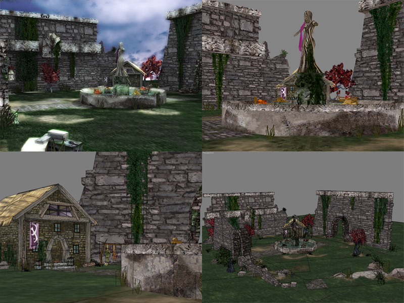
courtyard.jpg

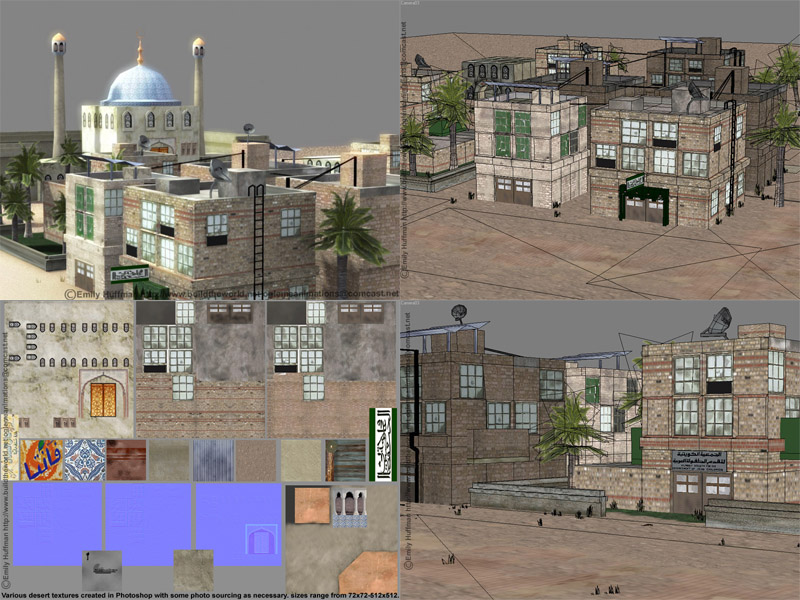
Desert Enviro::17,523 tris
desert.jpg

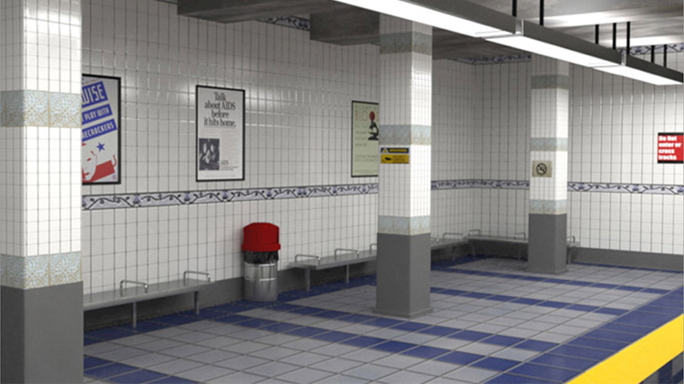
Subway Environment(done for a viz company I worked for)::
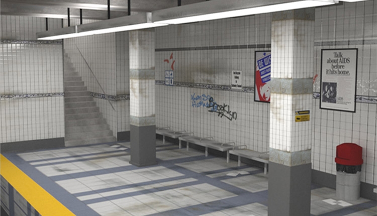
3P_a.jpg
3P_b.jpg

Replies

  • JDinges
    Offline / Send Message
    JDinges polycounter lvl 18
    Hey your links menu on the main page is overlaping your name plate. It mostly covers the word "Environment". Need to pull it down a bit.

    This is in IE
  • Jarrod1937
    Offline / Send Message
    Jarrod1937 polycounter lvl 15
    yeah, same here with the website thing in firefox 1 (have yet to download ff2... lazy).
    the main crit i can give is it seems like you waste polys quite a bit. although its hard to judge where and why without better wire views. this applys mainly to the 'Desert Enviro', and if you didn't waste polys then your scene just looks a lot lower poly than it actually is. textures could use a bit of work too, you have the base of all the textures, now start adding in those tiny details, baked ambient occlusion (or not depending on what you're going for), dirt, and other basic grimy details. you've added some, but not enough imo.
  • Em.
    Offline / Send Message
    Em. polycounter lvl 17
    Thanks for the crits, wierd it's doing that in IE, I checked it in both firefox and IE and didn't see that, I'll see what I can do to fix it. I'll take a second look at the textures and geometry of the desert scene tomorrow and hopefully post an update sometime this weekend.
  • Asthane
    Offline / Send Message
    Asthane polycounter lvl 18
    The menu overlaps in Opera 9.10 as well-- also, the background doesn't tile and therefore looks rather bad at higher resolutions, other than that the work looks nice. I especially like the subway.
  • Gmanx
    Offline / Send Message
    Gmanx polycounter lvl 19
    The menu overlaps in firefox 2 as well. A few other things I noticed.. The drop shadow on the gallery pages' right/bottom edge has a grey background. Is that intentional or is it meant to blend into your background image? Also, you have some obvious use of the PS clone tool on the background image - most noticably on the resume page - at top left. As a potential employer I would think carefully about hiring an environmental artist showing evidence of PS tools. The title image has obvious seams around it. I would either make it match or put a border round it. You should really make the background image tile too, especially vertically.

    Sorry to appear nit-picky, but an environment art-lead is gonna spot these.
  • Em.
    Offline / Send Message
    Em. polycounter lvl 17
    Thanks again for the comments, I didn't sepnd the time I should have on my front page, graphics etc, I probably spent 15 minutes at the most on those, and it shows.
    @Gmanx::Nit-picky is good, I need nit-picky right now to make things better. I'll add that to my list of changes.
    Thanks for taking the time to look so closely.
  • Jarrod1937
    Offline / Send Message
    Jarrod1937 polycounter lvl 15
    you can always do your interface art in your preferred 3d app. that is what i did with my wip folio site, which took only around 30-45 minutes. as for the overlapping, since it is not apparent on your pc but is on everyone else's, what is your desktop resolution?
  • Em.
    Offline / Send Message
    Em. polycounter lvl 17
    Well, I think I just fixed the overlapping button problem, as well as the crappy BG image problem, which should now tile and not have craptastic clone stamping evidence.

    @Jarrod:: My resolution is set at 1280x1024, the wierd thing is a friend of mine looked at it in the same browsers with the same res and saw the same problem everyone here did. However, he said it's fixed now, at least for him.
  • Ruz
    Offline / Send Message
    Ruz polycount lvl 666
    well I like the models you have shown here, althought the lighting seems a bit off in the ones you have lit. Everythng seems overbright.
    The subway scene would benefit from a good lighting set up especially
  • Em.
    Offline / Send Message
    Em. polycounter lvl 17
    @Ruz::Unfortunately there's no way to do any fixes to the subway scene, it was for a viz company I worked for that no longer exists. They shut down with no warning and I was only allowed to take some images, no max files. The other scenes can be helped, so I'll take a second look at the lighting. Thanks for the comments.
Sign In or Register to comment.