The Champion Of War: Duty Beyond Death
Hello Polycount community,
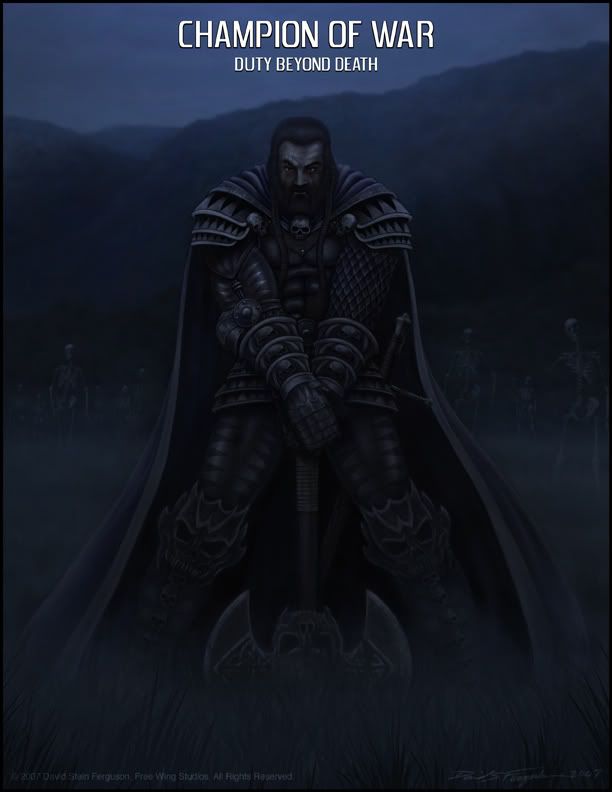
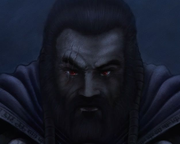
This is my first post on polycount. I would like to share my work with you all and see what everyone thinks. This painting entitled "The Champion Of War: Duty Beyond Death" was created with Painter 9.5 and a Intuis 3. He is a original cheractor from one of my stories. The scene is dark and lit only by diffused moonlight, which creates a challange to pull the detail out without any artificial lights while maintaining the dark moonlit night environment. I have stuck to a limmited pallete of mostly blue hues to capture the cold blue light of the moon. Feed back from my fellow artists would be greatly appriciated. How do you all adress the issue of natural moonlit environments?
Thanks for your time,
David Ferguson
Free Wing Studios
Replies
After receiving some feedback from this and other forums it seemed to be a consensus that this painting was to dark so I tried to lighten it up a bit. Hopefully it reads better. I Have been challenging myself with low light scenes lately, trying to find out how dark is too dark. Your opinions would be helpful to me with this.
David Ferguson
Free Wing Studios
I think that it could benefit greatly from a bit more planning to get a more dynamic and interesting compostion going on. (Especially with the static pose the character is in).
Other than that, it's looking cool.