Dominance War 2: bennyball
hi
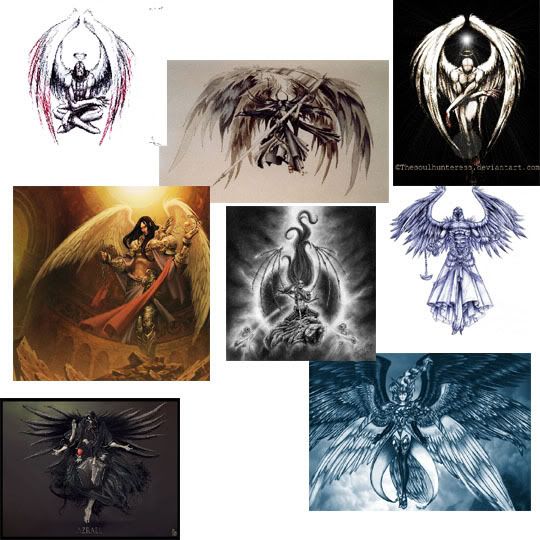
this is my entrant for the dominance war, im going round with the theme of the angel of death as that killed some serious amounts. so far i only have a montage of images that ill be basing my concept art around. i should be posting some of my concept stuff later.

this is my entrant for the dominance war, im going round with the theme of the angel of death as that killed some serious amounts. so far i only have a montage of images that ill be basing my concept art around. i should be posting some of my concept stuff later.

Replies
Considering Scar Night was a book you might have trouble tracking down ref images? http://www.panmacmillan.com/scarnight/
-J
heres a picture of the wings i am currently content with using on the final modelling, anything you like or dislike about them let me know and ill take them into consideration.
2nd Angle O Death I've seen, 3rd one I've heard about on the polycount side. I switched mine for a goblin artillery team so that leaves you competing with one other fellow from the same side. I never did find his thread so you might be safe with the idea.
[/ QUOTE ]
It is dejawolfs entry
dejawolfs - Angel of Death
any helpful hints or advice on what needs improving would be appreciated
something along the lines of this pic i found?
[/ QUOTE ]
That looks like a fairly solid design although you'd be wanting to put your own spin on it, particularly when you consider you'll need to evil-ify it some how. It'd be worth doing a bit of research on Seraphim in religions, mythologies and artworks (wikipedia is probably a good place to start) and seeing what specific details you could carry over into your design. With regards to the corruption, have a look at Games Workshop's Chaos army minatures, particularly the Nurgle ones, to see how they represent it.
Nevertheless I agree with Rooster and Rick.. concepts is teh shit.
[ QUOTE ]
Any preliminary sketches, concepts, and paintings that you created to help you understand how to make your character, can be shown here. Squeeze everything onto this one sheet.
[/ QUOTE ]
A well polished concept is not required what he has in the first post would pass just fine. But it is going to help him get his idea fleshed out. Right now it looks like you have a few ideas for bits and pieces but nothing that flows together.
Lacking a concept that is a great master piece that shows off your raw traditional art talent will not cost you the win, it won't help you either. Unless you have your idea solidified you'll just spin your wheels trying to fill in the gaps on your model and its going to look disjointed and hodge podge. It's easier to erase a pencil line than it is to delete hours of 3D work. Knock up some quick thumbnails using a hard round brush set to 100% opacity. Give yourself about 1-5min per thumbnail.
Make the brush about as thick as a persons wrist and see what general silhouette shapes you can come up with. It won't require a degree in fine art and you don't have to even show us, just get your ideas down on paper and get that idea firmed up. The clearer you can picture your model finished and fully textured the easier it will be to make it.
Times a tickin, time to get movin!
The submission page actually says:
[ QUOTE ]
Any preliminary sketches, concepts, and paintings that you created to help you understand how to make your character, can be shown here. Squeeze everything onto this one sheet.
[/ QUOTE ]
A well polished concept is not required what he has in the first post would pass just fine. But it is going to help him get his idea fleshed out. Right now it looks like you have a few ideas for bits and pieces but nothing that flows together.
Lacking a concept that is a great master piece that shows off your raw traditional art talent will not cost you the win, it won't help you either. Unless you have your idea solidified you'll just spin your wheels trying to fill in the gaps on your model and its going to look disjointed and hodge podge. It's easier to erase a pencil line than it is to delete hours of 3D work. Knock up some quick thumbnails using a hard round brush set to 100% opacity. Give yourself about 1-5min per thumbnail.
Make the brush about as thick as a persons wrist and see what general silhouette shapes you can come up with. It won't require a degree in fine art and you don't have to even show us, just get your ideas down on paper and get that idea firmed up. The clearer you can picture your model finished and fully textured the easier it will be to make it.
Times a tickin, time to get movin!
[/ QUOTE ]
Some great advice right there. I'm not even thinking of starting modeling until my concept's solid.
still working on what expression to have the mask for the pose as well as the overall armour design. so what do you think of it so far? oh and the pictures arent very good as my scanner doesnt like working so i had to use my digital camera until i either get a new one or go round my mates and use his.
You'll probably want to really push the humanity of the mask is its supposed to be a representation of a beautiful man
to learn you should pay 100% more attention to negative comments as you do to the possitive comments.
so heres what i have to say. have fun with this contest try and finish something,, anything, do your best.
then after the contest work on more basic stuff, study up proportions and anatomy, and structure, work on your flow, don't extrude chunks out without thinking, its all about flow and form and shape.. don't be afraid to push yourself,, practice with you your software till you can make it do almost any shape you can think of,
a good way to practice making your software work for you is just start with some simple stuff, simple things you have on your desk,, a coffee cup, a tv remote, then move up to stuff thats more dificult, cell phones, modeling physical objects right in front of you allow you to examine them closely from all angles and perhaps pull out the best resemblance
good luck learning