Windmill
polycounter lvl 18
First post!
Im currently building my portfolio so that I can launch my web site in preparation for GDC. Critiques are very much appreciated:

Im currently building my portfolio so that I can launch my web site in preparation for GDC. Critiques are very much appreciated:
Replies
Some critics:
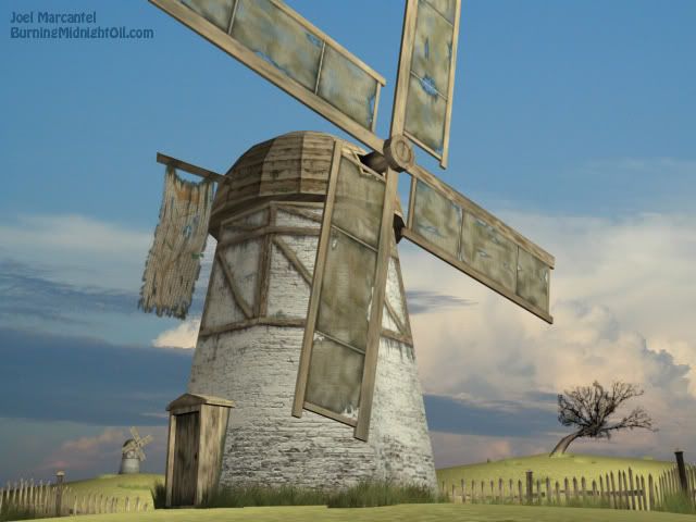
It is quite hard to understand what the dome is covered with (messy texture). And why is it faceted?
Why are there no shadows?
You should use refs to see how a windmill is built.
The main point of your scene seems to be making it as low-poly as possible, but there is still some obvious poly-wasting. The grass for example - what is the use of the height segments? Actually, you'd probably get the best result by using just separate planes. No need to use that many polys for the flag either. And a tip for the caps of cylinders - if you don't want to make it look round, don't put a vertex in the middle. Weld it to one of the side vertexes.
And actually, the dark edges of the cloth were first thing that caught my eye.
And btw, the blades of the propeller (or however they are called) must be rotated, otherwise the wind won't make the propeller turn at all.
Good luck
@ oglemeanimations: Ill put in some rocks or junk or something to make the scene a little more interesting. Good call with the tree; Ill spruce it up.
@kukk: I think Ive received the most flak from people for that dome. I wanted the sides to look segmented, like theyre flat pieces of wood arranged in a dome shape, but if it comes off looking like Ive made a mistake, then it doesnt serve me too well. Maybe if I softened the smoothing and then textured harder seams between the planks? It looks like they need to be sharpened up anyway.
Thanks for the advice with the blades and spindle. Ill bend the blades and weld that vertex on the spindle.
I had the height segments in the grass planes so that I could bend the grass, but apparently it isnt working too well. Hmm Maybe all I really need to do is figure out some more interesting angles for single planes.
When you ask Why are there no shadows? I think youre referring to shapes cast by the geometry and whatnot, right? Its simply preference. I like soft lighting because it seems more soothing to me.
Ill change it up and post again sometime next week. Again, thanks a lot!