The BRAWL² Tournament Challenge has been announced!
It starts May 12, and ends Oct 17. Let's see what you got!
https://polycount.com/discussion/237047/the-brawl²-tournament
It starts May 12, and ends Oct 17. Let's see what you got!
https://polycount.com/discussion/237047/the-brawl²-tournament
New Fantasy Characters!
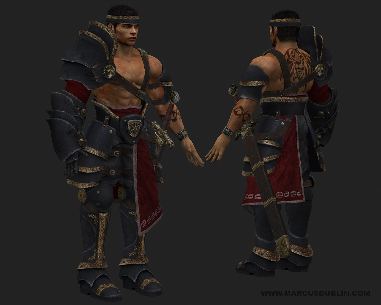
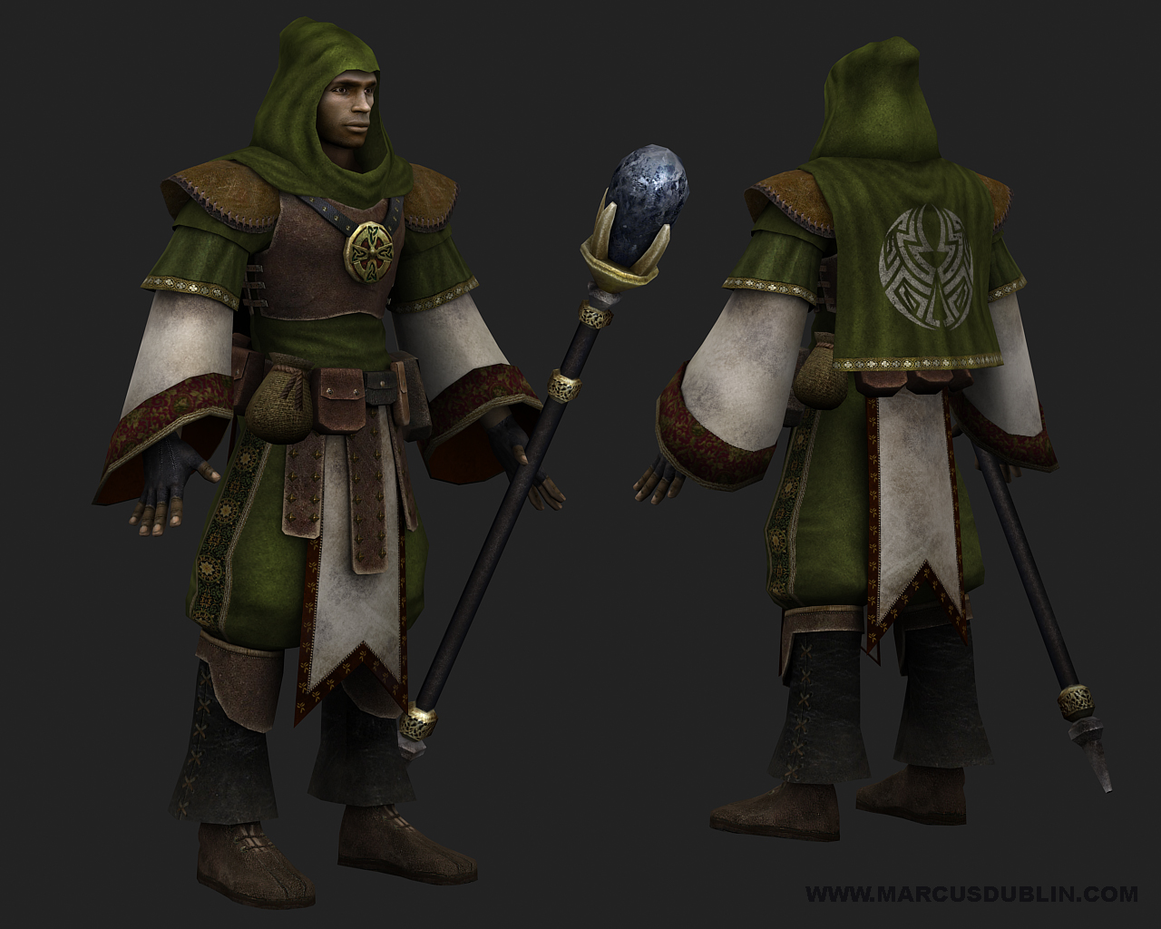
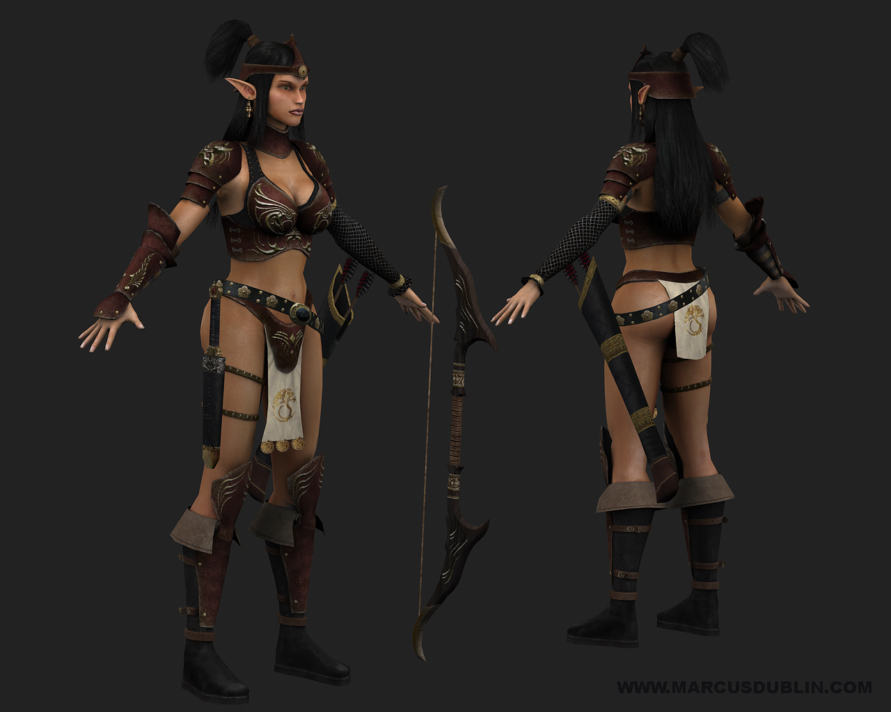
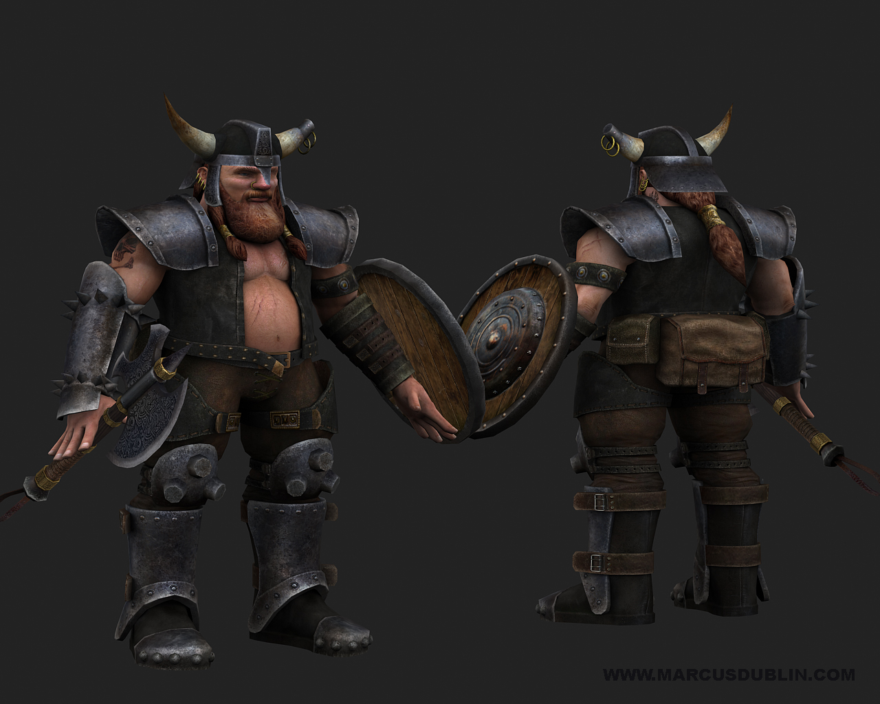
Well this is my first post here on polycount in the Pimping and Previews section and I thought Id show some characters that Ive been working on in my spare time. Its a strange time to post this stuff considering war is upon us but its still peacetime for now so its all good I guess, hehe. These are work in progress images and won't be completed until March, when I re launch my website. I still have to add more detail to the color, spec and normal maps for these guys but thatll wait until the wars done. When these are cleaned up and completed I'll take the final beauty shots in the Unreal 3 engine.
Marcus Dublin
Artist - Kaos Studios


Marcus Dublin
Artist - Kaos Studios
Replies
Any chance of some wireframes?
not sure about the feet on all the characters though.
renders also look a bit odd done without perspective...
Assuming he reaches across with his right arm to pull it out, then he'd be wielding it with his armored arm, which wouldn't make much sense. He'd want the unencumbered arm holding the sword with his armored side towards the opponent. I think?
Not a fan of the beard texture on that dwarf.
Other than that... pretty fucking snazzy work.
I It's not a big deal to use photos in your textures, but on some of them It looks like you relied on them a bit too heavily. I know these are probably done, but next time around be sure to paint a bit more, rather than counting on Photos to give texture. Great work man. I havent seen stuff from you in a while, so I can definitely see a progression.
Keep up the good work!
Oh and the skin color of the mage looks somehow unhealthy.
besides that and what others have said. these look pretty damn solid. any chance of seeing some wires and textures?
Well done! Solid work.
It's really cool to see how much you've improved.
Some crits: (if you haven't already moved on from this work)
I second Rawkstar on the lighting. Also, rig these guys!
The mage guy's cloth feels a bit stiff, i think posing him would help alleviate that.
The top guys shoulder pieces are kind of lost amongst each other and form a giant blue blob. Some directional lights should really help sort that area out.
Again, really great work. You've been busy!
B
Sectaurs: hehe your absolutely right about the sword placement, Im not sure what it is but I always tend to put attachments on the left side of characters, it's purely psychological, hehe but Ill shift it over for the Fighter since it makes sense.
3D-j: Yeah everything should come togher quite nicely when all of the maps are done. I intentionally didnt paint to hot of a specular on some of the broad parts of the armor, since Ill let the spec map do what it does best. As for my intentions for the characters, well what started out as something just for kicks and to update my portfolio turned into a little side project between myself and a programmer buddy of mine, well see where it goes.
ghost_rider: Ever since joining Kaos Studios, Ive been pushed as a texture artist to incorporate more photo sourcing into my workflow, and that new direction in thinking also translated into my personal work as well. Its really given me a bigger brush to paint with so to speak and I try to blend the best of both worlds to better express myself as an artist. I still love painting and have been working on some digital paintings that Ill show in the future. Funny thing is Im itching to do some small PSP or DS spec pixel stuff, hehe.
JKMakowka: Good call man, I added a bit to much shading around the eyes, which gives them the impression that the eyes are sunken in; thankfully its a quick fix. The same goes for giving the Mage some nice crimson tones and a touch of rose to really give the skin some punch!
Lee3dee: Hahaha, yeah man the cats out of the bag; they were going to be Easter eggs until the higher ups caught me, Damm! Now back to work on Hour of Victory for you!
modeling_man: Rigs and final poses for these are definitely on the to do list, just wish there were more hours in the day.
Hey thanks for the crits and comments guys, when I take the final pass on these models Ill definitely work in all of the great advice passed my way. Ill post the wires for these guys tomorrow to show the poly flow and construction for those interested.
Marcus Dublin
Artist - Kaos Studios
http://www.frontlinesgame.com/
I have been reading some of the other posts and see that everything I saw is up there already. So I guess I won't try to reiterate what's been said so well already, other than KICK ASS WORK DUDE
with a few tweaks and a rig and I don't how people won't take notice of your work.
Later,
Marcus Dublin
Wonderfull, awsome pices - don't know what more can I say.
For me it's perfect.
and rig the hands! ahhhhhhhhhhhh. Either that, or maybe try modeling them a little more relaxed. I would highly suggest posing the hands at least if you make them show pieces. They're all really high quality models, but for me personally the hands detract a bit.