Another portfolio site in need of critique
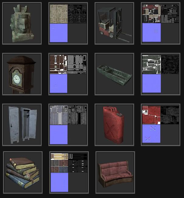
So I just made a huge update to my portfolio site. Got rid of all the old 3D stuff and added new (2D section however stayed the same...). I would love to hear some feedback and critiques on it. Im getting ready to go job hunting and want this to be looking its best.
www.alter-nate.com

www.alter-nate.com


Replies
As for the work, it's very nice. I would recommend picking an object or two and doing some LODs for it. A lot of companies have Automatic LOD generation now, but it's always good to know how to do it the old fashion way. And it's usually pretty easy.
Oh and also, if you have the time/desire, it would be good to get an entire scene or two in there too. Nothing huge, but make a little world for your gas can to sit in, or a high school hallway for the locker. Someplace for your models to live, it makes a big difference, even if it's not the main focus.
All of your work still suffers from not having enough dirt and damage where you would expect it, look at the small crevices and edges of your works. There is almost no overlapping dirt, dent, scratches, sunbleaching or anything between uv parts. Look at where the inner wall meets the floor in the landing craft. Shouldn't there be some water damage, dirt, oil or just about anything here?
A good idea would be to get a 3d painter software and either paint dirt directly in it, or do a new layer in the texture and just paint some distinct color to show which areas that connect to what on the uv.
Getting something inside an engine to show that you understand the process (and it gives you the ability to work with the its lights, enviroment mapping and more to spice up the final look of the model) is never a bad thing. I also think its a good idea because your work it might be seen as more real (as in harder to fake the actual result) vs a render in the software of your choice. Plus what tumer said about levels.
Put in something about texturesizes somewhere in those images.
Most of the normalmaps seem kinda pointless, it's like previous gen texturing but with some additional texturemaps that really don't do a lot.
And as for the dirt, Ill definately go back and make another pass on all the textures and do what you suggested. Ill also go back and add texture sizes.
And lastly about the LOD's. What the workflow on that? how many polys do you shave off per LOD? Most of this stuff is pretty new to me.
Anyways thanks for the help so far.