zombo joe
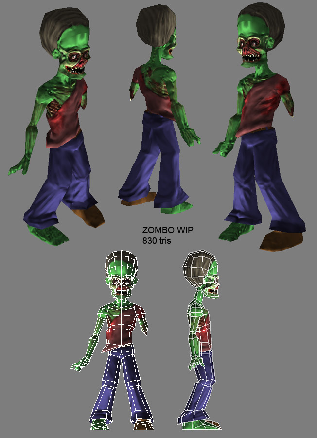
been workin on this guy in my spare time, couple days a week. Hopin to eventually build a zombie game with some friends and the torque engine. Realistic and a bit cartoony... and not super desaturated. Nuts to that next gen action.
Normals are still pretty wip... forehead especially. Color map is still very wip too. Does he look too much like an alien?
The high poly for this guy marks my first mudbox model ever. Sweet program, I really need to start doing some quick busts or something to get the workflow down. Feels great already though.

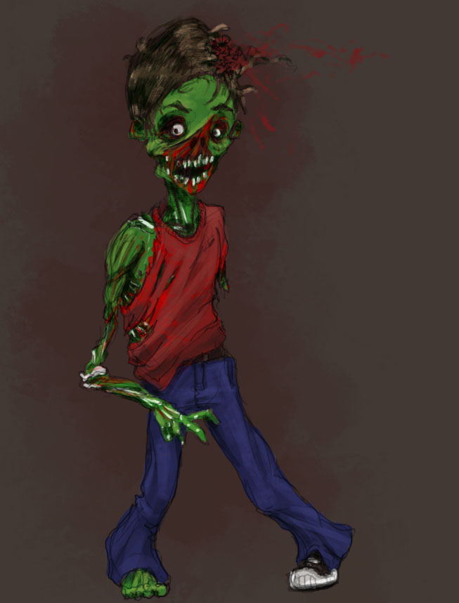
based on this concept I made last week...

Normals are still pretty wip... forehead especially. Color map is still very wip too. Does he look too much like an alien?
The high poly for this guy marks my first mudbox model ever. Sweet program, I really need to start doing some quick busts or something to get the workflow down. Feels great already though.

based on this concept I made last week...


Replies
I think you should either de-saturate the green or opt for a greyish blue, because at the moment he's looking more like a zombified frankenstein with a beehive hairdo.
Some of the normals are looking a little off, you already mentioned the seam on the forehead, but that should be an easy fix. I think the eye sockets are looking a little sharp and jagged which could be the look you were aiming for. But maybe see if you're able to smooth it out ever so slightly.
I really like the area where the skin has been torn off, that looks great and matches the concept really well. Great stuff!
Finally, I have noticed with a lot of models lacking a good diffuse map once they throw a normal map on. So I'm hoping you take a bit of time to paint a decent diffuse to make this character really pop.
I'll keeping my eye on this one.
-caseyjones
Nice one Ferg, the face detail is great!
The head is a little bulbous, even for the concept. The hair seems a too perfect I would suggest adding a few opacity mapped planes to mess it up a bit. Also work harder to properly blend the hair line so it's not a helmet of hair with a defined line but a scattering of clumps. I also think the foot should be bloodier, zombies normally scrape their feet when they shuffle and that would no doubt bloody up his foot quite a bit
betta?
click the image for a larger version
(I havent painted any normal info for the shoe yet)