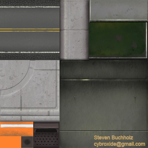
Hey everyone! This is a low res environment I've been working on to practice my texturing skills. The total polycount is 2371 tris and all textures are on 3 512x512 textures. Any crits/comments would be greatly appreciated! All textures are hand painted in photoshop.
More images/detail shots are available Right Here!
Nice work, very clean, my only crit would be that the Tree could use more texture space for it's leaves than it has currently. Other than that it looks ready to pop into an engine right away. I immediately thought of GTA when I saw it. It's got a nice inner city "lived in" look to it.
To force any sort of crit, the road lines could use some more work perhaps? Being a t-cross I would think it'd look different. I'd also like to get a hint why that way is blocked, but that's just me.
Put a bit of texture to the grass and give those leaves some touch, they look a bit exploding-ish.
You have a comfty feel to your environment, and I like that sort of stuff. Nice nice ^^
[ QUOTE ]
It's got a nice inner city "lived in" look to it.
[/ QUOTE ]
There is no 'lived-in' look to it - it looks like it was just built.
You've got a disparity in your polycount and texture resolution - the polycount is about the same as one of the PSP titles, but the texture sizes are bigger than most PS2 titles. For that polycount, you'd be much better off using more and smaller textures.
What you want to do is keep things modulal - you've got the road textuers on 2 different sheets, the tree textures on two different sheets, the roadwork props on two different sheets etc.
If you want trees, you are loading in the textures for the roads and the roadworks - that's not sensible for memory usage.
What you should do is go back and make a road sheet, a pavement sheet, a tree sheet, a traffic cone sheet. Treat the scene as an enviroment (ground, road) with props (trees, poles, cones etc).
Also conside the pixel disparity you've got going on - the light is a s big as the tree branch. The barrier is as big as the entire road. The chain fence texture is bigger than the road. Try to make the amount of texture space you give for each object match the physical size of the object, otherwise you will some huge objects with nastry stretching, and some small objects that are incredibly detailed.
Good work, I like what you have done. Some very good crits so far also. Just to add to them a little;
- The pole tops have a texture assigned to them, if the player is never going to see the tops of the poles then get rid of that part of the texture and use it for something else.
- The street lacks the normal wear and stains you would see. If the pavement is that cracked on the sides you need to have more wear and tear in the main useable part of the street. I expect to see things like wheel ruts and oil streaks yet its pretty clean? How did the side of the road get chewed up but the main part did not?
- Think modular and break the scene apart and make some new areas with the same pieces. How can you make some simple changes to a few of these pieces to help break up the tiling?
- In thinking modular you should make your fence module = to one street module.
- To stress what rick pointed out about the textures, sort them out so that if you have just a tree in one area it isn't loading the whole sheet and only using 10% of it.
Really good work, just a few things to keep in mind for the next one, I look forward to seeing more
I was thinking about wear and tear also, but with such a few number of sheets it would be hard to make it look unrepetitive. Wheel marks down the lanes could work. Turn marks at the corner would be really good. Multiple street textures would probably be the best, but this IS a sample not a full set of textures.
It looks more like a texture set from a birds eye view game than a first person game
I like the crit about the tree sharing a sheet with non tree stuff. I really think those leaves need more space, if it's gonna share space, maybe with it's trunk and the lawn for starters.
All in all, I like the look however. The road may look recently repaved, but I bet some decals with craters and trash (a flattened pigeon?) would fix that up nicely.
I notice you have lighting the image as well - is this include in the specs? Many current gen games use lightmaps, and this perhaps should also be considered, as you wouldnt get a ps2 game with immaculate lighting without using up extra resources. Just for reference, many assets in the spiderman 2 game (which is free roaming) doesnt contain much lighting information. This most likely means that vertex lighting was used on the buildings, but couldnt be used on objects. Perhaps this is something to consider, given the spec you have set your self?
The streets will be getting whole lot more work as far a dirtying them up and detailing.
I definitely see what your saying about keeping the texture sheets smaller and more organized, I think for all my future projects I'm going to do alot more planning of exactly where I want the textures to go. This should make sure things like the tree leaves getting too little texture space and the barricade light getting entirely over detailed. I see now the need to keep similar/coinciding textures on the same maps, common sense that just seemed to elude me on this one.
For this project I was trying to use as little polys as possible and let most of the detail be shown though the textures which probably the reason for polycount/texture res disparity, I dont know if I had PSP in mind for the target system specs maybe PS2/GC.
I'm seeing modular building is key for environments which leads back to planning things out a bit better before I get to work.
The shadows were just for beauty shots, I'm gonna do some more in game worthy shots after I do some revisions.
I've done a little work on the streets. I'm trying to damage up the street a bit more but I'm not sure this looks good. Any suggestions would really help me out.
I like where you're going with this, and I do like the dirt/tire marks you have.
However in terms of street damage, I think what you've got going is too regular (on the gutters anyway) Look at real streets and they've usually got some big cracking areas, areas that have been patched before (different colors) pot holes, etc. I'd just use decals. The gutter area usually has less damage, or, big deep potholes, instead of regular cracking, as people don't usually drive over there. A lot of times, the most damage is at the 1/3 & 2/3 marks across the lanes, where tires ride the most.
np, just spend a little time on google images or Flickr and you'll find all sorts of stuff. Also don't be afraid to just go for a walk and take a look at the streets around your house, I'll bet you'd be surprised how non-uniform the asphalt is.
Replies
Put a bit of texture to the grass and give those leaves some touch, they look a bit exploding-ish.
You have a comfty feel to your environment, and I like that sort of stuff. Nice nice ^^
It's got a nice inner city "lived in" look to it.
[/ QUOTE ]
There is no 'lived-in' look to it - it looks like it was just built.
You've got a disparity in your polycount and texture resolution - the polycount is about the same as one of the PSP titles, but the texture sizes are bigger than most PS2 titles. For that polycount, you'd be much better off using more and smaller textures.
What you want to do is keep things modulal - you've got the road textuers on 2 different sheets, the tree textures on two different sheets, the roadwork props on two different sheets etc.
If you want trees, you are loading in the textures for the roads and the roadworks - that's not sensible for memory usage.
What you should do is go back and make a road sheet, a pavement sheet, a tree sheet, a traffic cone sheet. Treat the scene as an enviroment (ground, road) with props (trees, poles, cones etc).
Also conside the pixel disparity you've got going on - the light is a s big as the tree branch. The barrier is as big as the entire road. The chain fence texture is bigger than the road. Try to make the amount of texture space you give for each object match the physical size of the object, otherwise you will some huge objects with nastry stretching, and some small objects that are incredibly detailed.
- The pole tops have a texture assigned to them, if the player is never going to see the tops of the poles then get rid of that part of the texture and use it for something else.
- The street lacks the normal wear and stains you would see. If the pavement is that cracked on the sides you need to have more wear and tear in the main useable part of the street. I expect to see things like wheel ruts and oil streaks yet its pretty clean? How did the side of the road get chewed up but the main part did not?
- Think modular and break the scene apart and make some new areas with the same pieces. How can you make some simple changes to a few of these pieces to help break up the tiling?
- In thinking modular you should make your fence module = to one street module.
- To stress what rick pointed out about the textures, sort them out so that if you have just a tree in one area it isn't loading the whole sheet and only using 10% of it.
Really good work, just a few things to keep in mind for the next one, I look forward to seeing more
It looks more like a texture set from a birds eye view game than a first person game
I like the crit about the tree sharing a sheet with non tree stuff. I really think those leaves need more space, if it's gonna share space, maybe with it's trunk and the lawn for starters.
All in all, I like the look however. The road may look recently repaved, but I bet some decals with craters and trash (a flattened pigeon?) would fix that up nicely.
The streets will be getting whole lot more work as far a dirtying them up and detailing.
I definitely see what your saying about keeping the texture sheets smaller and more organized, I think for all my future projects I'm going to do alot more planning of exactly where I want the textures to go. This should make sure things like the tree leaves getting too little texture space and the barricade light getting entirely over detailed. I see now the need to keep similar/coinciding textures on the same maps, common sense that just seemed to elude me on this one.
For this project I was trying to use as little polys as possible and let most of the detail be shown though the textures which probably the reason for polycount/texture res disparity, I dont know if I had PSP in mind for the target system specs maybe PS2/GC.
I'm seeing modular building is key for environments which leads back to planning things out a bit better before I get to work.
The shadows were just for beauty shots, I'm gonna do some more in game worthy shots after I do some revisions.
Again thanks for your help everyone!
I like it a lot, good luck on the optimised version
what rick said
[/ QUOTE ]
What hawken said.
-caseyjones
[ QUOTE ]
what rick said
[/ QUOTE ]
What hawken said.
-caseyjones
[/ QUOTE ]
what caseyjones said
And very good tips for we all think about it in ours future projects, thanks for that!
nice work
However in terms of street damage, I think what you've got going is too regular (on the gutters anyway) Look at real streets and they've usually got some big cracking areas, areas that have been patched before (different colors) pot holes, etc. I'd just use decals. The gutter area usually has less damage, or, big deep potholes, instead of regular cracking, as people don't usually drive over there. A lot of times, the most damage is at the 1/3 & 2/3 marks across the lanes, where tires ride the most.
http://cycling.stanford.edu/Views/EurekaCyn.JPG
http://research.microsoft.com/users/joyojeet/death-pothole.JPG
http://sepwww.stanford.edu/oldsep/joe/fault_images/FT10c.5.gif
http://home.cc.umanitoba.ca/~dmcmill/Images/Photographs/NPP/1995%20RoadWork.jpg
Or it will crack into large sections:
http://www.ci.seattle.wa.us/transportati...cing%20West.JPG
potholes aren't usually in a very regular shape either:
http://www.istockphoto.com/file_thumbview_approve/234266/2/istockphoto_234266_pothole.jpg
http://www.istockphoto.com/file_thumbview_approve/238890/2/istockphoto_238890_pothole.jpg
http://www.nnvesj.org/Y05/Ed25/images25/McKee_Road_Pothole.jpg
And if this is an older, less traveled street, consider adding some street trash, & weeks in the cracks:
http://www.clownswilleatyou.com/pix/my_neighborhood/meeting-street-trash.jpg
Of course you could always take it to the extreme:
http://s133702574.onlinehome.us/pictures/blog/sinkhole.jpg