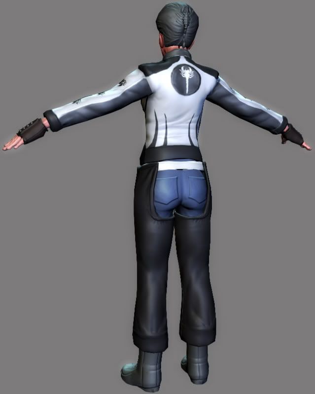
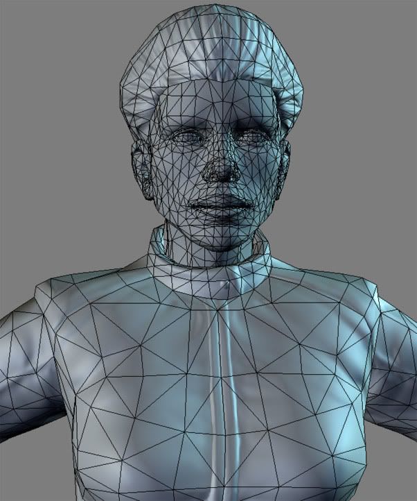
It's about 8000 tris, I plan on bringing it down to about 6000 tris.
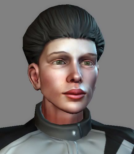
I've just started the texturing, I plan on adding some more accessories, and making the hair a bit more extravagant. At the moment she has serious helmet hair, I'll fix it with some alphas.
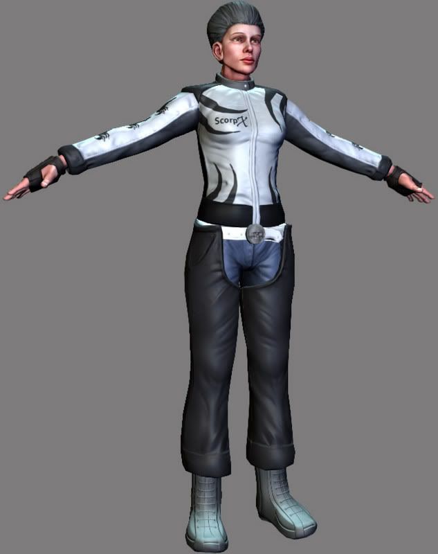
I think the real issue isnt so much the feminity of the face, but the style and color of the hair. She would look younger if the hair wasn't reading as mule grey, and especially if it was more pulled back and through the scorpion clip than into a more puffed style like it is now.
Also there is a strange conflict of styles going on in the top and bottom of the model. The jacket reads like sport bike wear, and the bottom like harley style. The scorpions and skull belt buckle suggest more chopper gang style, while the panels, and design of the jacket really say street racer. Its all good individually, but together its hard to figure out just what shes doing.
Actually I think it looks less cliche as is. While it may not be the desired result (ie hot biker chick) it's an interesting model. As is, she reads as much mroe of a person with a history and a life of her own rather than as a part of the scenery in a game.
I definately think its the hair that's giving her the older female look just as Vailias stated.
I really like the jacket and the gloves, but I'm not a big fan of the pants or the leggings or whatever it is. It doesn't seem to sit well with me. If she was wearing just the jeans without the leggings I think it would look a little nicer. But that's just me.
The seam in the hair is really obvious in the screen without the diffuse map. It's a little less obvious once the texture is in place, so I guess once you paint in the roots of the hair it will disguise it really well.
Great stuff.
Thanks for the crits guys. verybad summed it up pretty well, I wasn't going for someone who is just a professional racer, or someone who rides a Harley or belongs to a chopper gang, rather a woman that likes bikes, and wears whatever looks nice. The jacket could be from an ex-boyfriend, it gives her history, like verybad said.
Agreed about the hair seam caseyjones, but I'll tweak the normals a bit anyway.
Sorry for the late reply, and lack of an update. There was a thunderstorm, and apparently our sub-station got pwned So I've been without power since I started the thread.
- The granny hair is too grey and too poofy. Go shinny jet black or give her grey streaks.
- Give her some caked on mascara, instead of bags under her eyes. It will have the same haggered party chick look but is way more sexy. It says I care enough to put it on, but I'm too busy partyin' to take it off. Something kind of like this but without the runs.
- The larger than life upper lip needs to be slimmed down, as well as the ears. she has pretty thick ears for a lady. Normally the bottom lip is the bigger of the two. Not even Ms Inflato lips Angelena Jolie has an upper lip that out shadows her lower that much. With a smaller upper lip she will have more of a pouty quality.
- Non-tapered extremities is taking her sexy away. Normally you want your arms and legs to slim down as they reach their ends. When I think biker chick I think hot skin tight shinny black leather. Not really puffy ski coat arms. Personally I would ditch the jackets and go with something like this. Or just go with the black leather vest or sleaveless shirt.
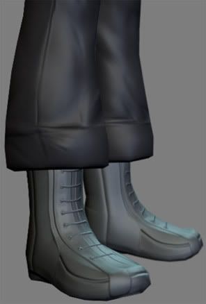
- Doing a little more research in the chaps department might help also. Normally chaps don't snap to a belt but they have loops on the inside the belt goes thru. Or they have their own belt. Snaps or buttons would pop off too easily. Chaps also don't tuck into your boots but often go down right to the heel. They are normally really thick and it would be hard to fit them into your boots. With the chaps tucked in the material type looks very thin almost like the thickness of military pants, which isn't the thickness of most chaps and not the thickness they start off at up at the hips. Also if you tuck in your chaps, they will come right out and leave your legs unprotected if you do crash. You want snaps or straps that go around the ankles, down past the bulk of the calf, that way it can't ride up as you skid across the ground. With the chaps tucked in you miss out on the classic chap flare at the end.
- Awwhh but doing that will cover up the really cool detail I put into the normal map on the boots. Its ok they are guys racing boots not really hot chick biker boots, save em for another model, they are pretty cool! Also baggy pant cuffs are a good way to get your pants caught in your chain (if you don't have a guard) or snagged on something else.
Thanks for the great crit Vig, truly helpful. Looking at those pics makes me realise just how many cool things I left out, because I was pretty much just making the stuff up as I went along, planning it to be more of a technical exercise. You've inspired me to just call this one practice, and to make another, much better biker girl
Here's the progress I made before I read your crit:
Most of my original crits still apply but you made some good changes. It would be hard to work in most of my crits without starting from near scratch, I think its wise to call this one done.
I have one last round of crits about the hair and then I'm done. The hair line is too sharp it needs to transition from skin to hair more smoothly. Check out the hair line here. For do a search for "UpDo". See how the skin is softly blended out as the strands of hair grow more dense.
The overall volume of hair is also still pretty large and closer to an afro shape, than straight hair that has been pulled back.
Her ear is too big, too low and the angle is slightly off. A persons ear should never hide their jaw line especially pretty people.
Here are the changes to the head I would make:
Smaller better positioned ear.
Stronger jawline under the ear.
Better hair blending.
Smaller hair.
Swizzle sticks optional, but it would be a nice touch to have tiny sheathed throwing daggers holding the bun in. On the hilt could be little skulls
Tip for blending hair: Use a small smudge brush and pull parts of the flesh color into the hair.
I like what you have going here and its closer to what an actual real world weekend biker would look like hehe. However in the world of games realism sometimes needs to take a back seat for sex appeal and I think most would agree biker chicks need to be hot. Even when most are fat old hags with saggy jugs that think they are hotter than they actually are. I mean no offense to any actual biker chicks or the model, but take a look around any state fair and you'll find 20 nasty biker chicks before you find 1 hot one =P
Thanks Vig, your comments are really helpful. You're obviously an expert on biker girls Throwing daggers with skulls? I just might steal that idea.
For the blending of the hair, I had a nice technique going (Skin and hair on separate layers, and then I use a hair brush (3 dots with little spacing) to erase the hair layer, this makes it easy to tweak the roots colours and what not as well), but the blending wasnt as extreme as it should be, like in the Up Do.
Agreed about the sex appeal thing, any biker chick that looks 'average' (i.e. breasts smaller than her helmet) would be shot down by the average gamer, its much safer to go for the stereotype (at least for certain characters) , but make it unique within those limits. Ill definitely go for a bit more sex appeal for the next one (I might also do the male version)
It would be really worth it to pump out a bunch of naked attractive generic figures (aged between 20-30 years) as anatomy study. In the figure above you might want to use Marvellous designer or do some fabric material studies so the folds and creases support your figure. Atm they are fighting with the form. Look at some character concept tutorials to help making compelling character designs.
Replies
Also there is a strange conflict of styles going on in the top and bottom of the model. The jacket reads like sport bike wear, and the bottom like harley style. The scorpions and skull belt buckle suggest more chopper gang style, while the panels, and design of the jacket really say street racer. Its all good individually, but together its hard to figure out just what shes doing.
I really like the jacket and the gloves, but I'm not a big fan of the pants or the leggings or whatever it is. It doesn't seem to sit well with me. If she was wearing just the jeans without the leggings I think it would look a little nicer. But that's just me.
The seam in the hair is really obvious in the screen without the diffuse map. It's a little less obvious once the texture is in place, so I guess once you paint in the roots of the hair it will disguise it really well.
Great stuff.
-caseyjones
Agreed about the hair seam caseyjones, but I'll tweak the normals a bit anyway.
Sorry for the late reply, and lack of an update. There was a thunderstorm, and apparently our sub-station got pwned So I've been without power since I started the thread.
- Give her some caked on mascara, instead of bags under her eyes. It will have the same haggered party chick look but is way more sexy. It says I care enough to put it on, but I'm too busy partyin' to take it off. Something kind of like this but without the runs.
- The larger than life upper lip needs to be slimmed down, as well as the ears. she has pretty thick ears for a lady. Normally the bottom lip is the bigger of the two. Not even Ms Inflato lips Angelena Jolie has an upper lip that out shadows her lower that much. With a smaller upper lip she will have more of a pouty quality.
- Non-tapered extremities is taking her sexy away. Normally you want your arms and legs to slim down as they reach their ends. When I think biker chick I think hot skin tight shinny black leather. Not really puffy ski coat arms. Personally I would ditch the jackets and go with something like this. Or just go with the black leather vest or sleaveless shirt.
- Doing a little more research in the chaps department might help also. Normally chaps don't snap to a belt but they have loops on the inside the belt goes thru. Or they have their own belt. Snaps or buttons would pop off too easily. Chaps also don't tuck into your boots but often go down right to the heel. They are normally really thick and it would be hard to fit them into your boots. With the chaps tucked in the material type looks very thin almost like the thickness of military pants, which isn't the thickness of most chaps and not the thickness they start off at up at the hips. Also if you tuck in your chaps, they will come right out and leave your legs unprotected if you do crash. You want snaps or straps that go around the ankles, down past the bulk of the calf, that way it can't ride up as you skid across the ground. With the chaps tucked in you miss out on the classic chap flare at the end.
- Awwhh but doing that will cover up the really cool detail I put into the normal map on the boots. Its ok they are guys racing boots not really hot chick biker boots, save em for another model, they are pretty cool! Also baggy pant cuffs are a good way to get your pants caught in your chain (if you don't have a guard) or snagged on something else.
Here's the progress I made before I read your crit:
Most of my original crits still apply but you made some good changes. It would be hard to work in most of my crits without starting from near scratch, I think its wise to call this one done.
I have one last round of crits about the hair and then I'm done. The hair line is too sharp it needs to transition from skin to hair more smoothly. Check out the hair line here. For do a search for "UpDo". See how the skin is softly blended out as the strands of hair grow more dense.
The overall volume of hair is also still pretty large and closer to an afro shape, than straight hair that has been pulled back.
Her ear is too big, too low and the angle is slightly off. A persons ear should never hide their jaw line especially pretty people.
Here are the changes to the head I would make:
Smaller better positioned ear.
Stronger jawline under the ear.
Better hair blending.
Smaller hair.
Swizzle sticks optional, but it would be a nice touch to have tiny sheathed throwing daggers holding the bun in. On the hilt could be little skulls
Tip for blending hair: Use a small smudge brush and pull parts of the flesh color into the hair.
I like what you have going here and its closer to what an actual real world weekend biker would look like hehe. However in the world of games realism sometimes needs to take a back seat for sex appeal and I think most would agree biker chicks need to be hot. Even when most are fat old hags with saggy jugs that think they are hotter than they actually are. I mean no offense to any actual biker chicks or the model, but take a look around any state fair and you'll find 20 nasty biker chicks before you find 1 hot one =P
For the blending of the hair, I had a nice technique going (Skin and hair on separate layers, and then I use a hair brush (3 dots with little spacing) to erase the hair layer, this makes it easy to tweak the roots colours and what not as well), but the blending wasnt as extreme as it should be, like in the Up Do.
Agreed about the sex appeal thing, any biker chick that looks 'average' (i.e. breasts smaller than her helmet) would be shot down by the average gamer, its much safer to go for the stereotype (at least for certain characters) , but make it unique within those limits. Ill definitely go for a bit more sex appeal for the next one (I might also do the male version)
Thanks again man
It would be really worth it to pump out a bunch of naked attractive generic figures (aged between 20-30 years) as anatomy study. In the figure above you might want to use Marvellous designer or do some fabric material studies so the folds and creases support your figure. Atm they are fighting with the form. Look at some character concept tutorials to help making compelling character designs.
speaking about aged between 20-30 years, i'd argue Jaco has this covered by now ;)
how did you even get into this thread?