critique my wip level
polycounter lvl 18
now while i hate getting negative feedback i need to learn to accept it and use it to improve my levels... so be as brutal as you can (but not too nitpicky).
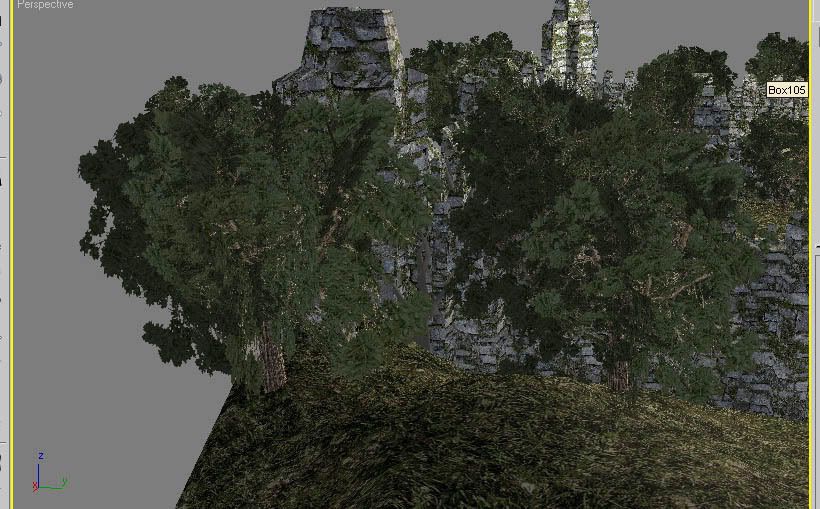
currently i am at work posting this and since i've only recently discovered how to not get halo's around my trees when rendering (see, stray sod wip), all i have are viewport grabs right now. when i get home i'll post some more high res renders with shadows.
i should also mention that the level is a floating fortress, and only the outside has been worked on so far, there is going to be a lto of inner catacombs and such underground.


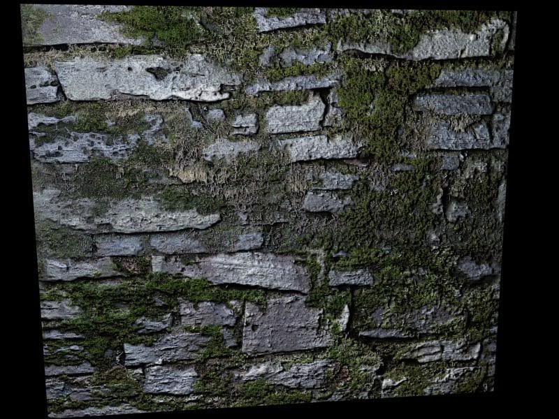
a render of what the wall texture looks liek with normal mapping:
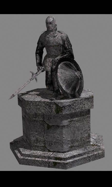
and a statue prop that will be at the entrance:
currently i am at work posting this and since i've only recently discovered how to not get halo's around my trees when rendering (see, stray sod wip), all i have are viewport grabs right now. when i get home i'll post some more high res renders with shadows.
i should also mention that the level is a floating fortress, and only the outside has been worked on so far, there is going to be a lto of inner catacombs and such underground.
a render of what the wall texture looks liek with normal mapping:
and a statue prop that will be at the entrance:
Replies
Things that will help:
Get some lighting in here to break up shapes,
Put the camera in game play positions so we can see the detail levels the way the player will see it in game.
Highlight edge and shade inner corners with more customized texturing to define shapes.
If anything, at least some wireframes to give an idea whats going on.
as i said, these are low res viewport grabs, i'll have much more clean renders later on. as far as texture sheets go... well, the majority of the textures here are pure tiling ones, except for the trees which are made up of 1 256x256 and 1 256x512 textures (bark, leaves). however the statue i know is wastful, currently its made up of 2 512x512 and 1 128x128 textures (head, body, stand), but i was going to go back and have it only use 2 textures, all of the body in one texture and the stand in another. or perhaps is this too wasteful? i will admit i am not very texture performance conscious, this is something i am working on. all in all though the list for textures used in the outside environment are:
1.)1 512x512 (grass)
2.)1 512x512 (main wall)
3.)1 256x512(leaves), 1 256x256 (bark)
3.)1 128x128 (windows), 1 512x512 (building wall)
4.)1 512x512 misc rock.
5.) statue textures
the games min hardware we want to support is a 5900 with 256mb of ram. the engine is a portal based engine and i am wanting to have some zones setup like below (this is an old render):
I agree with what's been said, but would like to add the suggestion of breaking up the foreground from the background. Right now everything is kind of mushing together, if you give the foreground and background different texturing it should help to break this up a bit.
[/ QUOTE ]
by breaking up and giving different textures do you mean this for the ground? if so then that is one of the main annoying limitations i have to work with, i have no multitexturing blend capability.
basically I think you should aim for something where you can zoom out until its quite small / half close your eyes and still make out the shape of all the objects in your scene, then things will be clearly lit
edit: is that for me? maybe vert lighting will be detrimental to using normal maps. but in some games I see in-editor lighting that just looks like it would have been better off hand-tweaked imo. maybe hand tweaked light maps instead
and perhaps per's wtf is for me showing viewport grabs instead of renders? if so, i figured you guys would be abel to give me some suggestions untill i give better renders (which you have).
i dont know if this may work, but you can duplicate all of your geometry and apply a matte/shadow material to achieve the same result
Alex
well, here are better renders. i am not happy with how it looks so far though, it looks amaturish... which is not the look i am going for. so any suggestions at this point would be helpful.
please ignore some of the texture stretching, i am aware of it.
Alex
before you start worrying about lighting, or even the contrast and detail of the textures themselves as rooster suggests, you'll need to start looking at how buildings (roughly) similar to this are constructed : specifically what variation in stone work runs through the structure, how shapes are picked out, how the stone is laid to create curves, where to use appropriate trim etc.
when you've got together plenty of reference, you should start to create enough bespoke textures that will allow you add polys where appropriate and carefully map your building to more reflect the reference. The architectural style is of course entirely up to you, bastardize wherever, but it's important to suggest the basic rules of construction or your building will never seem convincing, even for a fantasy environment.
Crucially, you'll quickly find that using more textures (smaller, if necessary) and carefully mapping them to your polys (again, adding more if necessary) in convicing patterns will give you the shape and definition that this discussion about lighting seems to suggest you're missing. If a building looks solid, detailed and defined with all ambient light, shadow and vert colours turned off, you're more than halfway there.
Lighting is not the main problem. Jarrod, you're just slapping on one texture all over the building. It's about time now that you think about how a castle would be constructed and weathered and let that show in your texturing.
[/ QUOTE ]
I agree take a look at some castles here reference never hurts...
If you got the old look along with the color and texture look here to break it all up you can get something really cool.
Ive cheated a lot of cool ideas on the texture phase by not showing them enough love and thats a huge mistake because the texture is going to make verything. Push a little extra with it and you'll be very happy you did.
Spark
www.bbriley.com
the reason for the slight rush job is that i am the only artist for this entire game (except for one character artist), so i am trying to rush myself a bit so i can move on to the next thing and then the next thing... ect. however i guess i am not going to get the results i want if i rush myself, so i'll take my time from now on.
thanks for the help!
p.s. as far as the architecture goes, i tried to create a style that is unique so its not quite based on any particular style.
Looks like it could turn out to be an interesting piece though, so keep chugging.
edit: i rplaced it with a higher res render
A few people have already touched on the two key points I have make. Re-read what Dan said, then take these points on board.
You building seems to have no grounding in reality. I don't mean it's fantastical like Scar Night or Labyrinth or Ico or Final Fantasy. I mean that it wont work. It will not stand up. As already pointed out, even make believe needs to be functional, it's the grounding in reality of thousands of years of architecture and stonemasonry that makes us look and say - "That's not right".
So you need to think - how was this building built? What makes it stay up? You can't just make a pile of bricks and bung on a roof on there. Xeto posted some great easy shots. I spent a few day camping this summer in the grounds on a 13th century castle. It's still mostly standing, and that's not down to luck.
This one is camera phone:
There are a few here : http://www.flickr.com/photos/ianhowie/
Point two - you have 2 colours. Green and Gray. You can use dozens of shades of green, not only for artistic effect, but to lay depth to the scene - darker greens for the undergrowth, softer yellow greens for lichen and harsh mad green for the trees.
Just keep in mind all the good points these guys have made - keep it up, you're obviously learning very quickly!
yeluis, what did you mean by giving it a foundation? because it bothers me just as it does you, it looks like ti was just ploped in a spot on the ground.
Oh, and I forgot to mention, one of the things that really sticks out to me is the crenulation over top of the supports. This is a little screwy. If there is crenulation, then that means that you should be able to physically stand behind it. The way that it lips out right before the crenulation implies that it is either very unstable, or the crenulation only comes up to your waste. Either way, that's wrong. You can lower the lip, or raise the wall above the lip. Hope that makes sense.
Also, I couldn't stop painting, maybe this will give you some inspiration, maybe not...
and now that i know what crenulation is i understand that i should raise it some more. thanks
The texture seems to stretch horribly on some points, especially on the pilasters (is that the correct word?).
Furthermore, the statues. They're probably going to be eyecatchers, and can afford errors even less than the building itself does. It seems as if they're built out of giant rocks, which are then cut into perfect shape, which is a bit silly. Statues are made from and on premade square(ish) blocks. Seams are possible on the foundation, but only straight seams. You should also add wear and tear to them, since they're out in the open, and are subjected to the elements.
The correct spelling is 'crenellation', btw, for if you want to look up something on Google on it.
The one thing that sticks out and really breaks reality for me is where the tower meets the building. The building needs an end cap to help the transition. Just a simple end cap, nothing fancy. It just looks off because the textures don't match up and the arch just ends oddly.
It's time to also start adding dirt and crap around the bottom. As rain water runs off of the roof it makes mud and that mud splashes on the building. Also don't forget about dirty rain streaks on the statue bases, they are looking a touch too new. They could also use some plant life/overgrowth around the bases.
Great work. it can only get better right?!
tough to say because you never take close-ups and your compression is so high, but I think your bricks are upside down.
[/ QUOTE ]
i think you may be right... not exactly sure how they could have happened though. eitherway its as simple as flipping a layer in photoshop, np at all.
p.s. i am aware of some of the texture stretching in the second pic and also in the second pic i used photoshop to darken the supporting pillars for the aquaduct since i didn't have time to tweak the texture.
lol, and i think a tree may be floating in the first pic...
Jarrod: You've really made some impressive gains in a short time, but you need to keep pushing it. Everybody talking about your structure needing more grounding in reality is (still) right. I've hawked it before and I'll hawk it again: spend 3-4 dollars and get an old copy of David Macaulay's "Castle" used off amazon.com
http://www.amazon.com/Castle-David-Macau...TF8&s=books
it's simple, straightforward text, but the beautiful illustrations are the big thing. While accessible to children, don't think this is a kid's book--this guy walks you through the construction and purpose of a typical 13th century castle.
And as you can see, a used copy will run you all of 1 or 2 dollars. This and other Macaulay books are among the most inspirational I own. Even if you're not trying to be historically accurate, it really gets you thinking about the various facets of castle life (which'll give you ideas for defensive features as well as other aspects), and it'll get you where you need to be. That's not realism, it's believability.
Some of the most absurd, fantastic ideas work in games despite their outrageousness because someone has had the balls to sell it, make it seem believable to the player. That's your job. Now step to it!
The aqueduct kills the silhouette of your inner castle. Looking from the outside or from the inside looking out, all we get is a big box. So all the interesting shapes you've invested into the castle itself have little to no value. Additionally, it appears to be double scale of the castle. If you were to scale it down around 50%, then rebuild it at it's same ground layout, you'd still see castle profile, and have the aqueduct effect you were going for.
Your bird's eye view has really come together, but you need to focus more on game camera and player view. Import some scale reference player models and copy them all around at key scale locations (doors, paths, lookouts, etc.), and start posting screen shots of those angles, because when it comes down to it, what the player sees in game is all that matters.
To go along with that, watch your pixel density! This should be as even as possible where the player can approach it. It's ok to scale up distanced objects, but overall, it should be the same everywhere. In max, you can box map everything, say for example at 256, to get an even look all around, the correct the Uvs where needed.
for those who are wondering there is a reason why i have an aquaduct around the castle. the game is online with 2 teams, the imperials and the barbarians (which have been fantasized). the story of the level is that the barbarians took the floating fortress from the imperials. the imperials have planned an infiltration mission. the level goals are:
1.)barbarians defend the castle.
2.)the imperials can try to take back control of the castle.. or...
3.)the imperials can destroy the castle.
the watr has to do with the destroy goal. basically the castle has a large container that collects rain water. this rain water is filtered into two aquaducts, where they meet at the entrance and form a criss-cross waterfall. as the water falls though it falls into two drains, these drains lead into the underground catacomb system where the imperials first infiltrate (starting position for imperials in the catacombs). the water then eventually makes its way intot he crystal room where it cools the crystal. the crystal is what powers the fortress's levitation and if destoryed the fortress is destroyed. it is the imperials job to stop the water flow and therefore cause the crystal to overheat and destroy the fortress.
and gaus, for that price i can not turn down such an informative book, i'll check it out, thanks.
thanks for the suggestions so far, i'll make the changes and post back soon (hopefully).
Notice how the how the black and white version just blurs together and there are no points of interest. Thats not a good thing to see you need to get this thing lit so that it creates points of interest in the lighting. Something that also might help is to change up the color on some of the outer walls. The idea is to break out shapes threw use of color.
Your bird's eye view has really come together, but you need to focus more on game camera and player view. Import some scale reference player models and copy them all around at key scale locations (doors, paths, lookouts, etc.), and start posting screen shots of those angles, because when it comes down to it, what the player sees in game is all that matters.
[/ QUOTE ]
boy how right you are. today i did this and found that while my over the top camera looks nice and detailed... my player view looks kind of bland. i'll be adding a lot more things around the p[layer ground level next i guess.