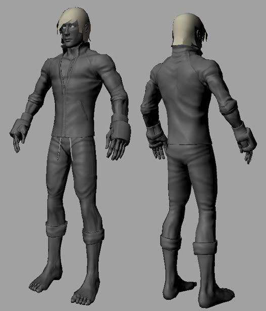
I also have troubles with displaying transparency in viewport with the same video card, so I do a quick render to see a result, cause I don't know about a way to fix it. It does work sometimes if you are not in high quality mode (then your normal maps won't show), but high quality mode with opacity mapped materials just seems to make a big mess and it looks even worse for me, with back side of the model showing through. Same goes if you are using 32 bit textures. GeForce is not supported by Maya, so I guess that's why. The workstation cards should work fine, but those cards are not very cheap =\. Anyways, look forward to see the textures!
Fogmann: From what I've seen of your work (awesome job on your streetfighter entry, btw), you are able to get renders with transparency. What do you mean by doing a quick render? I've tried maya hardware renders which don't work...is there something I'm missing?
Tulkamir: I'm using Maya 7. I see that there have been problems with geforce cards and maya, but I'm trying to figure out a way to get a render including both normal maps and proper alpha maps. otherwise, I'm going to have to buy a new video card before I can advance much futher.
I just do a software render with mental ray using draft or preview settings, so it renders very quickly. I know it's not very interactive, nor is it a real time preview that you should be able to get when working on a model, but at least it lets you see your model properly. Then, when you want to get a good render, just go to render settings and choose production quality and adjust settings as needed, so that you get nice antialiasing. If you are using Maya 7, you might need to use JSNormalMapper (grab it from http://www.pixero.com) to be able to render normal maps properly. There's a version for both Maya software and mental ray and it is very easy to set up and use.
New video card won't really help with the alpha problem as far as I know. I've used maya with Radeon (am at the moment actually), GeForce, and Quadro, as far as I can recall none have displayed alpha's properly in the viewport. :S
Although Im not positive on the Quadro part of that. :P
one trick that works is to break off the parts of your model that have transparency into separate objects. Maya does its z sorting per object by default, and so you get these zfighting issues with alpha mapped geo. So if you break off the individual planes of hair into separate objects they will sort properly and be able to keep their alpha.
Thanks for all your suggestions everyone. I am still trying to get a decent render using jsnormalmapper, but in the meantime, here are some viewport grabs (which is why the hair is messed up looking) showing where I am with the texture. I am rarely home anymore, so I never get to work on anything, so this is going very slowly. I'm pretty discouraged with how this is turning out, so any comments/suggestions are appreciated. Thanks for looking!
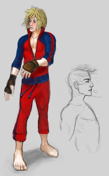
I second the request for the red suit, also Ken was like a mean looking mofo so if you can some-how project that mean look onto the model in a shot just for comparison that might help bring the spirit of ken out on the model.
Looking ace though keep it up even if it takes a while it's worth it.
Dont mind me I am the regular fanman!
I think the hands and feet look huge because of the focal lentgh the shot was taken at. Notice the size variation in the hands, the further away hand seems more in proportion than the closer hand. If anything, the forearms seem too short for the hand size or something. The big toe does look funky to me as well. I like your lighting setup though to show this guy off with. Maybe a front and profile shot so we can get a true sense of the scale of his features?
Big hands and feet make sense to me because he's a fighter, plus it's not like it's going for realistic proportions anyways, and the style is pretty solid overall (consistent from face to body shape to hands and feet etc).
Dennispls- I will keep all of your suggestions in mind while I am finishing up the character, I think you're right about the feet.
Jerome- I'm not sure what you mean about the toe, can you be a little more specific?
Goober- Yeah, the arm proportions might be off a bit. Check out this posed shot to get a better idea of his proportions. Notice there are still many seam/texture issues to address.
Nice man, I love his arms/hands, very nice detailing there. His clothing looks a bit boring at the moment, I think you could work up the spec map, but with lots of dark fabric overlays, and play with the rolloff, so that you get a good sweat-suit look to it. His hair could stand to be a bit higher res and have more crisp details, right now it looks a bit soft and fuzzy compared to the rest of him.
Replies
Tulkamir: I'm using Maya 7. I see that there have been problems with geforce cards and maya, but I'm trying to figure out a way to get a render including both normal maps and proper alpha maps. otherwise, I'm going to have to buy a new video card before I can advance much futher.
Although Im not positive on the Quadro part of that. :P
Looking ace though keep it up even if it takes a while it's worth it.
Dont mind me I am the regular fanman!
It should be a bit thinner
The hands look too big as well
Big hands and feet make sense to me because he's a fighter, plus it's not like it's going for realistic proportions anyways, and the style is pretty solid overall (consistent from face to body shape to hands and feet etc).
Jerome- I'm not sure what you mean about the toe, can you be a little more specific?
Goober- Yeah, the arm proportions might be off a bit. Check out this posed shot to get a better idea of his proportions. Notice there are still many seam/texture issues to address.
You could probably get rid of some of the polies in the face, especially the chin.