Home 3D Art Showcase & Critiques

RTS Woes

Madcap
polycounter lvl 12
Offline / Send Message
Madcap polycounter lvl 12
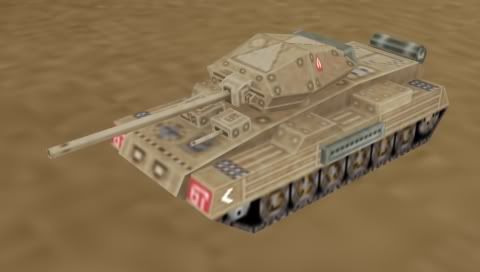
Hi I was wondering if anyone could help me with this. I'm making some RTS models suitable for the psp for a school project. They have 128x128 textures using 16 colors 15 and 1 team color. This model is 315 triangles. Anyone have any good tips for improving model readability at long distances. This is the model at what could be full screen.

tank1.jpg

This is it at a general zoom level.

tank2.jpg

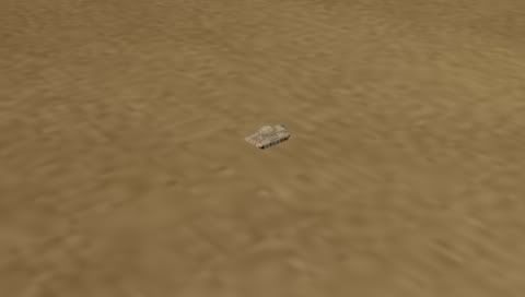
It's a bit blurry, is that down to the lack of colors or bad shading or texturing on my part. Texture filtering is on in max. Any tips about that or general critique would be great, please tell me if you cant see the images.

Replies

  • aesir
    Options
    Offline / Send Message
    aesir polycounter lvl 18
    You need some higher contrast to define the forms imo. Darker shadows, lighter brights. etc. But not really with an all around contrast, or else some already dark/light areas will get too dark/light. Just build the forms up.
  • Neox
    Options
    Offline / Send Message
    Neox veteran polycounter
    Realism and RTS are two things that will never work that well, you should definitely work more on the contrast in the textures itself and on the contrast of the vehicle to the ground, camouflage may be realistic but in this case reality comes into the way of fun and any time this happens, fun should win, it's a game so you can exaggerate it a bit more. Maybe Shadows would help in that case but i guess working more on the values would be a good idea.
  • Xenobond
    Options
    Offline / Send Message
    Xenobond polycounter lvl 18
    Some actual lighting in the environment will help make the model pop more. It looks like it is all fullbright, right now.
  • Ghostscape
    Options
    Offline / Send Message
    Ghostscape polycounter lvl 13
    I bumped up the contrast a lot with a quick curves adjustment and some dodging/burning.

    tank2pw0.jpg

    Also you're going to want to make the team color sections a lot larger. You could try something like this:

    tank3aj2.jpg

    Instead of using black as a second color, try using the team color. Aim for about 20% of the model being teamcolor.
  • CMB
  • Madcap
    Options
    Offline / Send Message
    Madcap polycounter lvl 12
    Thanks for the tips guys. I will definitely work on the shadows. I didn't know how far to take the lighting but after looking at field commander on the psp things could get a little darker.

    Thanks for the paintover Ghostscape, I definitely could utilize team colors better. I saw your RTS vehicles, nice stuff.

    Thanks for the link CMB I will check it out asap.

    Here's another wip unit. I have the same contrast problem but ile nip it in the bud this time.

    bomber.jpg
  • JordanW
    Options
    Offline / Send Message
    JordanW polycounter lvl 19
    One thing that would help these units a lot is to divide the object into larger blocks of color, the plane you just posted and the tank both suffer from the fact that they are essentially the same color all over with small variances. The thing about RTSs is that you more often than not view things from a distance so having seperate areas of color will add interest.

    One suggestion could be to make the cockpit/intake area a secondary color on the jet, maybe black or even like a faded yellow.

    Same thing with the tank...try making the center part of the tank a different color so that it breaks up the model as a whole.
  • StrangeFate
    Options
    Offline / Send Message
    StrangeFate polycounter lvl 18
    You don't need the shadows to be sooo dark.

    You need to keep shapes and details readable at distance, and contrast will make the object stand out more from the backround, but not make it easier to read. It's still a noisy mess, a bunch of dark and bright pixels.

    At that size, you'll want to lose smaller details, or make them softer so they only show up when zooming in (if that's an option).

    Work with solid, clear colors and larger details. Shade the model in a cellshading or pixel game style ie. polygons facing up can be the brightest solid braun, faces at a 45 degree angle from there are a bit darker, 90 even darker and polygons ein angles facing down even darker.
    A simple and clean shading following the large details and shapes will do wonders.

    That will make the shape of the models as readable as possible.

    I'm sure there's some pixel artists here that can help with basic shading techniques (for the diff angles etc) used in pixel games to get the best readability, and if not, tutorials on it should be easy to google up, if needed.
  • Madcap
    Options
    Offline / Send Message
    Madcap polycounter lvl 12
    Here's another unit. I have tried to incorporate the many suggestions made here into it. It reads a bit better at a distance and you can tell it's the red team heh heh.

    how1.jpg

    how2.jpg

    Thanks for the tips StrangeFate, I should really be looking at pixel art tutorials considering I am using limited palettes and that.

    I think I will try working on a human unit next to see if I can improve that way.
  • rooster
    Options
    Offline / Send Message
    rooster mod
    heres my suggestions, you need to use light against dark to make your forms read clearly
    how2.jpg
  • Steve Schulze
    Options
    Offline / Send Message
    Steve Schulze polycounter lvl 18
    sticking a shadow under your models would make a fairly significant difference to their visibility. If you can do 8bit or greater alpha mapping then simply paint a general shape of your model, guassian blur it and then stick it on an alpha plane under your model.

    If not, you could experiment with some hard edged shadow planes.
  • Xenobond
    Options
    Offline / Send Message
    Xenobond polycounter lvl 18
    or the shadows could be made using vertex alpha to fade it out.
  • Madcap
    Options
    Offline / Send Message
    Madcap polycounter lvl 12
    Anyone got a link to a tutorial for creating fake shadows. I remember someone posting here a cheat render to texture method.

    stoner.jpg

    I am still working the other units but I have started making some humans. This guy is 250 triangles, the anatomy is a bit whack at the moment. Do I want to be using 100% self illumination or Vertex colors maybe that's causing the shading problem.
  • monster
    Options
    Offline / Send Message
    monster polycounter
    I worked with DH on Age Of Empires 3, you can see some of his stuff here. http://www.horribledeath.com/2d3d.htm We had very small polycounts and texture sizes to work with as well.

    As for your textures I agree with Rooster's example.
  • Daz
    Options
    Offline / Send Message
    Daz polycounter lvl 18
    Also, ambient occlusion could really help you out here, but I really like roosters advice.
  • Madcap
    Options
    Offline / Send Message
    Madcap polycounter lvl 12
    Cheers Monster. Many's a time I have visited that site, only wish I was as good. I remember someone who worked on Age 3 posting that the texture size for in game units was 64x64 thats insane heh heh.

    Thanks Daz I have tried doing render to texture a few times but I get a lot of errors, ile look up a few more tutes and give it another go.

    Here's what I did today. It's that previous dude but hopefully a little better. I need to make better hands I can barely draw fingers on em.

    newdude.jpg
Sign In or Register to comment.