New here... new to max...
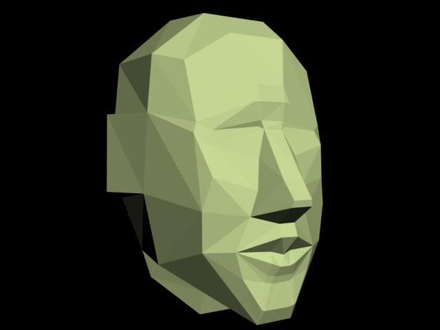
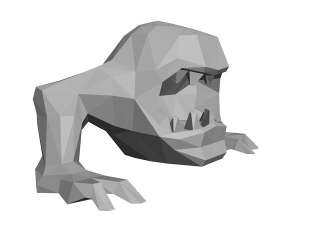
Hi, Im real new to all this stuff, Im going to uni in southampton, england, studying computer and video games design, though our course seem to be based purely on the art side of games... any way I've kinda just started to use maxs here what I've been working on I guess,
oldest- newest
and heres some 2D art work I have done, some before this course,
oldest - newest again
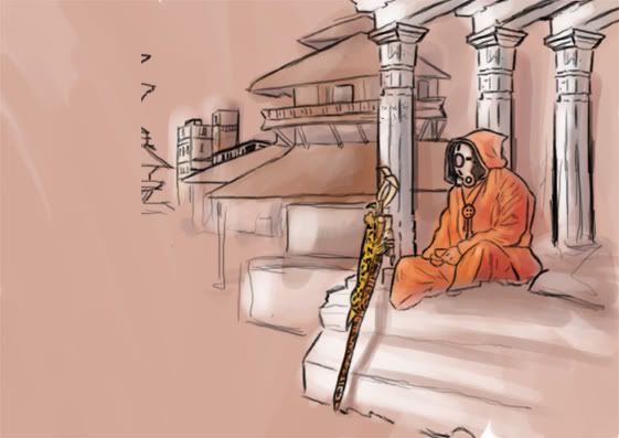
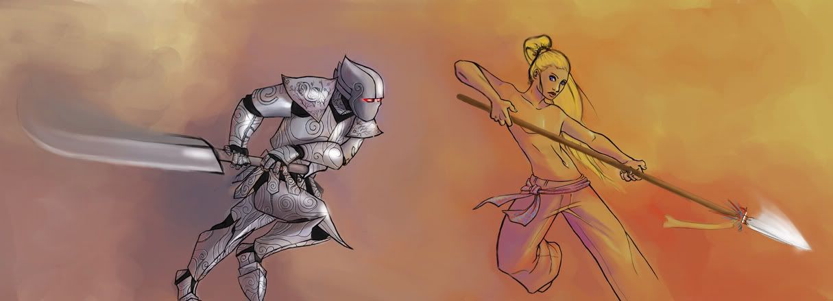
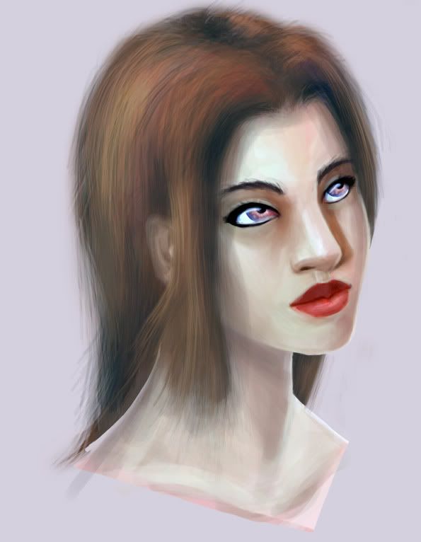
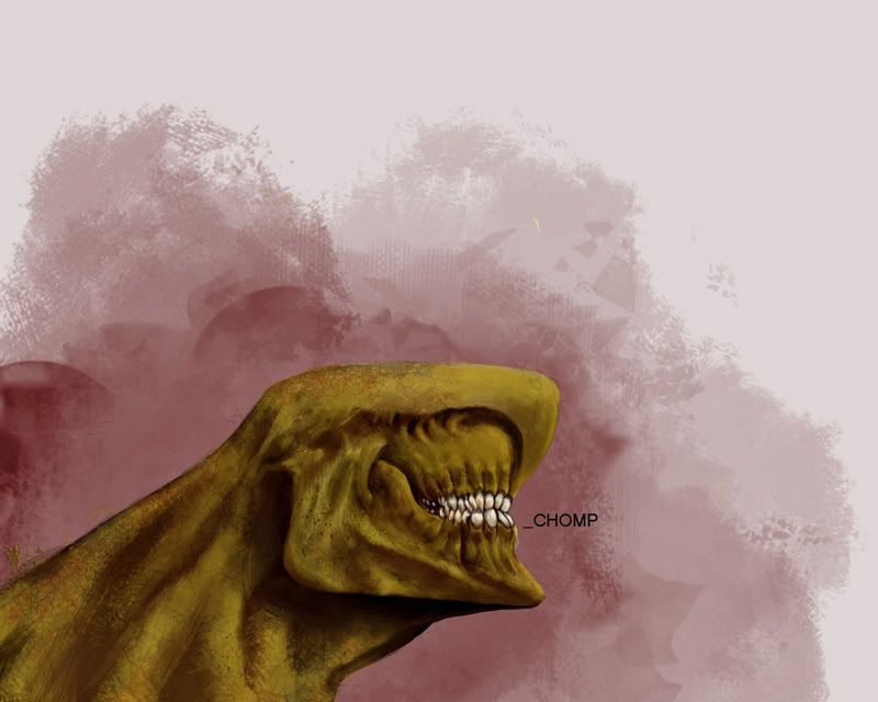
oldest- newest


and heres some 2D art work I have done, some before this course,
oldest - newest again


Replies
The first two models are kind of hard to critique as they are in a very early state (I assume) and don't show a wireframe or anything.
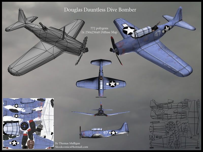
The plane is a great start. Keep at it, you're doing great man.
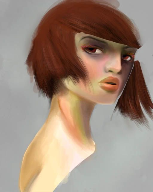
I really like your gals and the last art work.
For the 3D, ditto as Tulkamir.
Too early for any criticism.
your 2d stuff is coming along, I sugguest doing some research on photoshop painting techniques, and if you don't already have one, get a tablet
the 3d will come with time and practice. 2 tips for free:
1-not all mesh needs to be water tight, intersecting meshes are tri saving miricles at low poly. (if your teachers say they are expected/needed/used in this industry, then he needs head examining)
2- when making your textures never (nearly never) ever use black and white to shade, use a slightly saturated lighter coluor for highlights and a darker slightly saturated colour for shadows. as a rule i keep to the middle half of the light/dark colour spectrum.
I did read everything way back when and understood it all,
thanks for the crits..
(and your right McIlroy Im well off pro level, but you know pratice pratice pratice)
anyway NEW STUFF!!!
very much a work in progress
so yeah....
I know this is WIP, but I don't know how far along you are in that, so I'll say that there are numerous places where you have several verts along a straight edge. If you're not going to use those vert to help define the character, then get rid of 'em. Also, are you working off of reference, because either the legs seem a bit too short or the hips are too far down, hard to tell. Hope it helps, keep pluggin' away.
Geezus: its very early on, which is annoying becouse I don't have much time to finsh.... though Im doing better than most in my class
closeup
2 days left YAY!
gotta go unwrap now
where did I go wrong?
I think I've got closer to how she looks now
and
I have so much hate for both models now.
Uni does not give enough time.