Gremlin - First Post
Hi there. Long time listener, first time caller. I am making a Gremlin and I need some serious c&c. It is aimed at 10k polys, and it stands at 6300 now without the wings.
I need help especially with the arms/hands, as well as edgeflow.
Also, if you check out the concept, he has a lot of small horns/extrusions: How would it be best to model that. Seperate objects, or use the same geometry?
Wires:


Here is the concepts by Miles Teves:
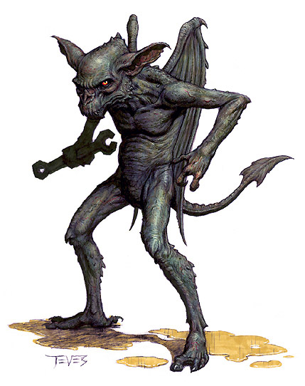
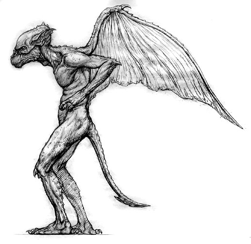
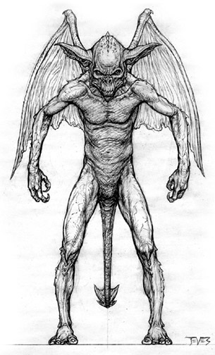
I need help especially with the arms/hands, as well as edgeflow.
Also, if you check out the concept, he has a lot of small horns/extrusions: How would it be best to model that. Seperate objects, or use the same geometry?
Wires:


Here is the concepts by Miles Teves:


Replies
For the tiny horns I would chamfer a vert and extrude the 4 sided poly it makes 2 times welding the second extrude to form a point. It will help when it animates if it is part of the same mesh. Since the seperate pieces won't have the same vert weighting as the arm and could float, or shift as you animate.
I would exagerate some of the features, such as the feet, head hands and mouth to look something like this;
Cheese: Thanks! I really havent started to optimize him yet but i will keep it in mind. The mesh density ins´t perfect I admit.
I am going to take hi minto Zbrush soon. Just need to make wings and optimize the geo first. Just got a new computer so I can start working from home (don´t need to live at school anymore). I will post more updates as it progresses.