Boat Yard- plz critique
polycounter lvl 18
Hello this is my first post on this forum. I would like some critique on my boat yard. This is about 60% done. If you think I need something to make the environment better. My poly count for the entire thing is about 50,000 and I haven't done all my textures.
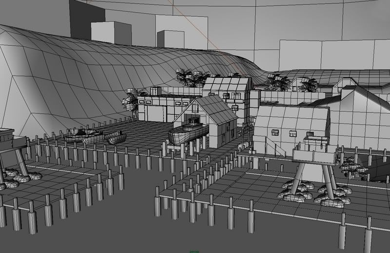
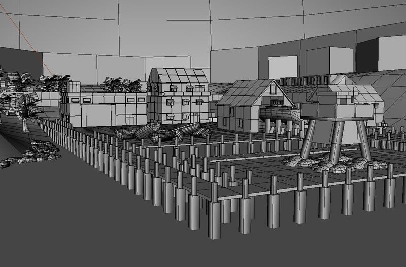
the lighting is not done yet I just added my light rig in. Critique plz
the lighting is not done yet I just added my light rig in. Critique plz
Replies
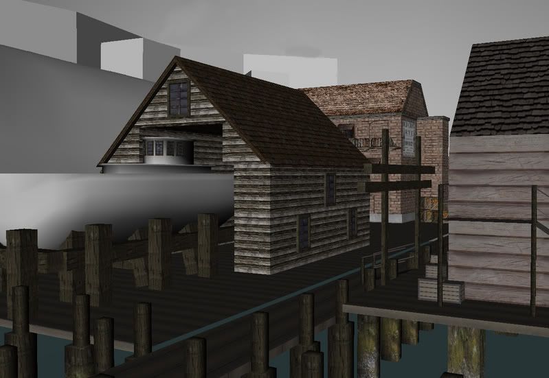
Also the textures look flat,they need a tad more lighting on some of them so they dont look so artificial
Resuse in parts is good but you reuse somethings a little too much,when i look at the boats windows and the windows on the house i see the same texture,try to have more than one texture which you can mix it up for things like windows,especially when they are so close to each other.
Similar issue on the support beams on the dock holding up the boat is it the same look of the texture on all sides? if not rotate those beams so you dont see the same pattern run down the row of beams,if its the same all around then you have to generalize the details so no piece of detail sticks out,a good tileable texture has to look like it isnt b ut when you see the same bold wood graian running down many instances of the geometery it just looks bad.
But keep going with it,i like the structure and the layout of the buildings,with beter texturesand reuse you can make it work.
I suggest you think about how the planks on the piers would be attached - get some reference. Flickr is superb for this
Flickr search on Jetty: http://www.flickr.com/search/?q=jetty&w=all
Pier:
http://www.flickr.com/search/?q=pier&w=all
Boatyard:
http://www.flickr.com/search/?q=boatyard&w=all
Docks:
http://www.flickr.com/search/?q=docks&w=all
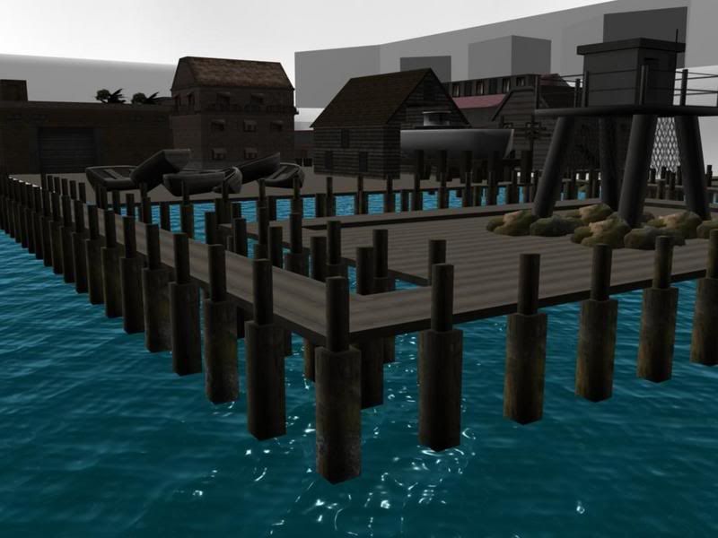
It would be nice on the ocean if you changed to color to more greenish cuz its more open ocean that would be blue in color...adding some floating planks or something on it would look more realistic.
And for the beams...you could add some neat little arrangements of beams sticking out of the water in the distance...you can use that as a sense of scale as you go along.
There seems to be far too many support pillars on the docks, but maybe that's just me and I don't know enough about docks.
I'd also say tone down the distance/intensity on the street lights, so they don't fill every nook and cranny with light so much. It'd add a ton of mood to the piece if there were a few more dark shadowy areas, and more variation, and extra shadows overlapping textures will draw attention away from the repeatition of the tiled textures.
Also, what lights are shadow casting here?
All the dock surfaces are totally flat. Try some variety of height for different sections. For example, lower the thinner walkways a bit with a few steps between them. Select a few boards here and there, and model them up in 3d as though the boards came lose and bent up at a subtle angle. Youve got all the edges in place, make building and structures sage. This will add a ton of natural appearing variety.
There is no small detail. While you have a few large crates and boats as props, you now need small details. Rope, tires, papers, trash, posters, etc. littered all around building and such.
The tree-line silhouette in the background is too synthetic. Adjust the heights of every other tree or add a height noise to it all for a lot of variety.
Lighting is too bright in the background, and in the front of those two brick buildings. Those far distance backgrounds should almost become dark silhouettes based on how dark the sky is.
And textures, think and create, not inversely.
Add a lot more trim on everything to transition it all together.
[/ QUOTE ]
Quoted for 100% agreement. TANSITION IS KEY.
So once more:
[ QUOTE ]
Add a lot more trim on everything to transition it all together.
[/ QUOTE ]
Here's an exercies - go outside and look at how surface fad into one another. Those hard edges between kerbs and roads and pavements and softened by dirt and debris. Once you get dirt and you get moisture you get plant life.
http://image.com.com/gamespot/images/2006/316/589486_20061113_screen022.jpg
http://image.com.com/gamespot/images/2006/316/589486_20061113_screen021.jpg
They've picked a very specific time of day and climate to depict, and added something that you have none of: randomness, irregularity and wear and tear (and some G.I lighting thrown in for good measure
Some very good crits posted so far, it looks like you tried to follow most of them which shows you are open to change, a good trait to have as most production art gets screwed with at some point.
I apologize for not posting this sooner before you where so far along. Since my crits are basically calling for a from the ground up approach. I'm going to take it screen shot by screen shot.
1) I think this is a cliff where a lighthouse is and this is where the light shining down on the dock is coming from? It would be nice to see even a small part of the light house, a corner of foundation, a hand railing, something that helps explain on this cliff is a light house. Light house or guard tower? A light house shines its light out to sea so ships know where the coastline is. Its a visual warning beacon not a fancy street light. That's not to say you can't have the light shine over your scene and still have it cast light but it shouldn't be used as a spot light on a guard tower to shine right on the dock.
2) The old row boat is a nice touch but happens to be facing the same position angle size and even same texture as the boat on the dock #3. If the boat is unusable as the picture suggests beat it up a bit, rotate it upside down something to make it look different from the boats in 3.
3) What are these boats doing here? Why have they been piled up in this spot? More importantly HOW did these boats get like this? Is there a crane that was used? Cranes would be a nice addition to the dock since cargo is loaded and unloaded all the time. Was this empty space and a convenient boat prop was a good filler? Think as if you actually worked on this dock, why are they there, what is happening to them and where are they going? Could you have put a bait shop here instead and made it more interesting?
4) If this is actually a dock that ships come too it needs to be a pretty deep water port a sandy little beach with a row boat on it is an indication that this harbor is not that deep on that side of the dock. The height of the dock suggests two things the tide is out, and the ships that come here are pretty big. I see no tie offs for the big ships. no sailor in his right mind would tie off to a pillar since ships move up and down in the waves, very easy for a tow line to slip off the top of a pillar. The dock needs tie downs.
Since the harbor isn't that deep on this side it makes a good spot for a smaller floating dock for smaller boats. It would raises and lowers with the tide and would have an adjustable ramp leading up to the main dock. It would really help fill the empty water space in the shot. Or place some old support pilings out here that indicate an older dock was once here but was no longer needed and is now just used by seagulls.
More supports doesn't mean more detail. Take a few of them out or cluster some of them together. Make larger main supports and have the little ones link to it with beams. The support beams seem to be missing from the under structure of the dock? How are those boards supported? Or is the dock actually meant to be one big piece with a board texture painted on it? Again how are those boards supported, we know how the 3D model would physically work since it is one big piece but the thing(s) is it representing are individual pieces and the support for those pieces needs to be explained.
5) I like the houses on the hills, but how do the people in these houses get down to the dock? Is there a road, a foot path?
6) Rocks on top of the dock? Or are these sand bags? Either way its not a good idea to stack heavy things on a frail wooden dock for long periods of time. Wood + Water + heavy stress = broken dock. Open the dock in this area and have the pilings go down to a man made rocky out cropping.
7) The trees. Unless this is a fresh water port the coast line is pelted with sea spray. Salt keeps things from growing or at least stunts their growth. So does the constant pounding of waves and wind. I expect the tree line to grow thinner and more sickly as it gets closer to the water and eventually turn into nothing but inhospitable rock. Check out some ref of coast lines, what you'll find is a bunch of plants that spring up quickly and not so many trees that take a long time to take root and grow.
1) The large door rolls up? What happens to the smaller door? How does the door frame rolls up? Normally you see the smaller door in a larger door on a the big doors that slide to the side not the ones that roll up. I'm not saying it isn't possible because it is, But if this is the door you modeled yours off of, you need the strong hinges running thru the sections. It bends in large panels not every piece. It would be easier to explain visually if you made the door panels like on the back of a moving van.
2) The wooden dock under this building should be concrete. Buildings don't use wooden docks as a foundation. Wooden docks are attached to foundations. Either way it would be a nice visual break for this to be a paved street or a concrete dock with a curb.
3) Again the things placed on the wooden dock seem odd. It might look better if the lights where on pilings.
4) Trim on buildings like it was mentioned before buildings have trim, over hangs, and gutters.
5) (Not pictured). The tiling textures are pretty bad. Not the textures themselves but the tiling. You have a bunch of polygons all over the place, you could make a few different tiles based on your texture and replace certain pieces to break up the tiling. If you aren't going to use those polygons for that, then take them out and optimize your scene. The more polys you save, the more you can use for more detail like cranes, bait shacks, fork lifts, piles of clich
john