The BRAWL² Tournament Challenge has been announced!
It starts May 12, and ends Oct 17. Let's see what you got!
https://polycount.com/discussion/237047/the-brawl²-tournament
It starts May 12, and ends Oct 17. Let's see what you got!
https://polycount.com/discussion/237047/the-brawl²-tournament

Replies
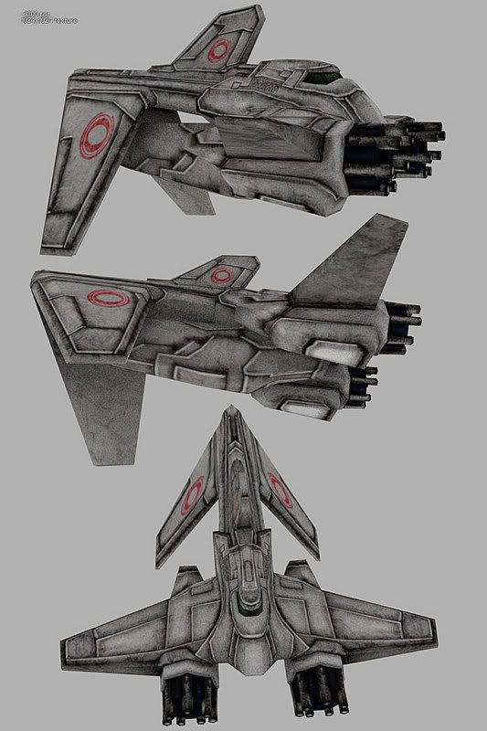
The texture needs more variation in color. Metal has color, it's not just grey. Usually faint hues of blue applied work well. And some oranges and browns to even some of it out. It's looking a bit too grainy as well. It also seems to lack any sort of specularity, making it come off very flat.
Over all it's a neat design, it just needs a little work.
-caseyjones
It goes forward. The black things are guns. The thruster is partially hidden.
Thanks again for the crits. I reworked the texture and feel that I like it better now.
Andy
I think you need to work up the specular highlights or even go one further and leave the diffuse map as it is and make a spec map to make it shiney underneath the scratches and dirt.
The texture is a big improvement though I'm not too sure about the green.
-caseyjones
I took it to photoshop again. This time I made a specular map and adjusted some lighting. Is this looking more metallic. The concrete with moss was not the look I was going for.
Andy
Something else that will really help out the ability for your texture to "sell" this ship as believable and interesting would be to adjust the partlines. You don't have to get super scientifical to create mechanical things that look convincing, but it does help to understand a few principles...
By partlines, I mean all the divisions in the paneling. Partlines arise from manufacturing processes--ideally, you'd make it in as few pieces as possible, since it's more economical and structurally stronger as well.
But given the various restraints of different fabrication methods, this usually isn't possible. For instance, a certain metal stamping or shaping process might only allow you bend a shape just so many degrees (usually you can't have any "overhang"). So you end up with a partline to compensate for manufacturing restrictions.
So take a look around you and you'll see the dramatic visual effect that partlines have on manufactured items all around you. Airplanes, cars, even your cellphone or iPod. Notice how that's part of what gives the iPod its futuristic appeal--there are no real visible seams, and certainly no clumsy battery access panel. An elegantly incorporated partline as opposed to an obstrusive and ugly one can go a long way in establishing an item's aesthetics.
So what does all this have to do with doing a spaceship texture? Well, how you arrange the partlines suggests and infers a lot of information to the viewer. Say it's a really cheap, shitty spaceship--you're going to have more partlines than usual, perhaps some bad make-shift welds in certain places, missing access panels, etc... but if you wanted an easy visual shorthand for "super futuristic", beyond our current manufacturing capabilities, you'd have barely any partlines at all. Like if it were assembled on a molecular basis by nanobots--they wouldn't create partlines at all unless they had some functional basis.
But I'm guessing you're going for a more intermediate step, something that references more current aviation looking manufacturing standards. In which case, you'll still want to do some work, since a lot of the partlines don't make any sense. You don't have to partition the wing for flaps, since it's a spaceship, so why are there flap-like partlines? Look at pictures of jets and how the partlines follow shapes...partlines are one of the greatest ways to indicate/enhance form while drawing, but also while texturing.
If you look up some good refs of jets and similar craft, and adjust your partlines to match the way they tend to flow around forms, you'll find your spaceship looks a lot more believable and appealing, even if it is science fictional.