Texture Practice
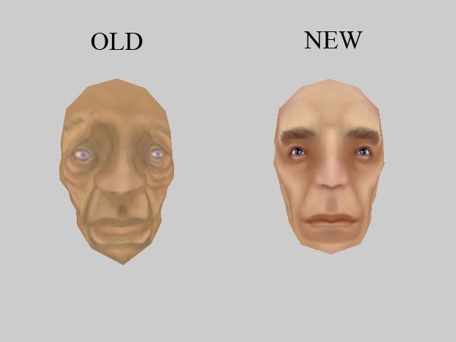
I have recently been trying to enhance my performance in photoshop and have had some better results after some practice. I know i would get better if i could get some critiques so here is a texture practice i have been doing.
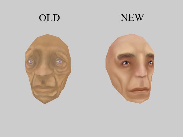
The first one is my first texture from about a week ago and the new one is one i made in the past couple of days. They are both the same head model but with the same uvs, only a different texture.


The first one is my first texture from about a week ago and the new one is one i made in the past couple of days. They are both the same head model but with the same uvs, only a different texture.


Replies
- There is a brow line and the nose starts under it, think of the forehead as a shelf the eyes and nose are under it. The nose doesn't start above the brow line.
- The eyes are set kind of far apart, as are the eyebrows. The reason a lot of people have a Uni-brow is because its not that far of a gap to cross =P
- The upper lip is too long even for a stylized character.
- Because the nose and eyes are under the shelf paint a shadow on them. Also a little red flushing around the eyes helps give people that haggered look.
- Painting a grey-ish tone over the bottom part of the face helps give the appearance of stubble and helps break up the face into regions.
- Playing around with the hue and saturation will help bring out the flesh tones more. I think you have some great tallent starting to come out here the best thing I can say is to do more, you are on the right track!
Here is a quick paint over I did.
Also that image is pretty big for the faces shown, either crop out the wasted space or scale up the heads.
.
-caseyjones
Good luck