Introducing myself... (RE-UPDATED with DEMOREEL)
polycounter lvl 18
Hi everyone,
I'm newbie on this forum so I thought I had to introduce.
My name is Raphick and I am Belgian, I'm a newbie in video game mod/tex world...
Here is my online portfolio, which I put online in order to find a placement hum.... lol
http://www.raphick.be(UPDATED)
Here are two pictures of my current project too. I have to finish and put the spec and the subsurface on (WIP) .
<font color="yellow"> Yeeeeehaa pictures are back... </font>
See you...
Replies
Big problem with your site... when I view your 3d work, I can't get back to your main page without using the back button. Then I'm forced to reload the flash and start from scratch. I kind of gave up looking at your work because of it
We crit because we care.
The site:
- It took me too long to get to the art. The self portait on the main page and on the 3d art page is tiresome, give the viewer some new eye candy. Flashy sites are nice but they hire you based on the art presented in the site NOT the presentation itself.
- I love the slide shows very simple to look thru the art quickly once it loads. I managed to break it once by clicking before it loaded...
- I don't think opening it up in a new window is a good idea. Mostly because it makes it too easy to lose your site. People doing portfolio screening will more than likely have a few open at a time, they could get confused as to what pop up goes with who's art. Or end up closing your site trying to get back to your main page.
- In the slideshow galleries give the person a way to get back to the navigation page.
- Load screens and wait times are your enemy and are more than likely going fustrate the viewer and close your site, game over you lose.
Keep em hooked, keep the art flowing and keep em moving.
The Art: There is some good stuff in there, but some of it shouldn't be in a portfolio.
- The meteor doesn't belong. I had to look at the URL to figure out what it was, its texture does not cover the whole surface and it has visible seams.
- OBORE the guy in the hat and sunglasses. The texture seems very dark, I am not really sure why this is, it could be the game he is designed for is always cloudy or it could be your monitor is too bright?
- MECA, neat idea, bad texture. needs shading and small details. It seems like it is ment to be in UT-UT2K4 but comes off as a Q1 looking model. I would take it out.
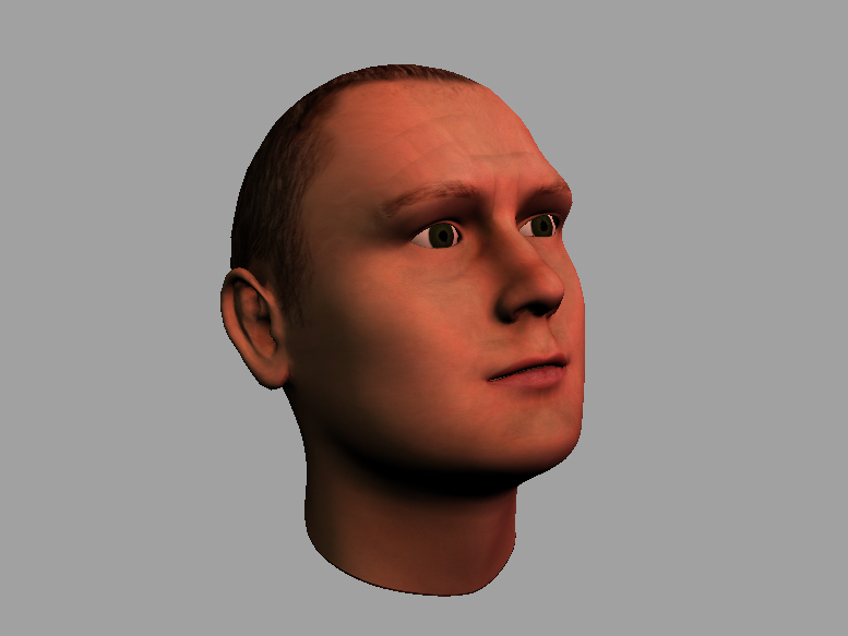
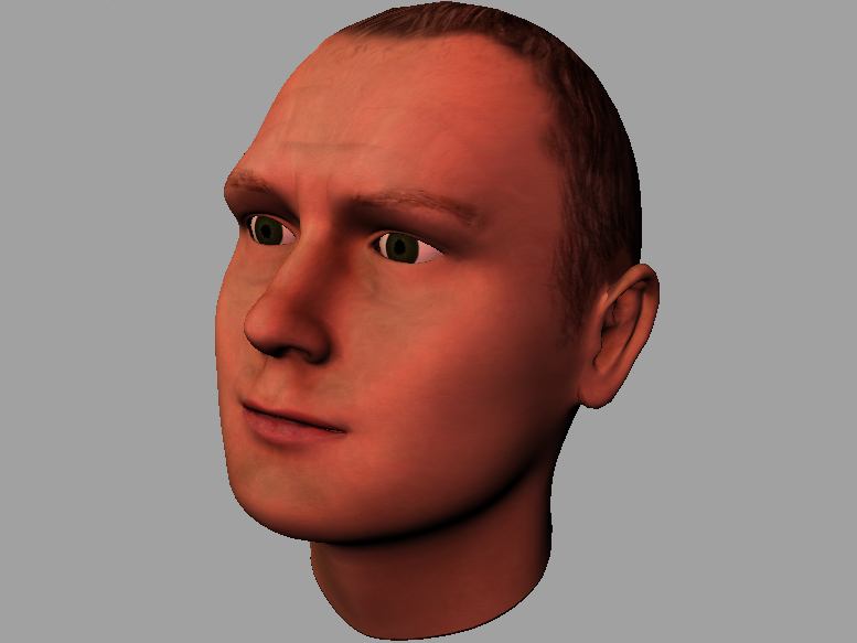
- The self Portait, looks great, but since we don't have a referance to go off of we don't know how accurate it is. Its your best piece and best chance at landing a job but doesn't have a slide show?
- The UT level, looks bad. It has the same texture applied to to very basic shapes. I would take it out for now until you get a chance to really pack some deatil into it.
- The mill scene, is your greatest enviroment work. I get the feeling it is one of your most recent? Which is very encouraging I would continue to pound out pieces like this as they will fill a portfolio nicely. I would caution you agaisnt working with cartoony settings as most places tend to focus on real world objects and places.
On the outside shot looking at the front door that has two pieces of wood leaning agaist a support beam (I would link the image but its a flash gallery). The camera seems to be really high and makes me feel like I am taller than the first story of the building and wold have trouble fitting inside. Move the camera closer to the ground to make the building appear bigger.
Flash, get rid of it or make it load faster.
wow... the sound effects were enough to make me shut it down.
Don't want to look at the art if all I hear are wizzes and bangs going on all around me, and I hate looking for mute buttons.
I am going to rethink the whole thing!
Don't use Flash for Portfolio sites. Knowing your navigation, it took 33 seconds from opening your page to viewing your art. Load times, waiting on cutesy flash tricks, etc. just get in the way.
This article might help:
http://boards.polycount.net/showflat.php?Cat=0&Number=73945
or in Photoshop, File > Automate > Web Photo Gallery.
Not that i'm one to be telling others what to do, as my work is far surpassed by yours.
I agree with most everything here.
That ps2 spec enviroment is nice, though.
The Unreal environment is a box... I could throw that together in an hour. The outdoor scene was very well put together, but again just very simple blocks stamped over and over. The tree mesh is also odd, you really need to work on mesh topology. The meteor is 10 mins work tops for a beginner as well. The self portrait strangely stand out. It looks like a facegen head.
I'm sorry, but i'm being honest. But you are in the right place for help.
Isn't that made in facegen? It looks eerie similar to the meshes generated by that program.
nevermind on comments, i am a noob it's juste kind of starting for me...
see you later
it is currently 22.00
Don't worry about the bluntness, most of the guys here really know thier shit. I have learned a hell of a lot since I joined up here and trust me, the advice is worth the harshness.
Your model above, needs eyelids and more muscle deffinition, the cheeks are plane and lack detail and the head tilted up like that isn't helping the presentation, it also makes it hard to see its proportions while you are working.
Keep at it
Dit is nie swak werk nie
The adress is still http://www.raphick.be.
I hope you'll better like it...
You can find the old one at http://www.raphick.be/old.
Thanks to all the persons who commented my portfolio, I hope you'll like the new one, and the works published on it.
raphick.
My only major complaint would be that it still takes three clicks to see any actual artwork. Why not display at least one fullsized image of a model after you click it's 3d section link instead of another thumbnail page?
All the 2d images links are broken and last that contacts tab is a bit weird you might want to have your contact info at home and also not call it contacts since the first thing i thought was that it was a reference and couldnt see the persons title or where he worked. hope that helps on the site but i would focuis more on the work than the website. people always forgive websites if the content is bad ass
I also have put demoreel...
bye
links dont work for me... I'm getting a "URL not found" message
[/ QUOTE ]
Which links? They are all working fine for me
Thanks a lot.
There's no special tricks for that
btw, the ps2 map is cool, definitly you best piece of work, to me