[ QUOTE ]
Eheh, I guess females are spared from your paintovers (I shouldn't speak too soon, I know!)
[/ QUOTE ]
Don't give him any ideas!!!!
looks cool, only crit i have at this point is that she looks like she is about to fall forward. good rule of thumb is from a side view draw a vertical line that is centered with the head, someplace around the ear, straight down.. this is roughly were you want the ball of the of the foot.
i did a small paint over, i also straightened her back a bit, i just rotated the whole torso backwards a little bit.
Thanks, Ninjas. I look forward to see what will you come up with. I don't think I've seen your 3D work since dominance wars. Now get cracking
Arsh, thanks. I see what you mean. Luckily, she's cut up in parts so it won't be a problem to rotate certain parts. But I also think there's a bit too much perspective distortion in that shot, since I keep forgetting to lower the angle of view. This is the side view, I hope it's not too bad, but the back could go backwards a bit:
i think her head might be a tad too big and square-ish... but that's a minor nitpick.
funnily enough, while I agree with arsh that your initial profile seemed to be falling forward slightly, I think his paintover only succeeded in making her look like she was falling backwards instead... I actually prefer the forward lean (although something in between the two would be ideal, IMHO).
I like drawing women, so I hoped to capture a few little tips in this paint over:
I'm no master. My general advice is move the butt up, put her on heels, move the shoulders back. At the moment the only think wrong with her is that she suffers from bad posture.
Thanks, kind sirs.
I will make better posture for sure on low poly. I would have done it already, but I started some high poly, so I just want to make sure all parts line up when I bring them in together, so please disregard the side view for now. I'll rotate back more backwards, and I don't think legs will end up being visible. Either way, I think I won't be using photos for references anymore, as I end up changing proportions anyways (note that the head there is even bigger).
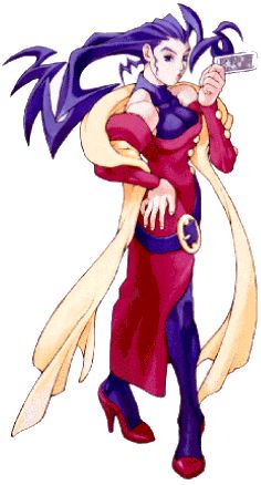
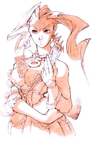
One thing i noticed, her face is much longer and the eyes dont seem to be centered like they are in the concept. I would bring the eyes/nose/lips down so the forhead is bigger and the chin is smaller. Or push the jawline up, maybe a combination.
Thanks, I'll have that in mind. Didn't work much on the head yet, and I'll get back to it as soon as I rough in the hair shape, because I think the face will depend a great deal on how the hair turns out. I'm still gathering courage to tackle the hair - for some reason it seems a bit scary to me. But sculpting cloth is fun Did a first pass on the main chunk of the skirt. I'll go one more level up and hopefully sharpen some of the folds. Now they look like mashed potato, sorry.
oh that is so sweet! I did an environment a while back that she would have fit perfectly in; a baroque/rococo french salon kind of thing. so nice to see someone explore this direction!
Very nice indeed!
Wrists look a bit thick, wouldn't be too hard to pull them in a little, make her look a tad more feminine.
That dress must be hell to work on, keep it up
Noritsune: I remember your baroque room, marvelous work! It would be really cool if you let Rose pose in there =]
Mop: Good point. I only just got around to work on the gloves, so I hope wrists look a little better now.
Finally, update:
Only the glove and the main part of the dress are more or less done - I know I could put much more time into it, but that would seriously threaten already slim chance of completing this on time. I've actually sculpted both sides of the dress, no mirroring there, since I don' like symmetrical cloth folds. And since I won't deal with legs, I think I will be okay if I give additional texture space to the dress. But I'm not sculpting another glove for sure! Still plenty to do.
Jarrod: I use a lot of references, and when I can't find something particular, I can kind of picture how cloth will fold, because there's cloth everywhere and it's not hard to imagine how it would look on a character.
Sectaurs: a couple of centuries ago, I'm sure I'd be wearing something like that ^_^ When I was a kid, I always wanted a ball dress like that, and the closest I got was 'princess dress' for new years masquerade - which is probably why in the first place working on this is very interesting to me. But don't worry, I'm not transvestite.
I tried some things with the head, but I'm not too pleased with it, I think I'm going to redo it, starting again from lowest level. The eyes are bit too wide open, and I'm not too happy with the shape either. As for the hair, the idea was to have more hair on top as a separate geometry, with more hair locks and ribbons coming down, but I think I need to change the way the hair is tied in the back for it to look more like in the concept. Anyways... here:
New face and head shape is much better! Looks like it fits very nicely.
I'd give the upper back area of the cranium and hair more volume though, it looks kinda collapsed at the moment.
I like the new face a lot, but agree with Mop on the cranium. I think the rule-of-thumb is that it should extend beyond the ears to the point that the ears are then along the mid-point of the head.
much much better fogmann got tons of character, be careful tho, your strokes are still looking a bit blobby, and even if it doesn't show much on the highpoly model, once normalmapped, they will pop out under extreme lighting conditions ( which happen a lot more in game than in reality.)
Coming along great. The back of the head needs to be inflated a lot, particularly since the geometry is including hair. The eyes also seem to be a bit off, the gap between the eyes is less than one eye width, so sorting that out should fix it up. Might also want to narrow the forhead a bit.
Thanks for all the comments everyone!
Agreed on the head, I gave it some more volume in the back, and also smoothed out most of the hair details, as I think those will look better painted later as bump map, and that's what I'll do for the rest of the hair, which will be only on low poly. I only have left some strokes to have the direction of the hair in place. Here:
I did use photo reference (not any of my own photos though!), so the eyes are lined up with reference; I guess it comes down to personal preference if the face looks nice or not, but I think I'll leave it as is, since I find it much easier to mess it up then to fix it
And finally had some time to finish up the dress, so here goes:
I see the model looks very blobby when I look at it from above or below, and I'm not sure how to deal with it, but it's driving me insane. When I try smoothing it out, much of the definition disappears. Then I put back the detail and it looks blobby again. Not sure if going one more subdivision level up is going to help or not.
no, you have to go one or two levels lower then slightly smooth the blobby parts (they appear because you stepped up too quickly )then go back up one level, smooth/flatten again, redefine with a brush with a large radius but small tip (the first one in the mudbox toolbar is good) using the scratch tool then go up to your highest level, redefine a little again with the same brush and you should be good.
Thanks for tips and comments, guys. I hoped today to finish off the high poly (I still have to add some jewelry), but I went back to fix the cloth and spent whole day on it ~sigh~... but I think it was worth it though. For some reason I was thinking that mudbox is super awesome and doesn't require to flesh out every possible level like ZBrush does, so yeah, I did skip a level or two and ended up bith blobbiness - which is now for the most part smoothed out. I also went one more subD level up for the lowest two parts of the skirt, as in some areas there wasn't enough polies for smooth result. This also let me add some finer wrinkles. I do use pinch tool quite a bit, and also love flatten and scratch, which seems to produce less blobby strokes than soft brush. Oh and the move tool has been most helpful.
Replies
Not quite set on this yet, but I guess I'll use it as a starting point. Also, not sure about the crazy hairdo, but the color looks kind of cool.
I've done some blocking in. It's not low poly, it's medium level, to be turned into high.
Nothing much, just added some pieces. Long way to go...
Eheh, I guess females are spared from your paintovers (I shouldn't speak too soon, I know!)
[/ QUOTE ]
Don't give him any ideas!!!!
looks cool, only crit i have at this point is that she looks like she is about to fall forward. good rule of thumb is from a side view draw a vertical line that is centered with the head, someplace around the ear, straight down.. this is roughly were you want the ball of the of the foot.
i did a small paint over, i also straightened her back a bit, i just rotated the whole torso backwards a little bit.
Arsh, thanks. I see what you mean. Luckily, she's cut up in parts so it won't be a problem to rotate certain parts. But I also think there's a bit too much perspective distortion in that shot, since I keep forgetting to lower the angle of view. This is the side view, I hope it's not too bad, but the back could go backwards a bit:
But somewhere along the way I just strayed away for some reason. Now I'm just trying to throw down some ideas. A paintover:
i think her head might be a tad too big and square-ish... but that's a minor nitpick.
funnily enough, while I agree with arsh that your initial profile seemed to be falling forward slightly, I think his paintover only succeeded in making her look like she was falling backwards instead... I actually prefer the forward lean (although something in between the two would be ideal, IMHO).
I'm no master. My general advice is move the butt up, put her on heels, move the shoulders back. At the moment the only think wrong with her is that she suffers from bad posture.
I will make better posture for sure on low poly. I would have done it already, but I started some high poly, so I just want to make sure all parts line up when I bring them in together, so please disregard the side view for now. I'll rotate back more backwards, and I don't think legs will end up being visible. Either way, I think I won't be using photos for references anymore, as I end up changing proportions anyways (note that the head there is even bigger).
the easiest way to add any punch to a model is to slightly exaggerate the proportions, I'm sure your on the right track
Wrists look a bit thick, wouldn't be too hard to pull them in a little, make her look a tad more feminine.
That dress must be hell to work on, keep it up
Noritsune: I remember your baroque room, marvelous work! It would be really cool if you let Rose pose in there =]
Mop: Good point. I only just got around to work on the gloves, so I hope wrists look a little better now.
Finally, update:
Only the glove and the main part of the dress are more or less done - I know I could put much more time into it, but that would seriously threaten already slim chance of completing this on time. I've actually sculpted both sides of the dress, no mirroring there, since I don' like symmetrical cloth folds. And since I won't deal with legs, I think I will be okay if I give additional texture space to the dress. But I'm not sculpting another glove for sure! Still plenty to do.
I can't wait to see this finished fogmann
Jarrod: I use a lot of references, and when I can't find something particular, I can kind of picture how cloth will fold, because there's cloth everywhere and it's not hard to imagine how it would look on a character.
Sectaurs: a couple of centuries ago, I'm sure I'd be wearing something like that ^_^ When I was a kid, I always wanted a ball dress like that, and the closest I got was 'princess dress' for new years masquerade - which is probably why in the first place working on this is very interesting to me. But don't worry, I'm not transvestite.
I tried some things with the head, but I'm not too pleased with it, I think I'm going to redo it, starting again from lowest level. The eyes are bit too wide open, and I'm not too happy with the shape either. As for the hair, the idea was to have more hair on top as a separate geometry, with more hair locks and ribbons coming down, but I think I need to change the way the hair is tied in the back for it to look more like in the concept. Anyways... here:
Gav
I'd give the upper back area of the cranium and hair more volume though, it looks kinda collapsed at the moment.
Sorry about calling you a 'he' earlier. I forgot we have ze women now!
this looks sweet, the normalmap for that skirt is indeed gonna rock! nj sofar
Cant wait to see what you will do on the cloth diffuse. Deadline is coming, hence we shall all see that soon!
GOGOGOGO!
Agreed on the head, I gave it some more volume in the back, and also smoothed out most of the hair details, as I think those will look better painted later as bump map, and that's what I'll do for the rest of the hair, which will be only on low poly. I only have left some strokes to have the direction of the hair in place. Here:
I did use photo reference (not any of my own photos though!), so the eyes are lined up with reference; I guess it comes down to personal preference if the face looks nice or not, but I think I'll leave it as is, since I find it much easier to mess it up then to fix it
And finally had some time to finish up the dress, so here goes:
I see the model looks very blobby when I look at it from above or below, and I'm not sure how to deal with it, but it's driving me insane. When I try smoothing it out, much of the definition disappears. Then I put back the detail and it looks blobby again. Not sure if going one more subdivision level up is going to help or not.
Here's the fixed skirt part: