The BRAWL² Tournament Challenge has been announced!
It starts May 12, and ends Oct 17. Let's see what you got!
https://polycount.com/discussion/237047/the-brawl²-tournament
It starts May 12, and ends Oct 17. Let's see what you got!
https://polycount.com/discussion/237047/the-brawl²-tournament
1k posts??? [image dump]
For my thousandth post I thought I'd do something fun.
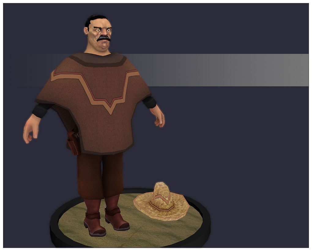
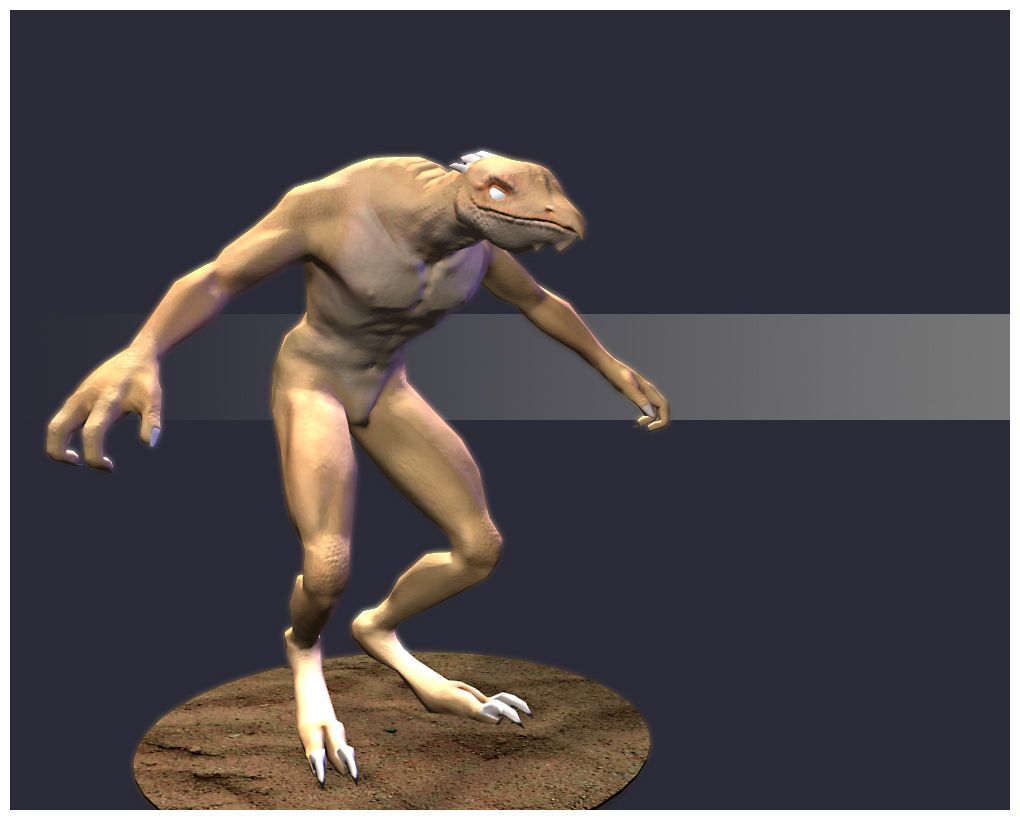
Heres a little image dump of my entire portfolio.
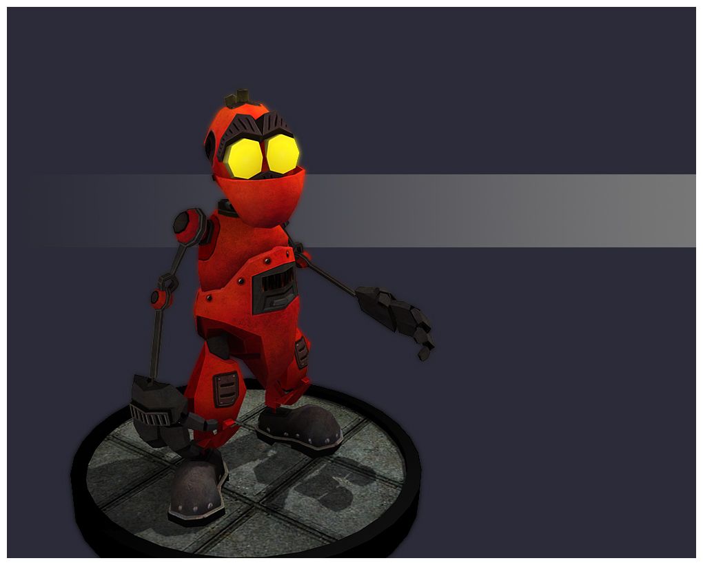
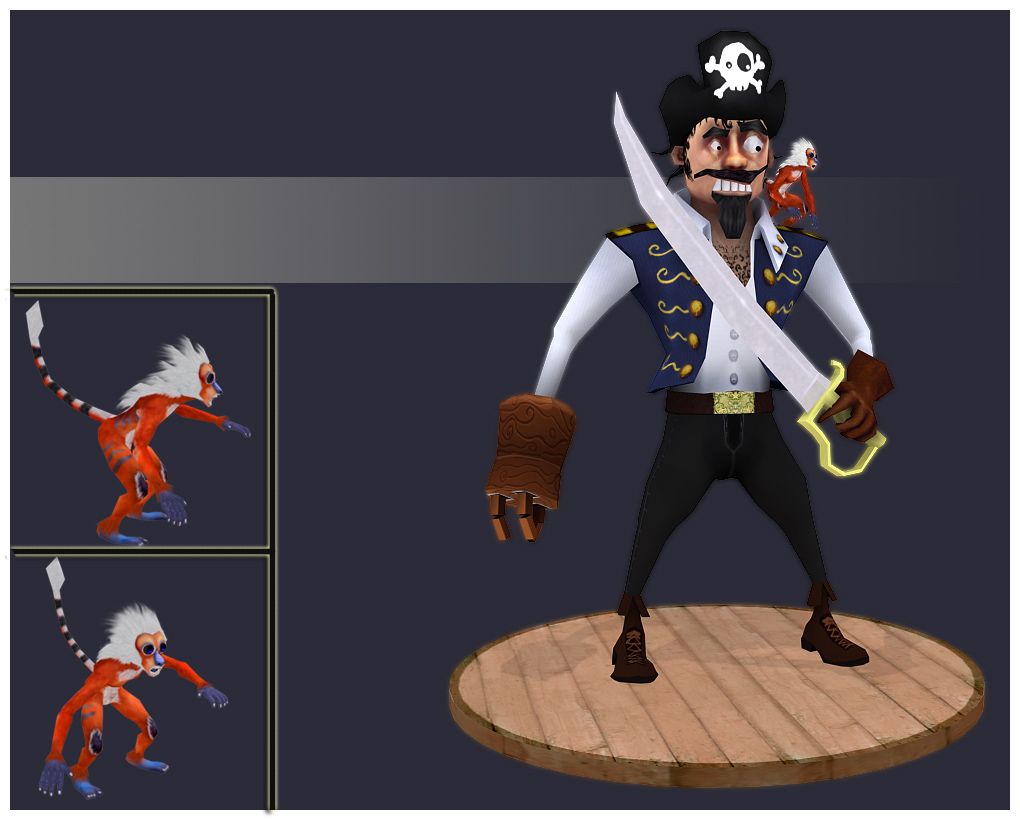
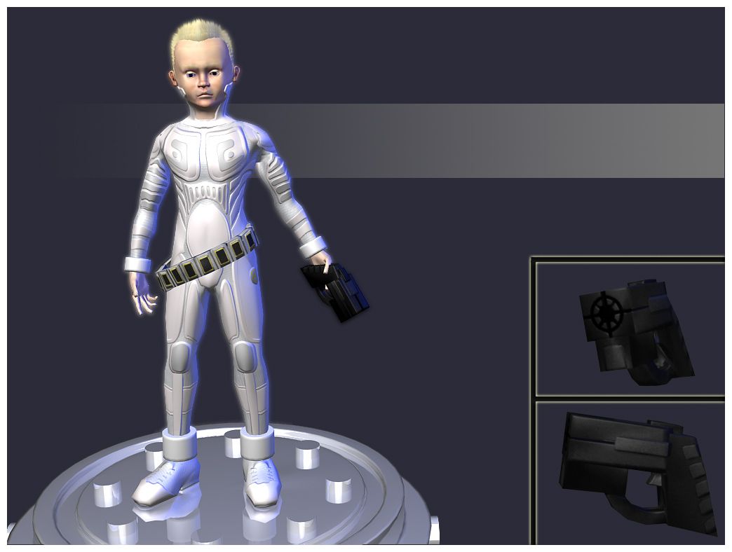
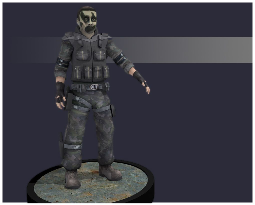
And just to compare, heres the link to the very first image that I posted on this forum
http://img.photobucket.com/albums/v223/aeson/hahahaha.jpg
Anyways, I just wanted to thank you guys for putting up with me this far. I've still got 2 years till I graduate and start lookin for a job. We'll see if I can't make some really cool stuff before then!
Heres a little image dump of my entire portfolio.


And just to compare, heres the link to the very first image that I posted on this forum

http://img.photobucket.com/albums/v223/aeson/hahahaha.jpg
Anyways, I just wanted to thank you guys for putting up with me this far. I've still got 2 years till I graduate and start lookin for a job. We'll see if I can't make some really cool stuff before then!
Replies
The mexican guy and the pirate + monkey are the ones that I think really stand out. The platforms are a nice touch too. GJ!
Edit: oooh, 60th
I do agree with EQ though. I notice it esspecially on the mexican guy. He's got a big ass cloth draped over him, but it has absolutly no folds?
Ahh well, still some great stuff man.
nealb4me, yea I agree, its definitely pretty small, but it starts to look a little odd when I get it much large. A large part of that is because I screwed up the proper monkey proportions for it. Its basically got human proportions with a monkey face and pose.
low odor, yea I hope to get some cooler poses. Sadly, right now most of those rigs are just 10 minute half assed attempts to make the pose asymetrical. Hopefully I can get some nicer rigs on them eventually.
EQ and tulk, yes. Cloth is probably my greatest weakness right now. I really have no understanding of how it folds and wrinkles and I lack the confidence to put it into my work. A lot of times I'll try to, but it'll end up looking shoddy, so I'll ditch it. I'll try to make that a focus on my next character. As far as revamping the kid, Im just planning to write that one off as a learning experience. I honestly dont like how the whole thing came out design wise. If I ever do overhaul it, it'll be waaay more then just the texture. (oh and eq, the lizardman has a normal map too
Hopefully, none of these models will be in my final portfolio by the time I start looking for a job. At least... thats my goal.
Anyways, keep pointing out any weaknesses you see in my work. Im not even close to as good as I want to be, so anything you guys can do to point out what I suck at would be lovely.
Your models are looking cool, I can see huge improvement from the 1st to the last
oh, and happy 1000th!