Portrait's need some work.
polycounter lvl 18
Hey everyone,
I'm fairly new to the digital art world, haven't used much color until I bought photoshop 9. I'm not that good with a regular pencil either but I'm trying to get better and I can't do that all by myself.
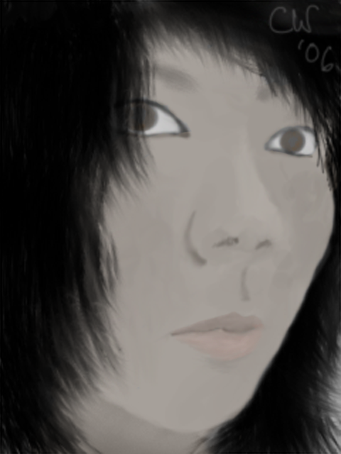
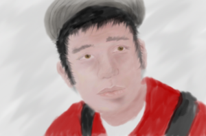
Heres 2 recent works i've done. I'm asking for critiques and helpful hints or links you can show me that will help me fix the problem.
Any help is appreciated, i really want to get over painting like garbage. I also realize that everyone has there own style, but before I develop mine seriously, i need the basics down.
I'm fairly new to the digital art world, haven't used much color until I bought photoshop 9. I'm not that good with a regular pencil either but I'm trying to get better and I can't do that all by myself.
Heres 2 recent works i've done. I'm asking for critiques and helpful hints or links you can show me that will help me fix the problem.
Any help is appreciated, i really want to get over painting like garbage. I also realize that everyone has there own style, but before I develop mine seriously, i need the basics down.
Replies
[ QUOTE ]
Any help is appreciated, i really want to get over painting like garbage. I also realize that everyone has there own style, but before I develop mine seriously, i need the basics down.
[/ QUOTE ]
That is great! I mean, fucking great! I hate it when people use style as an excuse for the lack of actual ability.
Now for digital painting, I have found that this tutorial is very well done, and fills you in on lots of good ways to go about certain aspects of digital painting.
http://itchstudios.com/psg/art_tut.htm
Now a critique:
The shape is there, it's just that they're coming off very undefined and rather muddy. Also very flat, there's hardly any shading in those two, there also don't seem to be any highlights at all. You also have very limited color in them, that could be a by choice, but you need to get some more color variation. Human skin has a plethora of various pigments in it. This should help a little. I can't remember who originally gave this to me, but it was given to me by someone here...
I do think this is more for a male though, but it gives you a good idea of what you'll be working with. Now it does vary for different sorts of skins, but again, it's really here for basic reasons.
keep working at it, you'll get better.
seriously, if you want to improve, and this might sound corny, but take a sketch book around with you and draw draw draw. once you're comfortable with drawing peoples faces it might be time to come back to your wacom, scan in a few sketches and mess about with them in photoshop.
it almost seems as though I'm afraid to add color other than what my eye is telling me is obviously the base color.
Also my eye usually tells me a color is alot brighter than i would imagine it on a color wheel.
<sarcasm>
oh yes i forgot to mention, my style of art invioles incorrect proportions and color usage along with no perspective and modified anatomy :] and THAT is why my picture looks the way it does :P
</sarcasm>
:
<sarcasm>
oh yes i forgot to mention, my style of art invioles incorrect proportions and color usage along with no perspective and modified anatomy :] and THAT is why my picture looks the way it does :P
</sarcasm>
[/ QUOTE ]
I think that styles becoming more and more popular!
<sarcasm>
oh yes i forgot to mention, my style of art invioles incorrect proportions and color usage along with no perspective and modified anatomy :] and THAT is why my picture looks the way it does :P
</sarcasm>
[/ QUOTE ]
That's my style too! I think accurate proportions and perspetive and that color thing just hold an artist back.