Flight--Low Poly Character
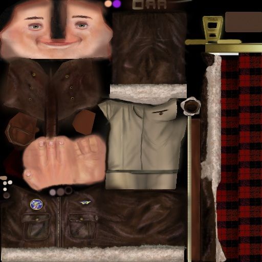
1001 tris...512 texture..nearing completion. All textures painted, minus the scarf...i got lazy on that.
Hes for a low poly class...Yep bout it...Comments and Crits Welcome...AND ENCOURAGED><<><><WINK>>WINK


3quarters
http://i2.photobucket.com/albums/y2/daveroo/progressF.jpg
Hes for a low poly class...Yep bout it...Comments and Crits Welcome...AND ENCOURAGED><<><><WINK>>WINK


3quarters
http://i2.photobucket.com/albums/y2/daveroo/progressF.jpg
Replies
The nose piece on his hat looks a little... strange. Did they really have those? With a face that wide I'd expect to see the nostrils poking out on either side of the strip. Right now its looking like he has no nose. maybe a tad bit more assymetry on his face to make the texture real estate worth it? give him a mole or something.
The scarf texture looks just a wee bit out of place, try running a very low smart-blur on it.
And I think the uvs may need tweaking, but also my video card doesnt have a very good viewport display, so that may be the problem.
So this is for the low poly class? Shame you got that one online, I hear Gabe teaches a superb low poly class. I'm trying to get Jeff to do another low poly workshop next quater.
Anyhow, good work man.
Also, added in some moles, and blurred the scarf a little, but it still seems a tad outta place..it may be the color.Any suggestions on what i could do to that would be very welcome.
Heres an update.
cant wait to see it animated n st00f
and heres the parachute.
Thanks gir!!!Stop playin with jedi genitals and get back to work!