Portfolio Review / Looking for Work

polycounter lvl 20
Hey all,
I am presently looking to make a change from where I am now. I would appreciate any feedback regarding my portfolio that anyone has to offer. Also, if you work for a studio that is presently hiring please feel free to pass my URL along. I DO have some next gen material that I will show upon request, but don't feel it is appropriate to display in my public portfolio presently. I would also appreciate it if any of you who happen to be contracting for LD at the moment keep this to yourselves. Granted, this is a public forum and individuals at LD may see this on their own, but I am trying to keep this as low key as possible. Thanks.
http://www.mforsyth.com

edit:
added sample images
I am presently looking to make a change from where I am now. I would appreciate any feedback regarding my portfolio that anyone has to offer. Also, if you work for a studio that is presently hiring please feel free to pass my URL along. I DO have some next gen material that I will show upon request, but don't feel it is appropriate to display in my public portfolio presently. I would also appreciate it if any of you who happen to be contracting for LD at the moment keep this to yourselves. Granted, this is a public forum and individuals at LD may see this on their own, but I am trying to keep this as low key as possible. Thanks.
http://www.mforsyth.com
edit:
added sample images
Replies
Web:
The first thing are the frames. I see you've gone for purely simple lay out but right now the frames are just killing me. I hate scrolling horizontally, especially to see art. You're trying to sell your art so this isn't nice. The thumbs could be placed in any number of ways and not have to use frames.
Resume:
I've got to admit I have no experience writing one or looking at them but under 'Qualifications' bugs me. It's not the layout its the use of capitals for every word.
Works Well in a Team Environment
Works well in a team environment
I dunno not much of a difference it just reads a tad better.
Art:
When you've shown wires the model is shadowed. I prefer to see 'Flat shaded' for wireframe shots, just helps you read it better. I don't know about the legalities but I'd also look to try and get a small texture shot in there like your SWAT guys. All the work looks good the only thing I would say is that the shots lack consistency in terms of presentation. Most have a white background and then there's one with a black one then the toilet with a ground plane. I don't know if you have access to these models but a consistent look in the presentation is nice. I think the levels are most certainly the strongest work(s) so I'd look to be placing them higher up and not looking like the last resort stuff to add work
not clear what you made in the final image there
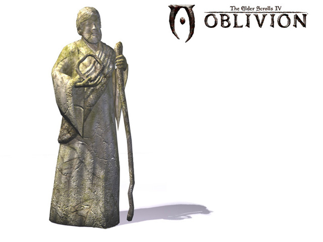
all the folds, hair, facial detail on that statue could have been done with the normal map you have applied, saving you roughly 240373498796836 polygons.
[/ QUOTE ]
OMG Hawken, you are totally right. I did that well over a year ago and it was my first time using normal maps; all of which were hand painted in Photoshop. I haven't really gone back and looked at it with a critical eye since then but what a huge WASTE of polygons that was. Chalk it up to inexperience combined with poor direction.
On one hand, I like having a big title like ESIV in my portfolio but both of the pieces I have there look very sophomoric to me at this point. Should I cull them?
Thnom, doesn't matter if you are in the industry or not, your crits are still valued and I appreciate the time and effort you put into them. I will take them into consideration next time I update (soon?). Thanks.
Looking good
You have some nice art, and i think your website detracts from that!
As Hawken mentioned, the statue is not a very good example of normal mapping - the lowpoly version has a huge amount of polygons wasted (look at the back of the head - what were you thinking?!)
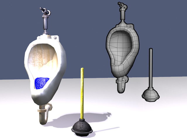
The urinal/plunger model is decent, and the texture might be ok, but the lighting/render is really blowing it out at the moment... also the way you have the ground plane visible and cutting the render in half is pretty unprofessional.
The buggy model looks good, but the texture itself is sorely lacking in detail - the side panels might as well just be a flat photo texture overlay... definitely needs a rework before it should be considered portfolio-worthy, IMHO.
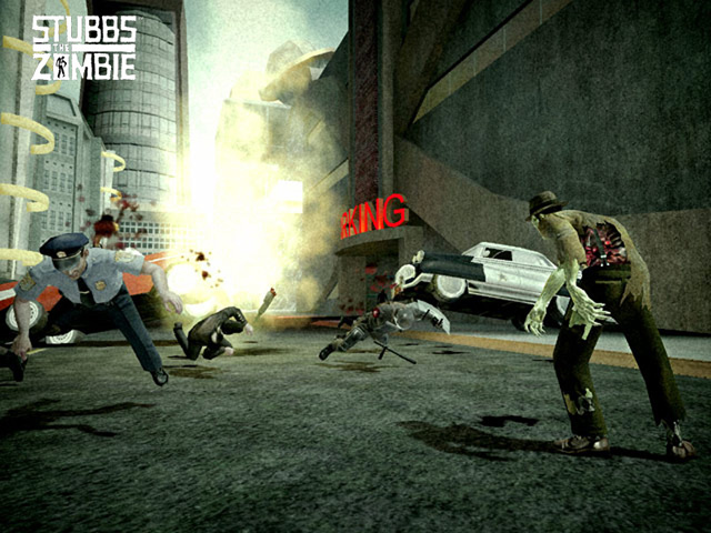
The "Stubbs the Zombie" screenshot looks nice, but did you do everything in it? If not, you should write a shot breakdown so employers know exactly what you did. If you did do it all though, good work, it looks pretty good.
In fact, now that I think about it - why did you select these images to post? The pink car you did for The Movies looks way better than the buggy here, and several of the other shots are higher quality than the ones posted here.
Like Spacemonkey said, your site could use an overhaul to look more professional, even if it's just using a style sheet to set the border style of the thumbnails, that'd go a long way to make it seem more slick.
Likewise, a consistent method of rendering out your models would help a lot in creating a more professional appearance.
Good luck with finding a new job, put a focus on refining your portfolio in that regard - quality over quantity!
-so many of the model renders are on stark white backgrounds, the least you could do is make the background more of a midtone with maybe a subtle gradient, it really tends to show off your work better than straight black or white.
-You really should lock down your website template size, I use widescreen monitors so the thumbnails you have on the right swing way out to the side, making the site look like a bunch of separate pieces, locking at least the horizontal size down will prevent people on different resolutions from seeing the website at awkward sizes.
-some kind of description next to each image would be great, list off the tri count, texture size, for ingame screenshots...it'd be great to know which part you did for those, even if you have them bullet pointed in your resume.
-I think a big one is the fact that there's no design involved in your site, you made no graphical interface at all, even something as minimal as a a few solid colored background shapes grounding everything together would go a longgg way to make your site look well designed.
Great work though, you've been on a nice number of projects, very cool!