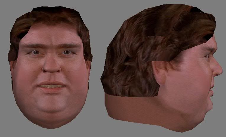
John Candy
Been a while since I've posted much of anything recently but I recently decided to bring Candy back to life, or thats the plan anyway (model -> skin -> rig -> animate to sound clips).
This is Candy from Uncle Buck. I am currently really happy with the profile, but the front is still lacking something, if anyone has a clue what "it" is, do share. I've UV'd him up, and am going to embark on the scan later tonight (I've made the template photosource base ).
).
Progress shots can be seen here: http://s10.photobucket.com/albums/a136/thnom/johncandy/
The latest shot: (I know the eyes are fucked! - as are the teeth ALL TEMP)

Wireframe: http://i10.photobucket.com/albums/a136/thnom/johncandy/candy5-wire.jpg
Texture sheet (temp!, UV Layout is final though): http://i10.photobucket.com/albums/a136/thnom/johncandy/candy5tex.jpg
C+C welcome..
PS Mop, I know its not an 'original' piece, but hey - its still doing something..
This is Candy from Uncle Buck. I am currently really happy with the profile, but the front is still lacking something, if anyone has a clue what "it" is, do share. I've UV'd him up, and am going to embark on the scan later tonight (I've made the template photosource base
 ).
).Progress shots can be seen here: http://s10.photobucket.com/albums/a136/thnom/johncandy/
The latest shot: (I know the eyes are fucked! - as are the teeth ALL TEMP)

Wireframe: http://i10.photobucket.com/albums/a136/thnom/johncandy/candy5-wire.jpg
Texture sheet (temp!, UV Layout is final though): http://i10.photobucket.com/albums/a136/thnom/johncandy/candy5tex.jpg
C+C welcome..
PS Mop, I know its not an 'original' piece, but hey - its still doing something..
Replies
I think this piece's main strength is the well done photo use as a texture, but your facial structure is off in several places, eyebrow arch, forehead shape, nose, etc.
Good job to get a likeness though that in itself is tough!
Profile shot here: http://i10.photobucket.com/albums/a136/thnom/johncandy/candynose2.jpg - editted, whoops linked to same image.
This better matches the shots I have and what you guys have shown, thoughts?
By the way, what do you guys mean when you say "the brows a bit straight"?
Are these better? I actually saw what you mean rooster as soon as I read it.. he looks evil when bigger people in general have a softer appeal about them, and in Candy - the eyebrows are key. The eyes are still off-putting in that area, but I think the eyebrows are now fine.
Now onto seeing if its the eyes geometry or the texture thats the problem. Then the teeth, and when I get back from my holiday (go to magaluff on saturday for 10 days) I'll start the proper skin.. (I don't plan on using the photosourced skin).
Wireframe of above here: http://i10.photobucket.com/albums/a136/thnom/johncandy/candyneweyes2.jpg
Fixed the eye mesh (brought the eye lids lower down) and cut the eyes in half (giving them more texture space, no back half). They now look much better IMO. I also added (although you can't see a damn thing) an extra row of vertices so when he blinks they'll actually wrap around the eyes - also fixing the eye UVs - I hadn't noticed before but they overlapped over the eyelids, now they are inside.
I also changed the teeth texture and made the lower teeth slightly further back (they were intersecting the "back" top teeth). This also has the happier-candy eyebrows from earlier
I just have a few short crits.
I think his forhead is too small. His hairline doesn't receed nearly enough.
His nose is too fat towards the end. he has a pretty streight nose... sexy, even. Your head's nose is too curvy.
John's features are more like your chartoon character fat guy features. Bubble cheaks and nose, he looks so happy all the time. Your characters cheaks are too flat, and his chin doesn't pop out nearly enough... Perhaps this is because your neck-fat is flush with the cheaks. If you bring in the double chin on the sides make his head look more like an upside down egg, then i think that'll help. Also, make his cheaks POP! those suckers are full of life and love in john's photo.
Thinking about it... your head looks more like john maden.
Good luck, hope this helps.