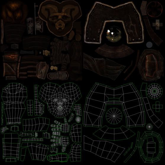
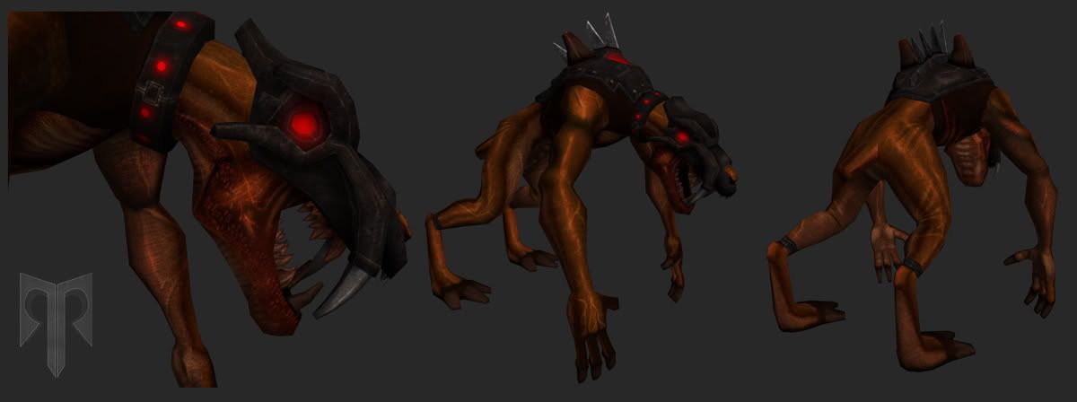
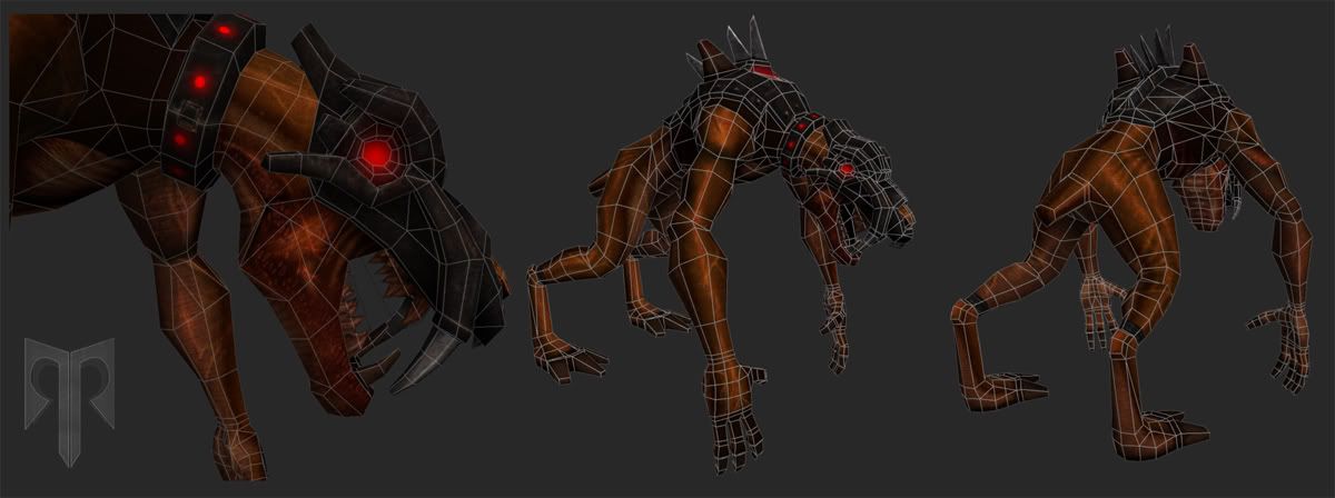
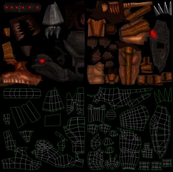
Well, the textures for both of them look very dark on my moniter. The texture overlays seem a bit intense, and there could be more hand painted detail, for example with the anatomy, because the anatomy doesn't look quite right.
Its a good start, and the characters look pretty cool.
Looks good, especially the head on the first one. I think you could collapse some edges on the side of the mouth that are extremely close together. Also, I'm with ninja's on the anatomy and contrast, they're very dark and blurry. Use some hard edged brushes and get some more lost/found edges in there.
Oops! I forgot to include my concept to the first character, it shows why I chose the boxy stylized look (head)...thanx for the advice guys...I agree w/ Ninja and poop I'll work on the definition and contrast of the textures...
Romel.
Looks great man. Depending on how the ankle is going to animate on the second character, you might want support the joint a little better. Possibly pull some out of the head?
Replies
Its a good start, and the characters look pretty cool.
Scott
Romel.