Forest
Well I got it my problem sorted out.
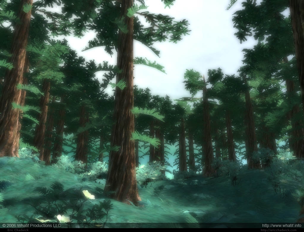
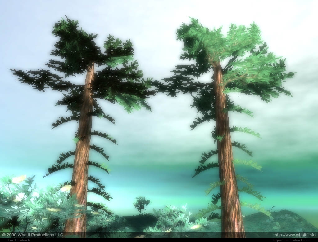
Here's the result in the engine. The edited normals really help the shading of the non-light-facing branch-planes.
Here's an example of non-edited (left) vs. edited normals (right).
And here's what the normals look like in 3ds Max.
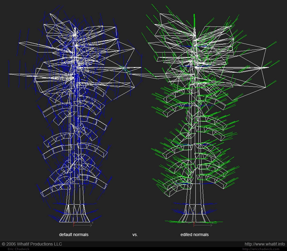
I rotated most of the normals to point out and up, but where the planes meet the trunk, I made those normals point straight out, so they would match the trunk's own normals, and so those verts get the same lighting direction as the trunk. Neat huh?
This is the first time I've had the chance to use this feature, and I'm really digging it.
So, I'm fishing for feedback... any ideas what I could do to improve these? I'm thinking about making the trunks more gnarly, for one thing. Also might add a vertex shader to get some wind going.

Here's the result in the engine. The edited normals really help the shading of the non-light-facing branch-planes.
Here's an example of non-edited (left) vs. edited normals (right).

And here's what the normals look like in 3ds Max.

I rotated most of the normals to point out and up, but where the planes meet the trunk, I made those normals point straight out, so they would match the trunk's own normals, and so those verts get the same lighting direction as the trunk. Neat huh?
This is the first time I've had the chance to use this feature, and I'm really digging it.
So, I'm fishing for feedback... any ideas what I could do to improve these? I'm thinking about making the trunks more gnarly, for one thing. Also might add a vertex shader to get some wind going.

Replies
I thing the colour of the trunks is perhaps too brown - it depends on the art style, but trunks are almost green in many cases.
The trunks seem to be big needles - no variation
The branches seem to be big leaves intersecting the needletrunks
And it's been a pretty harsh winter.
Bloom is almost the lense flare 2.0.
As for the trees, i'm not a fan of them at all art wise. For all those shader ops those trees should be much higher detail. If you want i could make you some trees for your tech demo?
Sorry about the bloom, don't have any control over that right now.
Yeah the weird oversized leaves need work. I was inspired by a redwood forest in one of the LucasArts games, but then took it way too far.
I don't understand the normals issue Zatoichi. Verts are welded where possible, and the normals work pretty well as-is. Could use more finesse though, too brightly lit right now. What bugs do you speak of?
Thegodzero, I'll take you up on that.
OK more geometry, yes a good plan. I need to profile the scene, but I think I'm fill-rate bound at this point, more room for more geom. Should probably drop the normalmaps from the leaves/branches, not all that effective at this point anyhow.
Will post improvements as I get them. Thanks again. More comments appreciated.
I'm not sure if you saw this, but this is the LOD i was thinking of going for.
http://tgz3d.com/newtree2.avi
quick test of some redwood bark using at 256 res and 512
That is indeed an amazing place to walk, though the paths are kind of fenced in now since it gets so much traffic. The photos are the areas you're forbidden from entering, so they've retained their untrampled lushness. If you venture further afield though, you can find less managed groves. Magical. I'm hoping to get a sense of this, not just a reproduction. But I'm not nearly there yet.
Tgz, I unfortunately don't have the budget to pay for anything, and to be totally honest in the end I might not being able to use your trees for one reason or another. But I encourage you to go for it. You could use it as a learning experience if you like.
Your tree complexity looks reasonable, though the redwood version of it would need some work with the vertex normals to soften the shading artifacts in the crossing planes. The bark seems a bit too lumpy to me, redwood bark actually has these hairy-like striations in it, and deep grooves. Hard to do in a normalmap.
Here are the flats I used. I like how the bark came out, the normalmap is also intended to tile separately from the colormap. I think the ground texture needs more color variation though.