UT2004 Map: 1on1-MobiusLabs
polycounter lvl 20
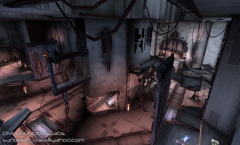
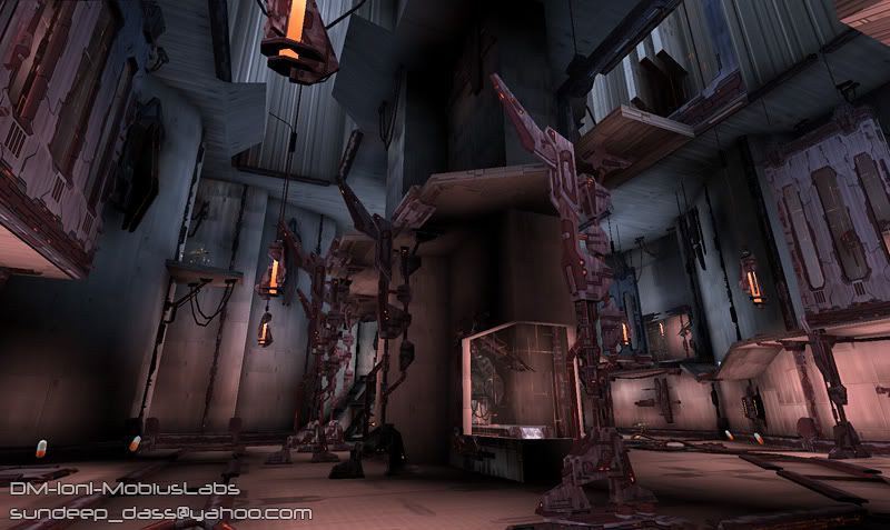
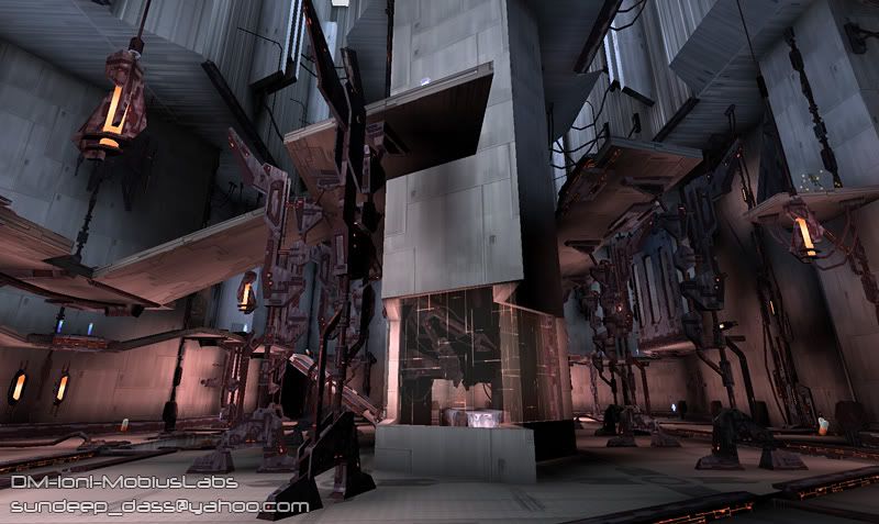
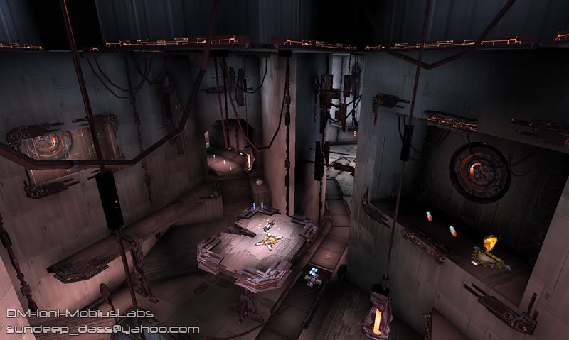
Hey, so I've been out of the games biz since Sept. last year, dealing with illness. When I had moments when I was feeling well, I decided to keep my skills up to par by working on a map for UT2004. Here are the finished results:
More screenshots, wires, texture flats here:
http://www.sunny-d.com/mobiuslabs_pics.htm
Oh, if you want to download it, you can grab it here:
http://nalicity.beyondunreal.com/map_hub.php?mid=9036
It's 100% new textures and static meshes. Crits appreciated, especially from those of you who play it. It's my first map and I'd like to make more, so I'd like to hear what you think about flow, size, etc.
-Sundeep
Replies
About the only crit I have is that it looks far too busy, especially in the second shot. The eye doesn't really snap to any place in paticular, which I've always found to be a nightmare with navigation.
However, I feel this way about many of the UT2004 maps, so it's probably just a personal preference thing.
I'll download this one and let you know how it plays.
It looks like you've got some mega-stretched textures in the ceiling.
It does indeed seem a little busy. Hard to follow visually.
I really like your textures. Very clean & well made.
Scooby - That texture that looks stretched actaully has some subtle horizontal lines running through it. I guess a little too subtle though. I wanted a texture to reinforce the verticality of the skylight areas, but I probably should have used a different pattern.
cman2k - thanks for the comment on the paintovers. I'm not exactly a pro concept artist, but doing those helped me really visualize the look, and lighting, most importantly, before I started making an art pass.
The way you built this level looks odd because you have massive, major level layout details, with small map object details and no mid-ranged shapes. Additionally, the materials between the level and the map objects is high contrast. This means the transition between the big and small details is very noticeable (like lego pieces tossed about). This reveals how your level was built just by quickly looking at it, and breaks the illusion or imagination that the user is actually in some facility.
Your base level is just too simple. Building up trims, more angular extruded shapes, texture variety, etc would have a huge effect. Work on making your level look nice and detailed before you pound in the map objects. Basically, you want to take a step back and look at how shape and detail is handled on old fps games such as the earlier versions of UT, quake, etc. Then, pour in all that map object detail and you'll have an amazing map.
One problem with the lighting is it's mostly sourceless, had you build up trims everywhere with little recessed lights, I think you'd be set.
Zergxes - Metroid Prime happens to be my favorite game from the current gen.
It has a very attractive look to it, and it's fun. I'd say top notch job there.
As a designer, sure, maybe there could be some minor issues with light sources, I guess, but as a player, I couldn't give two shits less. The only issue I had as a player, is that in the center with the tech items, my framerates slowed just a bit.