Demo Reel Urban environment model (WIP)
Hey all. I'm currently in my last semester working on my demo reel. It's still a working progress and I was hoping for some feedbacks. Be brutal as possible  . I haven't had any textures yet and some buildings, cars, etc are still being constructed.
Man stupid yahoo ...no hot linkin
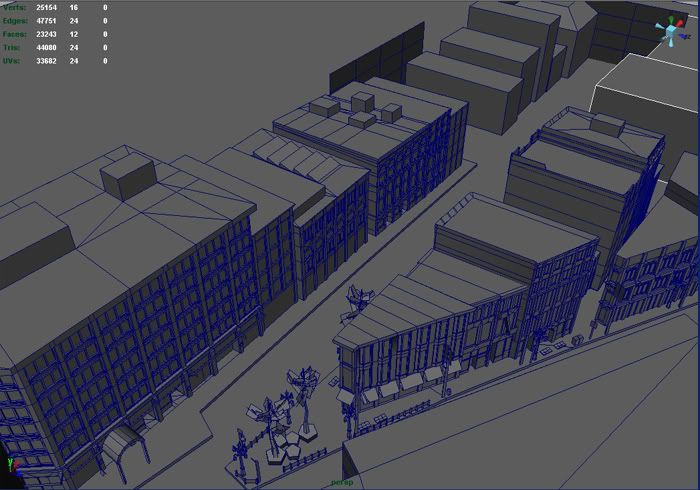
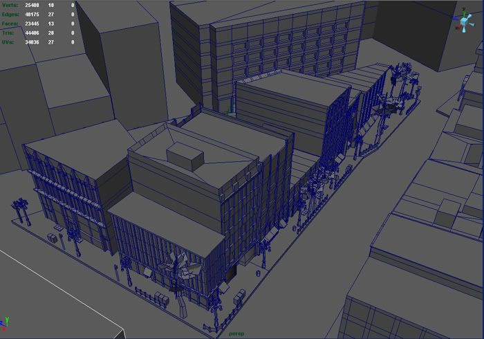
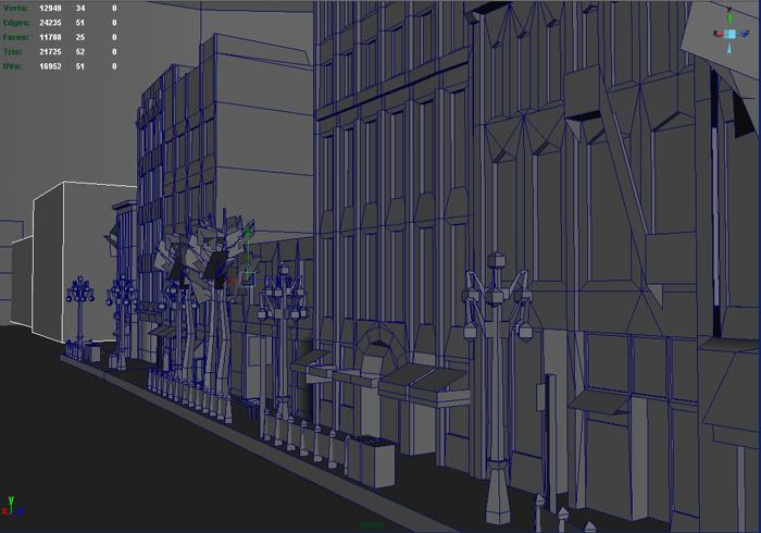
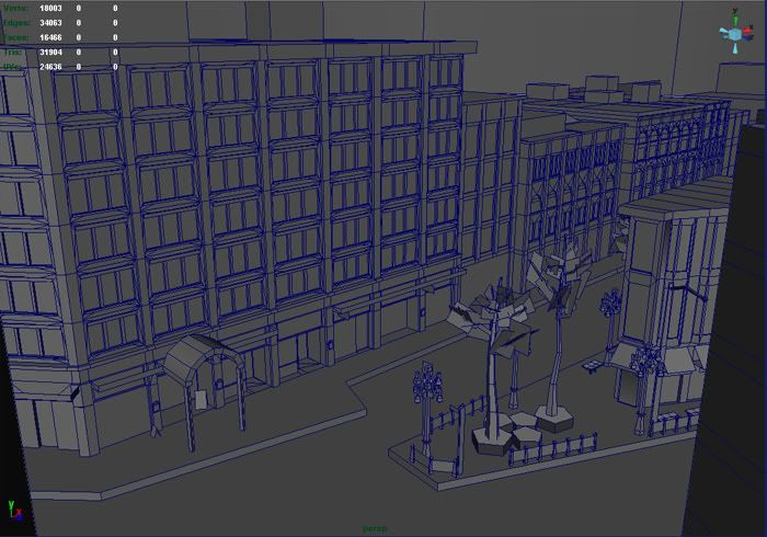
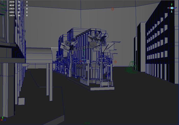
 . I haven't had any textures yet and some buildings, cars, etc are still being constructed.
Man stupid yahoo ...no hot linkin


Replies
I think you have some odd and useless polygons. for example on the top of the buildings but also on the front.
good luck with uv's and texturing.
It helped me with my buildings and it could help you
But the whole scene looks good, just fix up those few things.
The scene looks pretty good so far. I'd definately suggest you take a look at chris's tutorial. If you were going to break this up and import it into a game engine the more modular the better. That way the engine will have an easier time culling out objects in pieces instead of a whole building.
Also, one pet peeve I have with a lot of peoples city scenes is their fire escapes. I don't know what reference you're working off of but they fire escape in the third picture looks a little too steep. Unless its a stlanted ladder
Keep it up.
Polys with more than 4 sides are not really sloppy as long as they are perfectly planar and they are not overly complicated (like part of an arch).
Breaking up all the buildings into tiny bits as suggested in the tutorial is INSANE. It's a good technique to build a building quick, but then it should be imported as 1 piece into the game.
If it's an FPS or 3th person game you may want to have the upper half of the taller buildings as separate objects, so when possible, only the lower half that's always in sight gets drawn.
If it's for a GTA style game i wouldn't even bother doing that.
Engines work better when you feed them with large chunks, better to have 1 2048x2048 texture than 4 1024s, and the same applies for geometry.
UT games were close quarter and mostly indoor games were the lego approach made sense, plus the levels were built by LD's not artists, so the prefabs allowed them to have decent quality geometry and textures, and enough flexibility with the level design.
I'd still work that way for interiors, but it doesn't make sense for a city exterior, not even from an instancing pov.
I can't see anything wrong with the screenshots, besides some unnecessary (?) slicing like in the rooftop to the left in the first screenshot, unless a texture with some detail is supposed to go in there. If not, i'd clean that stuff up.
About the 4 sides...my roofs are seperate object entirely. I thought it was a good idea to for cutting down the amounts of polys. My roofs are mostly jus 4 sided square...most of them but there are a few roof tops are included with their buildings in which I added more triangles to cut out 5 sides. Since I have posted those images...I haven't gotten any 5 sided.
Also for my reason of adding the roof top...I was thinking of a helicopter panning on my scene and as well as drive thru. Should I jus ditch the helicopter pan infavor for my CARish drive thur pan? And yeah I was hoping for a GTA typing on my demo reel.
As for the fire escape...yeah it is that slented
Yeah I'll be cutting out some sides that are not showing in the camera. I wanted to wait until I have finished up high res buildings for showcasing.
I should have started with them in more peices at the very beginning. I modeled the buildings each started from one peice..then seperated the roof top at some of them.
And about the UVing...lol! yeah I have been starting with some of them already.
kalinka, Daz, Ben, Phobos and StrangeFate thanks for all the input.
I've worked on Xbox 1 games with a million polys per environment and next gen games with not even half that.
It overall looks good, except maybe you have a bit too much detail where you do not really need it. Depends on your camera angle but most of the high up windows would be easier just to texture on instead of increasing the poly count. Also the stuff on the very tops of the roofs may not be neccessary, that is unless you have a plane flying over or the camera goes that high.