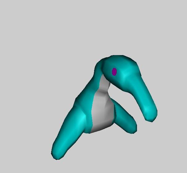
Yup. I was just going for getting the gist of it. I promise you, i will make this guy look evil. Somehow. I should make giant smog emitting pipes on his back...oooo and he would have somekind of gas mask, as well...
maybe. I'm just gonna mill around, play some games, formulate some ideas...
He's not much of a general. A pizza cutter isn't too powerfull for a weapon. But hes got a nice little form.
What would make him ownage would be little biped jumping minions that look alot like him/her to chew thorugh armor while he pizza cuts the rest with a sweep.
hey now, get back up and try again. take a step back to the concept until you get something you really like, i'd say don't stop until you got something you really want. you can do it.
Yeah, I figure I should give it my all on this bastard. Now i'll have something to do in study hall. Hehhehe.
Uhhh...Yeah, for like...the last hour or so, i've been thinking of ideas for him. Huh...I'm considering giving him Six eyes...three on each side of his head. Dunno what else though.
Update lawl
He now has a coat, and a weapon. A big one.
Also, he has an extra eye. May add a third one to each side, as well...I might give him a lil' hat too.
Jimmies i'm going to help you, but i'm not going to draw over it myself because honestly even you know that at this basic a level you understand how your design just doesn't say "i'm evil and scary". it's pretty obvious why.
if it isn't obvious, just take a little mental field trip. you're your own museum of favorite villains and evil-doers. what do they have in common? what are the visual signifiers of bad-assery and "i'm a mean guy" ?
take an extremely iconic example, Darth Vader. first of all, he's all black. lazy visual shorthand rule one, is that if you want to make something look evilish then make it predominantly black and red. second thing about darth vader: he is tall, you can't see his face, and he has scary materials on: a shiny helmet and leather. they both say "hey i'm kinda evil". the shapes of darth vader's helmet are predominantly sharp, not curved and soft. it does of course have some spherical elements, like the dome and the eyesockets, but everything is framed by sharp edges, which is not friendly. he's got a deep voice and is just generally very menacing. i could go on with examples, but take a look through the museum and it will be obvious.
so what's going on with your design? if we were to guess, we'd say that your'e going for as inoffensive and cute as possible. he is not dark-colored, he is not tall, he has a large head, and he's mostly soft and rounded, no hard edges. he has a snout like an anteater or an elephant, neither of which are particularly scary creatures. if you're going to borrow something from nature, borrow something scary. like a carnivore, or better yet, the skull of a carnivore.
so why don't you draw something fairly big, with a proportionally smaller head, with teeth, with furrowed brows (you know what an "angry" expression looks like, right?) sharp edges, and make it dark colored. it's really not particularly difficult, this is childhood good vs. evil here buddy now get going on something other than Cutie McNiceSnorkel here
I think that the problem here is that you are stick to a base that does not feel scary at all. Do not take me wrong, it could en up looking very freaky with all those machinery over it, but if the starting feel is "soft" then that will be growing all over the process.
Why not put a scary mouth like a worm with an ugly tongue hanging from there?
I really would get sticked to some concept before starting to move vertex.
I would look at stomach worms and different types of parasites for some inspiration. Macro-photos of thicks and leaches could give some interesting ideas too. Do a search in photoforums.
Well, it's more so i just had the concept laying around, and started making it. I'm liking the way it's turned out myself, but maybe his true evil lies within his misleading appearance?
Still, I hope to make him better suited for being a general on the warish side.
nature is full of creepy animals to take reference,, like this... "The Vampire Squid from Hell" or vampyroteuthis infernalis (this is a real animal! and thats its real name!! how can you not be evil with a name like "the vampire squid from hell"
How much more fucking bad-ass of an animal could you be?
Dude, i really need to start looking some shit up for ideas. Oh man, how fucking awesome. Wow.
There. Concept...of upperbody. Hope to add a lower section soon....
"ME KILL GOATS NOW"
I was also thinking..he's more of some kind of flesh incarnate for some greater being in a distant place...Captured off his homeworld of Suquamodas...(don't ask, i really made that up on the spot) and techno-augmented with mechanical parts. The people of his planet are quite advanced. His homeworld is a very wet place...has lots of oceans, with mostly low lying land, rock, and sandbars...etc.
I'm finally happy with him/it.
Yeeeeeeeah!
Abducted from his homeworld, Techno augmented, and has a sort of behavior control chip in his brain, allowing him to be controlled from an underground base. The day the chip breaks, it's unknown what will happen. As you can see, his capturer at least saw fit to suit him up with some nifty Treads.
Agh
I'll just post the link to my deviantart album, then. http://www.deviantart.com/view/28786431/
By the way, i checked out CGhat, and they really don't have anything, from what i can see..
Yeah, kind of a big mess at the bottom...actually, all over. I blame ms Paint. That bastard. Now to see if i can find a better color choice...Jacket'll be black or something.
Edit: Just so ya know, i intend to keep the color scheme...somewhat.
I give. No way i could make this thing as much to my liking as possible within the time limit. From now on, i'll be going at my own pace. I do intend to finish him. Just not for the contest.
Hey, no worries. When we start we're all slow. When I was 13, my uncle was telling me that I'd be able to do models 10 times better and 50 times faster within just a few years, IF I kept at it. Of course, I didn't believe him, but looking back I see that he was right. Camparing my stuff from when I started 3d four years ago... sheesh, it was far worse than than what you could call horrid.
I'm glad to see that you are humble enough to admit defeat, and yet courageous enough to finish. That's a good quality to have.
Replies
the colors you chose to model in are far too bright and cheery!
maybe. I'm just gonna mill around, play some games, formulate some ideas...
Imagine that as an upperbody...he'll have a robotic lower body.
What would make him ownage would be little biped jumping minions that look alot like him/her to chew thorugh armor while he pizza cuts the rest with a sweep.
Just an idea.
Uhhh...Yeah, for like...the last hour or so, i've been thinking of ideas for him. Huh...I'm considering giving him Six eyes...three on each side of his head. Dunno what else though.
He now has a coat, and a weapon. A big one.
Also, he has an extra eye. May add a third one to each side, as well...I might give him a lil' hat too.
if it isn't obvious, just take a little mental field trip. you're your own museum of favorite villains and evil-doers. what do they have in common? what are the visual signifiers of bad-assery and "i'm a mean guy" ?
take an extremely iconic example, Darth Vader. first of all, he's all black. lazy visual shorthand rule one, is that if you want to make something look evilish then make it predominantly black and red. second thing about darth vader: he is tall, you can't see his face, and he has scary materials on: a shiny helmet and leather. they both say "hey i'm kinda evil". the shapes of darth vader's helmet are predominantly sharp, not curved and soft. it does of course have some spherical elements, like the dome and the eyesockets, but everything is framed by sharp edges, which is not friendly. he's got a deep voice and is just generally very menacing. i could go on with examples, but take a look through the museum and it will be obvious.
so what's going on with your design? if we were to guess, we'd say that your'e going for as inoffensive and cute as possible. he is not dark-colored, he is not tall, he has a large head, and he's mostly soft and rounded, no hard edges. he has a snout like an anteater or an elephant, neither of which are particularly scary creatures. if you're going to borrow something from nature, borrow something scary. like a carnivore, or better yet, the skull of a carnivore.
so why don't you draw something fairly big, with a proportionally smaller head, with teeth, with furrowed brows (you know what an "angry" expression looks like, right?) sharp edges, and make it dark colored. it's really not particularly difficult, this is childhood good vs. evil here buddy now get going on something other than Cutie McNiceSnorkel here
Why not put a scary mouth like a worm with an ugly tongue hanging from there?
I really would get sticked to some concept before starting to move vertex.
This is war! and we need warriors! Keep it up!
Still, I hope to make him better suited for being a general on the warish side.
Dude, i really need to start looking some shit up for ideas. Oh man, how fucking awesome. Wow.
There. Concept...of upperbody. Hope to add a lower section soon....
"ME KILL GOATS NOW"
I was also thinking..he's more of some kind of flesh incarnate for some greater being in a distant place...Captured off his homeworld of Suquamodas...(don't ask, i really made that up on the spot) and techno-augmented with mechanical parts. The people of his planet are quite advanced. His homeworld is a very wet place...has lots of oceans, with mostly low lying land, rock, and sandbars...etc.
Finally finished with the bastards concept. Now i can only hope i can make the 3 dimensional representation nearly as interesting/good.
Yeeeeeeeah!
Abducted from his homeworld, Techno augmented, and has a sort of behavior control chip in his brain, allowing him to be controlled from an underground base. The day the chip breaks, it's unknown what will happen. As you can see, his capturer at least saw fit to suit him up with some nifty Treads.
I'll just post the link to my deviantart album, then.
http://www.deviantart.com/view/28786431/
By the way, i checked out CGhat, and they really don't have anything, from what i can see..
Edit: Just so ya know, i intend to keep the color scheme...somewhat.
I'm glad to see that you are humble enough to admit defeat, and yet courageous enough to finish. That's a good quality to have.