The BRAWL² Tournament Challenge has been announced!
It starts May 12, and ends Oct 17. Let's see what you got!
https://polycount.com/discussion/237047/the-brawl²-tournament
It starts May 12, and ends Oct 17. Let's see what you got!
https://polycount.com/discussion/237047/the-brawl²-tournament
Q4 Xaero
This is Xaero, from Quake 3, with a tribal spin:
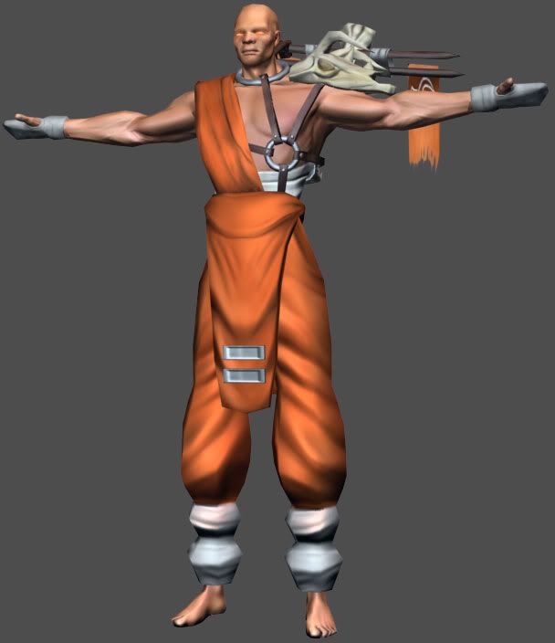
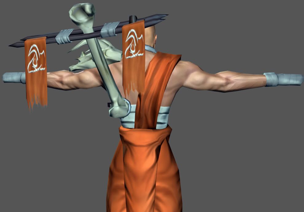
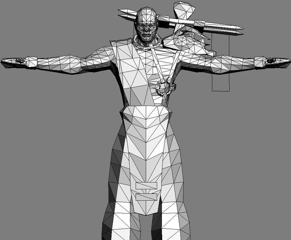
He's currently at 3296 tris (A bit high for Q4 spec? ), I'm using a 512 for the head, and a 1024 for the body. I'll post some screens from the Q4 Model viewer soon.
I'm basically finished, but some crits and comments are always obviously welcomed, especially regarding the textures.
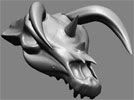
Renders of the Hi-poly mesh I used for the normal maps:


He's currently at 3296 tris (A bit high for Q4 spec?
 ), I'm using a 512 for the head, and a 1024 for the body. I'll post some screens from the Q4 Model viewer soon.
I'm basically finished, but some crits and comments are always obviously welcomed, especially regarding the textures.
Renders of the Hi-poly mesh I used for the normal maps:


Replies
However, your proportions here have a lot of issues. Mainly the legs are far too long, and his waist is too narrow - fortunately since you've normal-mapped it, you can just scale the low-poly mesh's legs down vertically, and scale the verts around the waist to be wider - I think that would result in much better proportions and make him look more believable. Right now those legs look extremely odd.
Also on the texture I'd work on getting some more colour variation and detail into the bone parts (the one on his shoulder, and the one on the back) - maybe if they were darker and had more brownish speckling it'd look more like bone, right now they seem very plain and grey, makes them look more like plastic than bone.
Good work though, keep it up
KDR_11K: In Q3 he was an augmented shaolin monk, yes. But I felt like doing something different, and I wanted to replace that arm thing on his back. And, since this is a re-design, I can do what I want
that and MoP's keen observations aside, it's looking pretty good. keep up the good work.
The eyes may be too wide too
The main problems with this have been said. He DOES have black facial features with white skin, which looks quite odd. Theres also not a lot of detail to the diffuse and specular, and i dont even think you have done a height map (Something which is really suggested)
The face does have a height map, but it isn't showing up properly in the max scanline renderer.
Isn't this enough detail for a normal mapped model's diffuse map?
As for the face, both asian people, and african people, tend to have wide cheek bones, large lips, and large noses.
But obviously this is closer to african, so I'll tweak the nose and lips a bit.
http://www.quake2evolved.com/odium/kane_head.jpg