The BRAWL² Tournament Challenge has been announced!
It starts May 12, and ends Oct 17. Let's see what you got!
https://polycount.com/discussion/237047/the-brawl²-tournament
It starts May 12, and ends Oct 17. Let's see what you got!
https://polycount.com/discussion/237047/the-brawl²-tournament
Q4 Gorre Redesign
I wanted to make a thread for this because this is the first character I've ever tried to model (aside from some low poly thing I did last week) and I'd like to get some good feedback on it.
Here's my concept: http://img.photobucket.com/albums/v19/dfunkt/Dfacto-GorreFinal.jpg
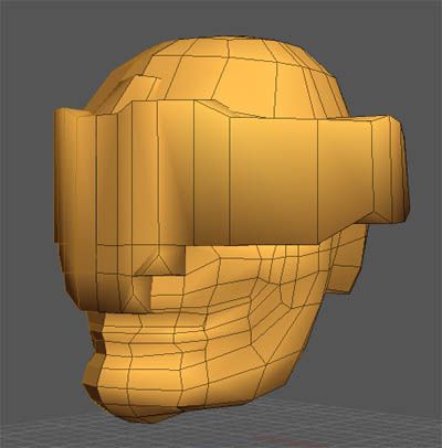
And the head so far:
My main question is: is the geometry looking alright? And, I have the visor split from the face, so should I fill in the big gap in the face with geometry, or should I leave it as a hole. Same goes for the back-side of the visor.
And two things to keep in mind are that he doesn't have a nose, and his face is majorly screwed up, so his cheeks aren't supposed to be normal.
Here's my concept: http://img.photobucket.com/albums/v19/dfunkt/Dfacto-GorreFinal.jpg
And the head so far:

My main question is: is the geometry looking alright? And, I have the visor split from the face, so should I fill in the big gap in the face with geometry, or should I leave it as a hole. Same goes for the back-side of the visor.
And two things to keep in mind are that he doesn't have a nose, and his face is majorly screwed up, so his cheeks aren't supposed to be normal.
Replies
and the edge loop look a bit chaotic.
Personnaly id remove all smoothing groupe while modeling.
Bit of work trying to get the edge loops smoother, plus I moved the visor away and filled up the hole just because it was bugging me to see the other side of the model. Still don't know if I should leave it like that or not.
As for the visor, I think I'll leave that till later. It's true that it isn't smoothing properly, but I can't find any 2 point polygons and there was only 1 unwelded vert that I fixed up. Either way, I'll probably just remodel it.
For your first character this is phenomenal. YOu don't want to see my first...
If it at all interests you, I have a base model I'd be willing to contribute to your cause. If you'd prefere to do it yourself, I can understand, as this experience is needed.
What would be really great though is if someone has a good picture for what proper joint geometry looks like. I.e. shoulders, elbows, hands, neck. I think I can piece the torso and head together well enough by stealing the geometry layout off of pior's patriot model pics.
Btw, vahl, you asked if you could do my model in the q4 thread. Not sure if you got my PM, but the answer is a definite yes.
I think I can piece the torso and head together well enough by stealing the geometry layout off of pior's patriot model pics.
[/ QUOTE ]
Funny thing is, that's exactly what I did with the base mesh I built. Of course, mine's not nearly as good as Prior's... he's like... a God!
Does Prior have any character tut's by chance? If not, his godly neck should be lynched. It's practically stealing!
keep it up ^^ training it the way of the samurai !!
Here's an update:
I left the head I had and just reworked it somewhat. Hopefully it will make a good zbrush base, and I can use it as a lowpoly later as well.
The body is coming along, although I have no idea if I'm placing the geometry well enough. I used the loomis orthos from "Figure Drawing for all it's Worth" to get the shape right.
Er, that's all, carry on, keep practicing, yes I know you can change it, nothing to see here...
Anyways, here's my "final" low poly organic body. The Ignore anything below the knees, because it's totally useless for the final model, so I left it with little work.
Any and all comments would be greatly appreciated.
I've found (and regularly read) that for using a mesh in Zbrush it's better to use geometry that has a roughly consistent quad size throughout. This means that when you subdivide, everything gets a roughly equal amount of detail. Obviously for stuff like hands and faces you can afford to up the resolution a bit, but for the most part you can actually get away with a very low-poly source mesh. All that really matters are the edge loops and keeping quad geometry.
Basically some areas that will probably become annoying in Zbrush if you used the current mesh, are around his stomach/waist area (you'll end up with a very subdivided mesh around that thin line of polys ringing his waist, but the area with the long vertical polys across his abs will have less available detail which will be frustrating).
Likewise the amount of geometry you have in the back of the neck is just going to get unweildy and annoying if you have to sculpt there much, you'd be surprised at how little detail is necessary for a base-resolution ZBrush mesh. When you start subdividing, the detail and polys multiply up very quickly, and (as I found out recently) if you have carelessly put too many polys in an area which doesn't need much detail, you're going to be spending far longer in that area smoothing things out and fixing the shapes than you really should.
Likewise the forearm is going to subdivide into an area of long thin polys, which may cause problems depending on what sort of detail you want there. It's better to try and keep the quads as square and evenly-distributed as possible. It doesn't even matter about maintaining a decent silhouette really, since you can move all that around much more efficiently in ZBrush itself.
Basically I think you'll be doing yourself a BIG favour if you lose a lot of polys where they are unnecessary (head, neck, waist, maybe even ends of the fingers), and even out the poly size and distribution so that it's an easier result to manipulate in Zbrush...
Actually if you saw that Sorlag head I Zbrushed in the "Q4 Character redesign" thread here, i actually started with a mesh that was pretty much a 30-poly rectangle... the main shape was then roughed out using the Move tool in Zbrush, and refined as the mesh was subdivided. This meant that the detail level stayed consistent throughout, which I think is a big bonus.
So the shape and mass of your mesh here are looking fine, you just need to refine the construction a lot. It's a different ball game modelling a control mesh for zbrush detailing than actually making a true sub-d model, IMHO.
Well, luckily, the stomach and back of the neck are going to be covered by armor later, so that isn't a problem, but I'll have to see about the forearms. If it doesn't work, then I'll go back to my model and fix it up.
And uh... I did try zbrushing him already. He's got skin cancer now. Lots of it. T_T