Silent Hill-ness
polycounter lvl 20
First of all.. if you haven't seen the intro to the Silent Hill movie site... I cast level 3 shame uppon you. YOU GO NOW
This may be the first real game/movie folks!
Second, they have a poster making contest which i'm working on, and wanted som feeback, crits. Here are the 2 things I've got so far:
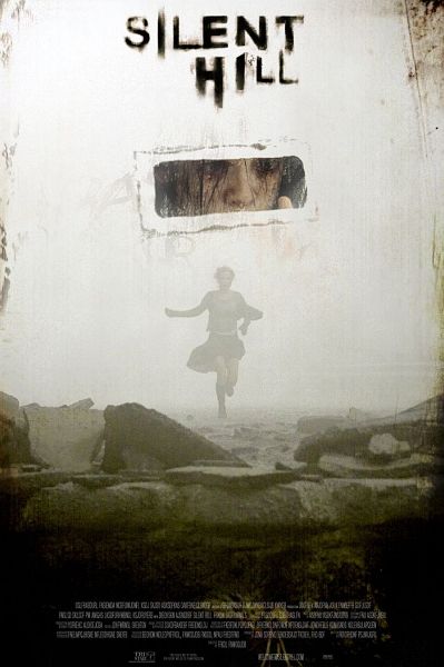
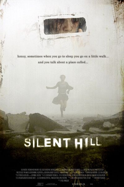
I like the visual feel of the first one more, but the text(from the site intro) in the second one adds a lot n terms of informing the viewer. It instantly makes a connect between a parent & a child, it connects the child to Silent Hill & declares Silent Hill as a place.
anyways, whaddya think? (gonna work on some darker designs)
This may be the first real game/movie folks!
Second, they have a poster making contest which i'm working on, and wanted som feeback, crits. Here are the 2 things I've got so far:
I like the visual feel of the first one more, but the text(from the site intro) in the second one adds a lot n terms of informing the viewer. It instantly makes a connect between a parent & a child, it connects the child to Silent Hill & declares Silent Hill as a place.
anyways, whaddya think? (gonna work on some darker designs)
Replies
edit: just realized this wasn't general but pimping and previews! Looking cool man
What about combining them? Put the text on the top one, over the running girl? or does that look super-shit?
To remedy this, you might try nixing the eye slot thing. It would then be a pseudo minimalist movie poster, emphasizing the fog fog and bleakness from the series, something that fans could relate too.
Lastly, the quote in the second one is a nice touch, but centered text can be boring, and as a rule of thumb, movie posters talk to the audience, even if it is a quote from the movie. For example "Don't go downstairs..." That said, the addition of the pet name, 'honey' feels awkward here.
As for the movie itself. If they can remain true to the series and stay unforgivingly derranged, surreal, artsy and Argento-like erotic- then it has a chance. I am getting really tired of mother/child horror movies though. It's not a macho thing, but I really want to see a head strong guy as the lead in a horror movie. Hollywood uses women as they're easier prey to the goings on in the movie. Then again, Silent Hill 2 is one of my personal all time favs, maybe I just want to see that into a movie.
I keep getting the feeling like I should be using the assets more, instead of just 1 photo and some deatails.. I also want to comunicate some things to veiwers who might not know the series.
As for the quote, it's the only one I have from the movie.. It's ok, but not great.
I continue!
Personaly, I like the second one better.
Any how, them pics are great.
In the first one I think it looks like someone is looking out this little window and that scene is kind of what he sees, the secound one it seems it's more seprated and the looking out the window and runging isn't thet connected. Both are very Silent Hill like, The secound one allso has a more empty feeling to it just as the city in the games.
Love 'em both and can't really give any crits beyond that.
(edit) I just realized i need to lose some saturation on that picture of Alessa's eyes.. hmm
feed backers?
PS - I'd also make the Alessa image a little smaller than it is in the more recent version, since her hand kinds looks like it's detracting from the silhouette of the running woman. Make it a little smaller and raise it up just a tad maybe?