Couple of FPS chars
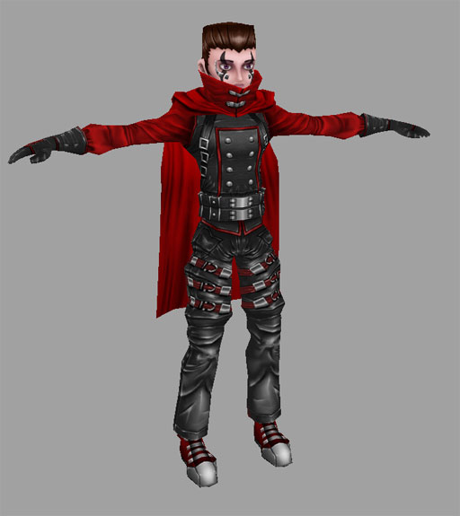
Evenin' all...here's a couple fellers I made for a student shooter game. Here's the first char (2500 tris, 512 map):

more pics and info here
They wanted something like Vincent from ff7/dirge of cerebus (not really original but gothy fun nonetheless). They were pretty adamant about him having a cape as they have some cloth dynamics going on so in multiplayer it swirls around him all pretty like.
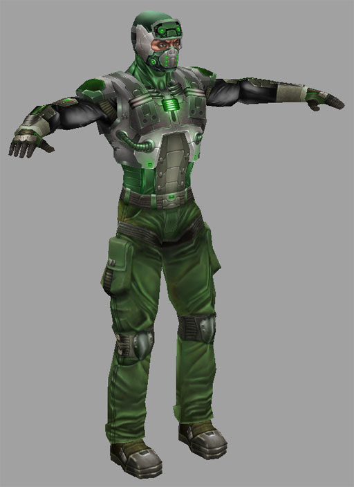
And for the second character here's a genericy soldier dude to shoot at in game as well (not really original as well but ooh glowy) 1971 tris, 512 map

more pics and info here
I should have him fight fat fish man sometime to the death.

more pics and info here
They wanted something like Vincent from ff7/dirge of cerebus (not really original but gothy fun nonetheless). They were pretty adamant about him having a cape as they have some cloth dynamics going on so in multiplayer it swirls around him all pretty like.
And for the second character here's a genericy soldier dude to shoot at in game as well (not really original as well but ooh glowy) 1971 tris, 512 map

more pics and info here
I should have him fight fat fish man sometime to the death.
Replies
I like the first character though he kind of bugs me from the waist down. You have such a nice, smooth style for the upper half, then the crotch/thighs are SO busy. That area draws my eyes to it in a bad way. The polygon use down there seems kinda jumbled and out of control. Some of the pants folds/wrinkles appear more as cuts or overlayed material, but you did a good job with them in the red sleeves. On a personal note, I'd make the shoes fatter in the mid/back areas and bring the ends of the high water pants down a bit. Like I said, REALLY like the upper half, it'd be great to see you clean up the lower to match. Also, The cape is kinda boxy towards the end, could use a little extra love.
The second character is my favorite of the two. His torso and head look really cool. I share a similar opinion with the character though in this case the lower half is less exciting. The upper is so well teched out while the lower is almost regular pants, but overall they look good. The mesh around the knees looks a little weird, and the knee pads could be bigger and more defined. His pants design could be improved to match the super stream lined upper body clothing. As is, he has loose and open material around the boots just waiting to snag on something and trip him up. Compared with the upper, which had everything packed tightly and neatly into something else.
But don't mind me, I'm just being nick-picky. Good stuff!
The second guy's definately my fav as well, and the pants were a mish mash of styles...if I get a chance I'll try to match those better.
Thanks again tho, really appreciate it!
I agree though, that the lower half of the second model seems a little less exciting than the top.
The best idea is to redesign the upper or lower torso
Would help make him look more consistent but maybe you should try to think of some other way to do it though.
too bad I'm drunk to write more.
I miss your thief... too bad it wasn't made for UT.
Take Care.
Etienne