Home 3D Art Showcase & Critiques

Crit Me Please

Kovac
polycounter lvl 18
Offline / Send Message
Kovac polycounter lvl 18
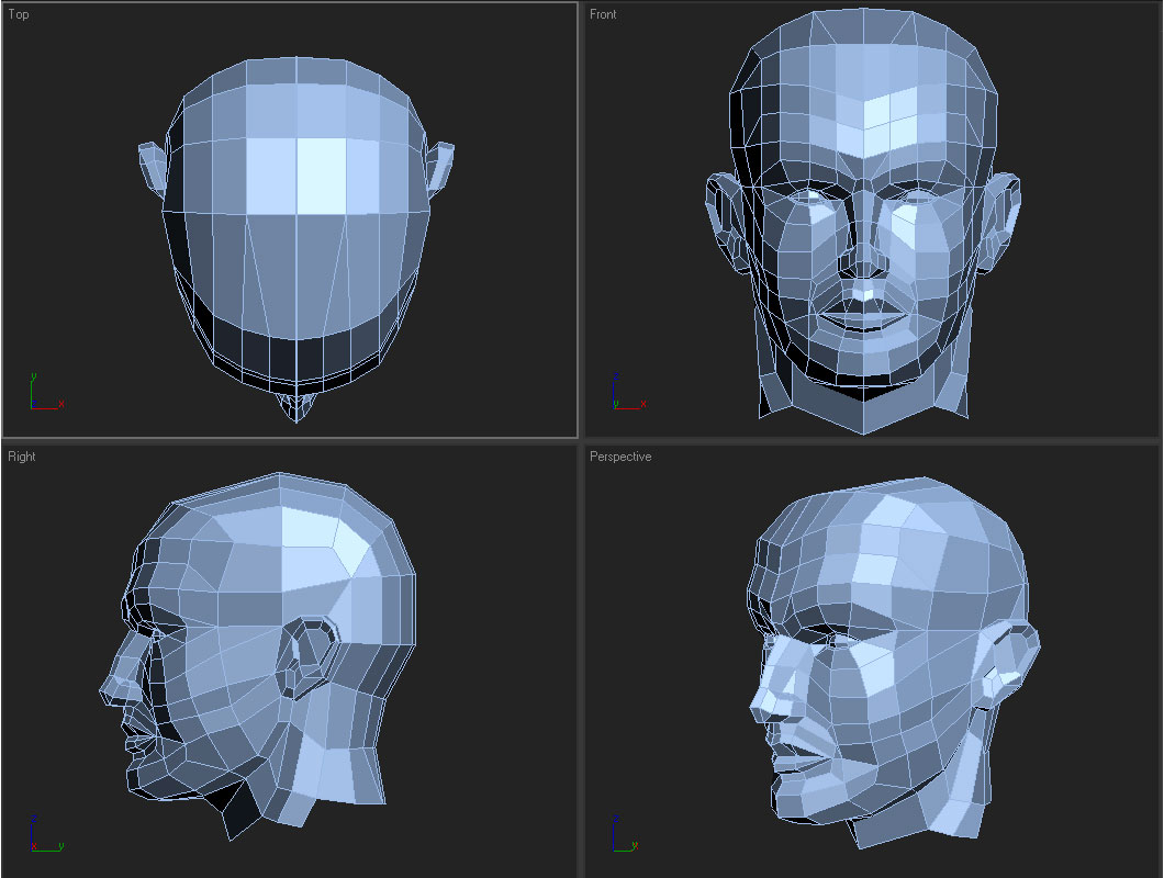
Hey all, I've been trying to improve my head modeling skills today and this is what I've came up with. There are a few obvious wrong doings on it that I am missing with both meshflow and anatomy (but am seeing past them myself, I just know they're there because I haven't done this enough yet). If anyone has a few minutes it'd be greatly appreciated if someone could do a draw over or throw in a few crits towards this. Thanks! smile.gif
57037471_dde21dd6c1_o_d.jpg

Replies

  • fal$eProfit
    Offline / Send Message
    fal$eProfit polycounter lvl 17
    The top of the head should not expand over his ears. His ears should be placed half way between the front and back of his head thus the back of his head needs to go back.
  • Ruz
    Offline / Send Message
    Ruz polycount lvl 666
    only thing i\ cna suggest is t get some really good reference and copy thr proportions. get a good 3/4 view as that always helps me the most
  • ironbearxl
    Offline / Send Message
    ironbearxl polycounter lvl 18
    I think your making a small mistake which is removing edges too early on. Try to keep it all quads, work out the shape until you're happy, and then add a meshsmooth to see how it looks. You'll be able to spot areas and correct them as you go.
  • Zeldrik
    Offline / Send Message
    Zeldrik polycounter lvl 18
    As said above the skull actually shrinks a bit when it gets past the ear around the temple area, feel your own head and you will notice it dips in.
    The neck tendons are'nt quite right, i suggest you look at more ref for that area, at the moment they're flowing incorrectly and are too pronounced.
    The front and side views look great but the 3/4 just doesnt look like its the sum of the parts if that makes sense.
    I reckon you should go into perspective mode and tweak it until it looks right instead of worrying about the profiles too much (unless it has to look like someone then this step is harder)

    Anyway i reckon it looks cool, take the crits with a grain of salt as always smile.gif
  • Ninjas
    Offline / Send Message
    Ninjas polycounter lvl 18
    Other than the shape of the head, the head top of the head should be higher and the ears should come forward. Face looks okay. I would fix that other stuff first and then take a look at it
  • Zergxes
    Offline / Send Message
    Zergxes polycounter lvl 18
    It all depends on what you want to ultimately do with this. For practice I would say definately keep it either all quads or all tris. Quads make Zbrush happy and if you mix and match you will have wierd crinkles if you animate facial muscles. You could also consider modeling this with the mouth slightly open, this would give you the option of animating it later. If you do open the mouth remember to tweak things so it looks like the jaw rotated the mouth open naturally. Also I would avoid having the mouth end at sharp points in the corner, keep a small quad in there- because cheeks have thickness. I would say add some geometry to the skull around the top and back to round it more. Finally, check your proportions. There is more head behind your ears then you think. Keep at it, lots of potential here.

    LUCK!
Sign In or Register to comment.