Rock Golem
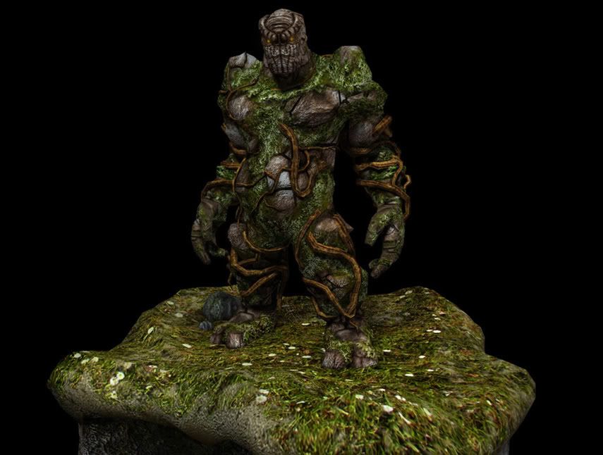
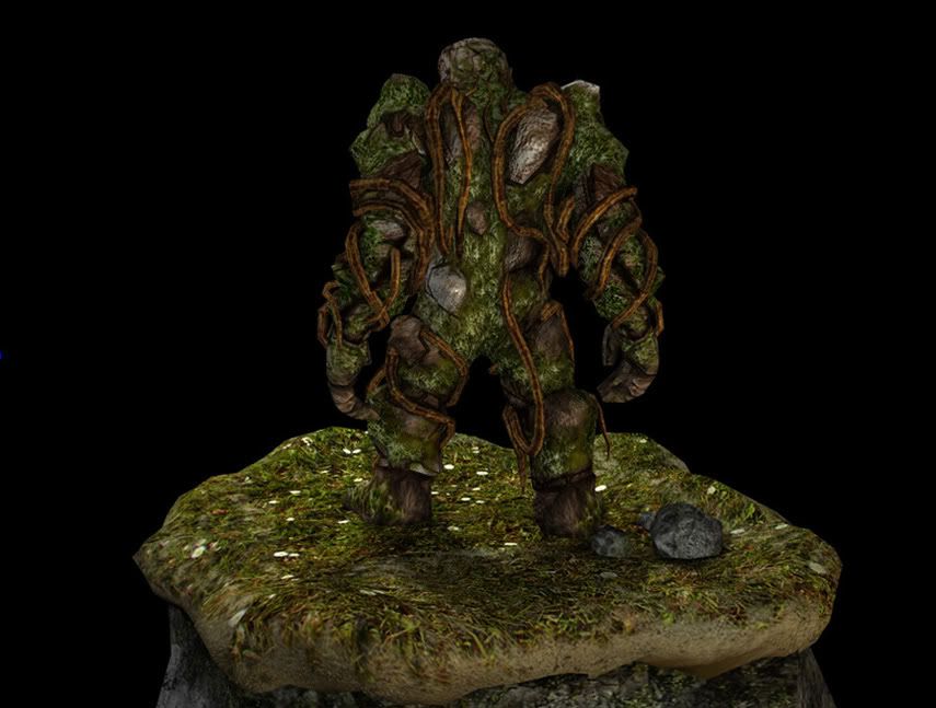
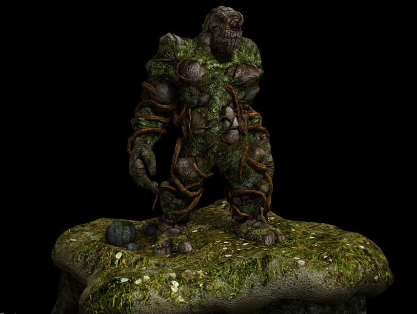
Hello all, I posted a long time ago and just generally a watcher(seems to be the saying around here) but I have something to post this time. Images might be dark for some people so I tried to bump up the lighting a bit, this was a school assignment. I had a bit of concept but it evolved from a swamp type guy to what you see(I know its not the best way to work), anyway heres some photos:
Flats:
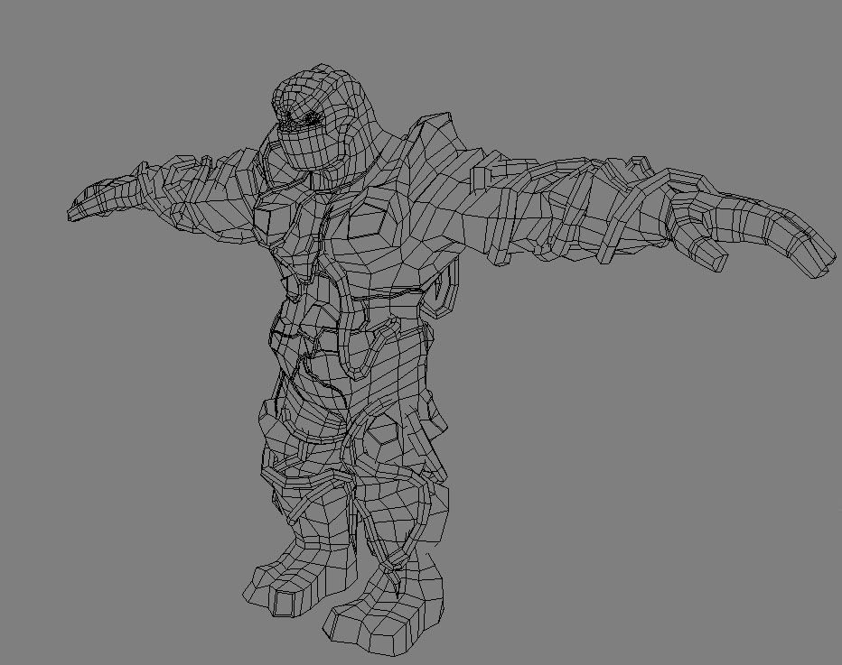
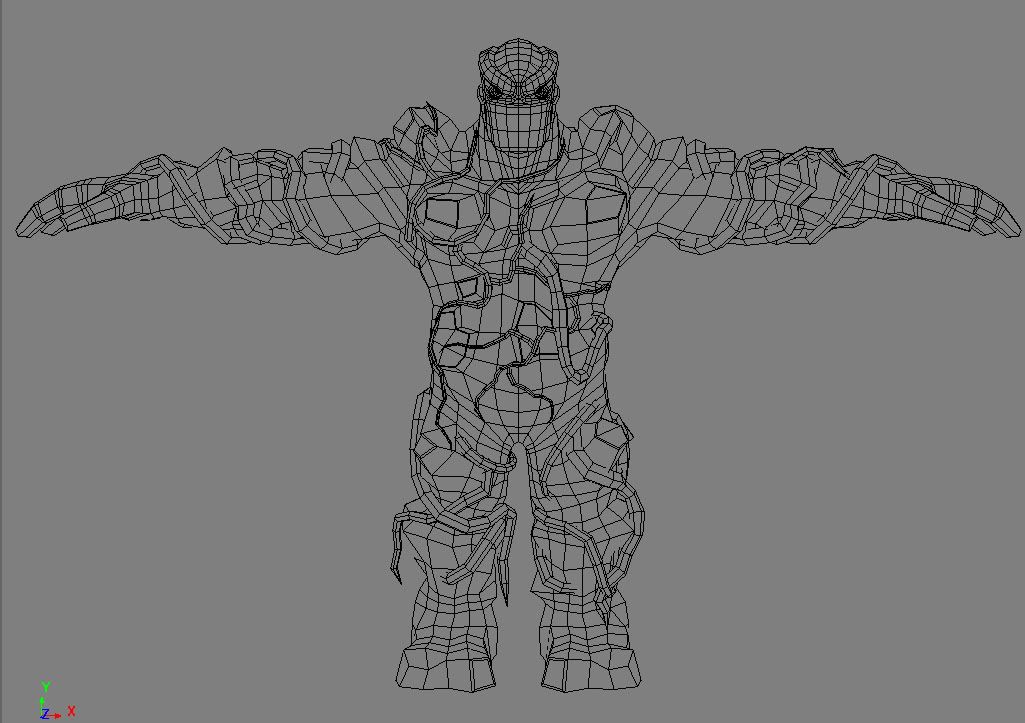
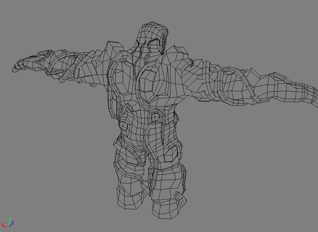
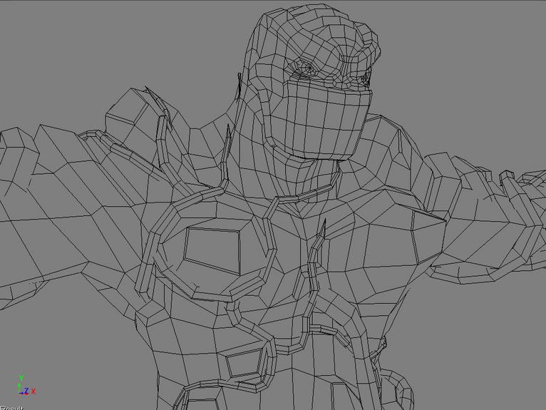
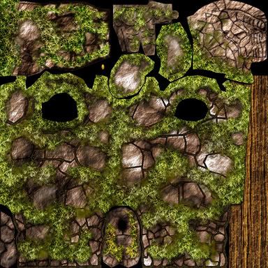
Texture flat, used 1 1024x1024, made it smaller since it was a little large.
The guy himself is 4694 tris, and the total is 10204(didn't really have a budget) C&C most welcome! (Oh and I know its hard to see sometimes whats going on, I have a rotation but I don't have anywhere to host it, its about 6mb, if someone could point me in the right direction to get that up so you guys can see it, I would appreciate it)
He has a spec and a bump aswell(spec needs work)and he has a slight glow to his eye in the render so its brought out a little better. Oh, and I need to work on the jay a bit so you can tell its actually there.


Flats:


Texture flat, used 1 1024x1024, made it smaller since it was a little large.

The guy himself is 4694 tris, and the total is 10204(didn't really have a budget) C&C most welcome! (Oh and I know its hard to see sometimes whats going on, I have a rotation but I don't have anywhere to host it, its about 6mb, if someone could point me in the right direction to get that up so you guys can see it, I would appreciate it)
He has a spec and a bump aswell(spec needs work)and he has a slight glow to his eye in the render so its brought out a little better. Oh, and I need to work on the jay a bit so you can tell its actually there.
Replies
Since you had no target polycount in mind, I'll forgive the fairly unnecessarily dense mesh here and there
No crits really, I like the proportions, the mesh seems pretty good (if a little wasteful here and there), and the textures work well. Nice consistency and feeling of mass.
Keep it up!
Good Stuff
Show
I do dig the design, though it'd be neat to see some roots dangling off and hanging, especially from his arms, to make him feel a bit more natural and green. Overall really nice product, I just wish I could say it was a good film model, or a good game model, rather than hovering somewhere in the nebulous in between.
Looks cool. I like the style.
I think it would work alright as a game model, its not THAT heavy on polys. Some more lighting info in the texture flat though would probably be a good idea.
looks great,
the mound too.
here are some suggestions you might want to consider, regardless of the assigment constraints:
1. i think a "fog of war" effect will easily make the render look more immersive. the black void just feels like its letting everything else down.
2. design wise, the cracks and veins could follow some anatomical landmarks.
3. anatomy wise, his pelvis sits just a ted too low, i think.
4. texture wise the cracks seem a little cut-out, not fully working together with the actual stone surface. get some edges pixel pushed there, some softer cracks and some deeper ones, make things look more like they are really there.
anyways i guess these might help take it to a higher level but its still really good work mate.
Shotgun - I agree with you about the cracks and the rocks, I will try to work on that some more(probably try to add some more vines here and there too, some draping ect). However I don't fully understand what you mean by "fog of war" if you could get or make a picture that would really help me out.
I noticed some people said that there was wasted poly space and such, if you could directly point these areas out to me it would be alot more help then just saying its somewhere on the model, thanks. I do also have to animate him doing something but I don't know what yet!! (ideas anyone?)
As for the animation, I would suggest something simple but characteristic. Something like him struggling holding a boulder on top of his head, knees bent really about to launch it.
Just out of curiosity, what school is this that your attending?
okay, i admit, "fog of war" is a really bad term
nu like this http://www.clanmacgaming.com/articles/images/Q3/q3fog2.jpg
I see what you mean shotgun, I think it looks better with some sort of fog, I think it would be pretty cool to have a really faded background aswell with the fog so that its not all black, because as you know.. black is boring and who likes boring! I will play around with things(depending on what my comp can handle of course haha, I will try to get some more work done on him quickly as I need an animation by next week) did anyone have somewhere or know any info where I could host that rotation video by the way?
What kind of animation system will you be using?
And as for the video, if you want I can host it for you, just PM me.