aesir's sidescroller art
So, I got involved in a small game project, as most of us do on this site, and it seems that Im gonna be doing pretty much all the art, animations, etc. The game is gonna be a 3d sidescroller, with a fixed view from the side. The entire premise is extremely corny, and hopefully will be pretty funny when its done. To summarize, it involves 3 main characters. A ninja, a pirate, and a robot. They fight against a mad scientist who stole a jewel that can create zombies to build an army for himself. He used to be making a robot army for himself, but it was too troublesome, so hes gonna try out zombies for a bit.
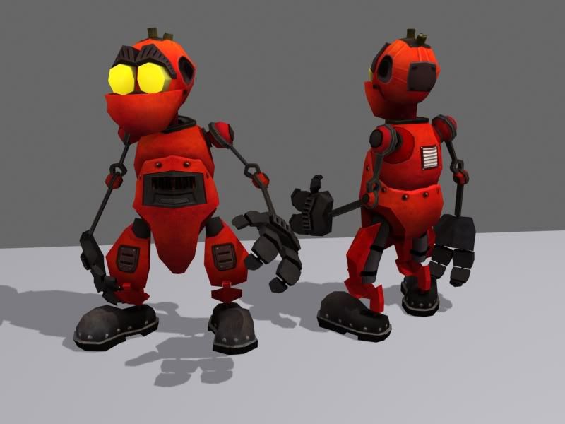
so, I've been working on the robot, using an old model that I never really finished. I remodeled it, re-did the UVs, and textured it. Here he is.

Feel free to critique the hell out of it. Probably wont look quite that good in game, what with the nice lighting I gave it, but good presentation is always nice Still have to properly rig it. Right now its just a messy collection of links.
Eventually, I'll get around to working on the rest of the characters and the props. In the mean time, if anyone has some spare models or textures lying around that they think we might be able to use, feel free to let me know. Doesnt need to be characters or anything, hell, just props like a table would help. Right now we're just concentrating on making one level, which is basically a prison where they've been captured and they have to escape. Gonna be really simple.
So, how ya like?
so, I've been working on the robot, using an old model that I never really finished. I remodeled it, re-did the UVs, and textured it. Here he is.

Feel free to critique the hell out of it. Probably wont look quite that good in game, what with the nice lighting I gave it, but good presentation is always nice
 Still have to properly rig it. Right now its just a messy collection of links.
Eventually, I'll get around to working on the rest of the characters and the props. In the mean time, if anyone has some spare models or textures lying around that they think we might be able to use, feel free to let me know. Doesnt need to be characters or anything, hell, just props like a table would help. Right now we're just concentrating on making one level, which is basically a prison where they've been captured and they have to escape. Gonna be really simple.
So, how ya like?
Replies
aesir, this model looks good - with the support of a solid shader system it would look great. Any info on the engine?
ninjas, pirates, robots and zombies. throw in a giant-squid as some sort of boss, and you have the best game ever.
what texture size is he wearing? and how large will he appear on screen? give us some mock-up shots on how he'll appear in game for us to ooh and ahh over.
You might want to reconsider his eyes and eyebrows. As you have it right now it might be difficult to express emotions, as it looks like his eyebrows are welded onto his face.
really digging him, though.
for donating meshes, what sort of polycounts are we talking?
Right now hes a little over 3k polys and wearing a 1024x1024 tex map. The map can probably get sized down without much of a loss in detail right now though. Hes gonna be pretty small on screen (thumb sized maybe?), but I wanted to have some fun.
For donating meshes, polycount isnt gonna be too big a deal (I hope) since the scenes we're planning are all pretty small. Feel free to PM me if you think you have something we could use.
Thanks for the comments
I strongly suggest redoing the arms and color scheme. Only this time, purely build and design him with your game camera in mind. Work towards lowering his his specs, for example, build a 500-1000 triangle version with a 128 texture for the distance view. Once you're confident in this version, zoom in and add some up close detail, like a cinematic view. With this version, you can use all the detail you really want, but I'd try to limit to 2k and a 256. Be creative within a tight budget instead of sloppy with whatever you want.
Sorry if I seem too harsh, it's just that I really like what you're doing here, and want to see it pushed as far as it can go. I love these types of characters and games. For example, I also made a clank inspired bot once he's 1k triangles:
http://chrisholden.net/portbot1k.jpg
Heck I even remodeled Ratchet & Clank once. :P
But as for your critiques, those are a lot of really smart intelligent problems that you've pointed out with my design.
As far as the polycount, I don't really think thats going to be an issue, and personally, I honestly dont think I was sloppy with my use of polys. True, I don't NEED that many for the distance away from the camera, but Im hoping that for little storytelling moments in the game, we'll be zooming in on the characters a bit more.
Your points about the arms and the color schemes are both spot on. I can see that being quite a problem with the skinny arms at a distance. I dont exactly want thick arms though because thats REALLY not gonna work with the rest of the character design, but I think I can beef up the arms a decent bit at least.
As far as the color scheme, Im not entirely sure what to do with it. Just playing with the hue/saturation hasnt really found me too many good looking results. Do you have any suggestions on that area?
To be perfectly honest, I dont really have the time to go in and completley redo the character like you want me to, or to make different LOD's for the characters. So, Im gonna try and make some adjustments, (hopefully soon. But who knows. Might set aside the bot for a while and work on other assets) but dont really expect a full redesign.
So, cholden gave me some great crits. Anyone else have suggestions, perhaps new ideas for a new color scheme?
http://www.webhelps.com/help/colorscheme.html
This is for the contest over at gamedev.net isn't it?
We're just using Quake's engine.
[/ QUOTE ]
As unmodified?
You're gonna have *ALOT* of fun with the original .mdl format [/sarcasm]
snowfly: it was originally for the contest and gamedev.net, but it seems we're gonna be waaay too slow to enter in time, so we're just gonna work on it for fun.
Cheap: havent gotten around to exporting shit yet. Im sure it will drive me insane...
If you're shooting for the software renderer, FTE Quakeworld can support MD3's in software mode by translating them realtime to MDL.
The engine is entirely custom made, since I enjoy messing about with the more low-level stuff.
We're using Quake3 .bsp files for the levels, which allows us to use existing editors for the project. However, since I wanted to learn how to use skeletal animation, we're going to be using the Doom3 md5 format for the meshes and animations.
Originally this game (not the engine) was indeed meant for the contest, but it seems very unlikely we'll be even close to finishing next month. But it seems everyone is willing to continue the project at a slower pace, so we'll see how it goes.
Regarding the no-shader statement, I'm not entirely sure about that. I've done some work on a shader system, but it's still extremely basic. However, I would love a reason to give more attention to that part of my engine
Adam: what kind of shaders were you thinking?
Sectaurs: good suggesting regarding the eyebrows.
cholden: thanks for those comments as well. I always love your low-poly stuff. Have you ever thought of using them in something?
sounds like you've got a recipe for awesome.
ninjas, pirates, robots and zombies. <font color="blue"> throw in a giant-squid as some sort of boss, and you have the best game ever.</font>
really digging him, though.
for donating meshes, what sort of polycounts are we talking?
[/ QUOTE ]
CALL IT "ULTROS"!!
- hardcoded 10fps physics
- horrible c game code
- horrible warpy md2 format
- why downgrade when they're already using more advanced tech, i.e. md5 and q3bsp?
I like his texture, but I think you need to do something to make his hands read better. At the moment it's hard to see them, which is going to work even worse in a side scroller environment. Perhaps bring in some of the red from his body to make them easier to follow.
Update us when you choose your new color scheme.
I just wander, is there a reason to why you don't use the Quake2 engine?
[/ QUOTE ]
Because I like to code my own stuff
RickA, hmm, that would explain it.
http://images.google.com/images?svnum=10&hl=en&q=yosemite+sam+pirate&spell=1
However, after posting this, it really seems like the pirate lacks character. Any ideas on how to change that. Frankly, hes supposed to be more of a crazy rum drinking pirate, but right now he looks like a boring gentlemen guy with a hook. I could give him a scruffy beard, or moustache. Give him bigger widlder eyes. But somehow I think it needs a more drastic change. Any ideas of where I screwed up?
Its odd how I always start to dislike my work directly after posting it on the internet. DAMN YOU INTERNET!
http://chrisholden.net/yarlseythepirate.jpg
Still... maybe a beard is a good approach. make him all scruffy like
anyways, a few more drawings.
hopefully my next pirate concept will be a final concept I'll start modeling from
the robot rocks dude. awesome.. i really like it
Unfortunately, despite your majority vote of the #1 design, your opinions have been vetoed. It was odd really, everybody seemed to like something different, and no one really liked the ones I liked. At cgchat, people liked 4 and 7. The lead coder on my team liked 8 the best. I personally liked 5 and 6... So, I just did what I felt like
Anyways, for now, this is the final concept. It may be subject to revisions as I model, but this is basically what I want.
and Im only using the concept as a rough guide. I like playing around with things as I go in 3dsmax.