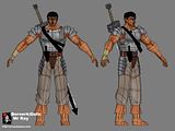
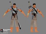
Gatts/Gattsu/Gats/Gutz/Guts
Heres wip of the texture. He is just unsder 3k tri's with all his accessories.
Two 512² textures, one fot the character and one for this addons.
Got some of the base texturing done but, still need to add the fine details and change some of the colours like his main aromour for example.
The colours on my model look totally different on my crt and my tft monitor, which one should i trust more??


Replies
but i play alot of games and i can't stand using LCDs. most of them seem very fuzzy to me. i'd rather have my display look good than have an extra foot of space on my desk.
Iv spent ages getting my games to look exactly like they did on the old CRT, the colours are exactly the same but even now the blacks are a dissapointment. There is always a very slight glow from the screen (only on dark images and more noticable on the top and bottom edges) so blacks dont appear 100% black even though its a good quality monitor.
Anyway, for games development (art/textures/3D) its still far superior to the old CRT (and I have so much desktop space now, I dunno what to do with it all!)
It's likely that even if you do use Photoshop gamma loader (I'm also using this on boot up), it'll still look different on a vga LCD. They are only good for word processing and 2nd display for tools. Artists should buy DVI only.
The shoulders are too far apart. The arms look really odd becuase of this, makes them seem too long and thick. It should basically be almost lined up with the hips, just a bit more out, if not right on it
The head is definately too small...partially becuase of the shoulder thing, and partially because it is scaled too small
The toes also look really wierd...I think it's because you gave the "boot" so much height, and it has such a steep incline to bottom out...just looks odd, but then again some art has that intention, so if that's what you were going for, it's fine. I personally don't like it, but that's me
I think there should be one more ring on the knee, it will look really pointed animated. Not to mention that the lines are sooooo close, that when it does animate, the texture will stretch like your mom's vagina o_O
Looking great besides that though
Yea Hawken its a dvi. It came with a dvi adapter but i didnt use it, just plugged it into the vga port. Ive plugged it into the dvi port now
Thnx Death for the model crits, ive moved the shoulders in and scaled the head alil. i totally forgot about the knee joint. The feet might look wierd because of the angle? i always rotate them 10deg.
The armour looks abit washed out because i forgot to apply a layer, my bad.
So how are the proportions now??
I almost want to say that the shoulders should come in a *bit* more...but i see your going for a definately strong/buff look...and i guess if you did that it would take away from that...so maybe just keep it the way it is
However, going for that look or not...I just realized that your (wow, i forgot the name of the muscle, but its basically your shoulder muscle, just before the tricept and bicept) has like, no defintion and doesnt seem to be the right size. It basically flows straight into the bicept, and that's not realistic. Try and push the "point" in a bit more by bringing the bicept down a bit, and just forming it.
Also, it's skinned too small...that muscle actually flows from the pectorals...and the way you have it, it doesn't match up...bring that down a bit and should be good
The head still looks wierd...and i think thats because you modeled it in an angled fashion (like \ / )...maybe try making the head a bit bigger, or maybe just try making it like | |
either way skin and model are looking great...love the single hand armor