The BRAWL² Tournament Challenge has been announced!
It starts May 12, and ends Oct 17. Let's see what you got!
https://polycount.com/discussion/237047/the-brawl²-tournament
It starts May 12, and ends Oct 17. Let's see what you got!
https://polycount.com/discussion/237047/the-brawl²-tournament
Link Model Needing Critique
Hi there.
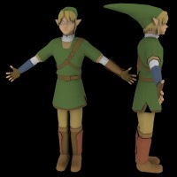
My name is Kedhrin, I was told by one of my coworkers to check here for some critique on my Link model - as CGTalk is a joke of a site.
Anyways, so I'm working on a Link model for shits and giggles, this model is not for any MOD or game, just my own interest and love for Zelda.
This model is based off the new Link for the upcomming Zelda game - [edit: please note the shadows are casting some weird things on the upper lip... they don't really look like he's trying to kiss you]

Anyways, a few things before you start clawing at it
the arms are the right length - I don't know why they seem long, but when they are dropped they go to the right spot. I think a big reason why it looks off is that the belt is actually on the top of the hip... instead of in the middle like most belts are placed. I don't know why it's like this, it seems like thats the way Nintendo made Link. Also - since this render I redefined the calf area a little more, making it look less flat, but until I get it textured it will still look flat :P.
Something still doesn't feel right about the model, can't really tell what. Please give me some good critique, I really can't work off generic critique at all.
anyways, I recommend looking at some of the new Link model shots from Zelda: Twilight Princess.
A big problem I am having is the boots - I can't get a close up shot of what the boots look like in the new Zelda game, so i'm just guessing... if anyone can find a good high quality close up of the boots - I'd be very very happy.
anyways... now please, start chewing and be polite
btw -
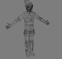
this is an updated wireframe shot.
anyways a few other notes: that render at the top has some black spots on it, I don't know what is causing it TBH, i checked the mesh and there is no rediculous polys in those areas or vertices sticking out of the mesh etc. So I'm not sure what is causing those.
before you ask I'm not revealing the polygon count as of yet -- because I haven't polished up my polygons yet, i want to get all the anatomy down first
Thanks!
My name is Kedhrin, I was told by one of my coworkers to check here for some critique on my Link model - as CGTalk is a joke of a site.
Anyways, so I'm working on a Link model for shits and giggles, this model is not for any MOD or game, just my own interest and love for Zelda.
This model is based off the new Link for the upcomming Zelda game - [edit: please note the shadows are casting some weird things on the upper lip... they don't really look like he's trying to kiss you]

Anyways, a few things before you start clawing at it

the arms are the right length - I don't know why they seem long, but when they are dropped they go to the right spot. I think a big reason why it looks off is that the belt is actually on the top of the hip... instead of in the middle like most belts are placed. I don't know why it's like this, it seems like thats the way Nintendo made Link. Also - since this render I redefined the calf area a little more, making it look less flat, but until I get it textured it will still look flat :P.
Something still doesn't feel right about the model, can't really tell what. Please give me some good critique, I really can't work off generic critique at all.
anyways, I recommend looking at some of the new Link model shots from Zelda: Twilight Princess.
A big problem I am having is the boots - I can't get a close up shot of what the boots look like in the new Zelda game, so i'm just guessing... if anyone can find a good high quality close up of the boots - I'd be very very happy.
anyways... now please, start chewing and be polite

btw -

this is an updated wireframe shot.
anyways a few other notes: that render at the top has some black spots on it, I don't know what is causing it TBH, i checked the mesh and there is no rediculous polys in those areas or vertices sticking out of the mesh etc. So I'm not sure what is causing those.
before you ask
 I'm not revealing the polygon count as of yet -- because I haven't polished up my polygons yet, i want to get all the anatomy down first
Thanks!
Replies
Not trying to be harshing your mellow, but that's what springs to mind apon first glance.
http://www.nintendo-difference.com/babynd/screens/news/gcn/20040511/link01.jpg
Planetgamecubes screenshot section:
http://www.planetgamecube.com/media.cfm?action=screens&id=2129
Planetgamecubes conceptart section:
http://www.planetgamecube.com/media.cfm?action=artgallery&id=2129
I do believe that Link nose should be pointer than that, lose a little of its width. The corners of his eyes could be a little pointier. If you look at the face in the concept it's a bit narrower and his cheeks aren't quite so full but they seem to match those on the ingame model. It's your call.
Good likness so far, I hope that you make the shield, sword and sheath too, no Link without his weapons
It looks like you have a rudimentary knowledge of anatomy, and that's throwing the whole model off. The pose, the shapes of the clothing, and the proportions are all suffering because of it. You have everything in the general area of where it's supposed to be, but it's not coming together. I'd suggest for this model to find a good reference to line it up with for proportions. And for future projects I'd suggest more life drawing to enhance your knowledge of anatomy.
Not trying to be harshing your mellow, but that's what springs to mind apon first glance.
[/ QUOTE ]
Thanks for your comment poopinmymouth, but this is the generic critique that doesn't help me much. I know I don't have much knowledge of anatomy and I've only been following it for the past few months of the 5 years I've been modeling.
But I need to know exactly what is wrong - not the "go study anatomy more" that doesn't help me much.
I have anatomy books and I have been following them the entire length of making this model - the problem is this model is of a cross between Manga and Realism. Not 100% Realism. I Have done 7 head proportion guidelines, and 8 head proportion guidelines - every time I do them the model looks too realistic and loses the entire feel that the manga style has - so I cannot do it.
If you can, provide me with more direct critique like Cubik did, because the "go study anatomy more" does not help me at all. I'm not trying to sound like i'm rejecting your critique - because you are right. But I know you have a lot of knowledge about character modeling, and I'd rather get that knowledge. I know there is a problem with the model's anatomy, I posted that to begin with - I just need to be point out what is wrong, not just reminded that it is wrong.... if that makes any sense...
Cubik: Yeah I was following the concept, and I should've just stuck with that but I decided to model more off the in game model rather than the concept (since most Zelda fans who see the model will connect with the model instead of the concept art)
but I do agree with the eyes for sure, I haven't really worked on them yet (they aren't even built in yet, was going to do that near the end).
Thanks!
Like Cubix says make him more angular 'pointy' hehe. Atm hes quite flat and spherical in places, try to move the mesh away from the primitives and use the polygons to shape your model efficiently and creatively.
Peace and Goodluck
Show
Thanks for your comment poopinmymouth, but this is the generic critique that doesn't help me much. I know I don't have much knowledge of anatomy and I've only been following it for the past few months of the 5 years I've been modeling.
[/ QUOTE ]
Don't be a CheapAlert and follow it - check out those arms, they're placed bad in a "hug me" position. This was a big mistake in my older Firebrand model,as it'll deform horribly. It doesn't matter if it's real or not - the muscle structures are absent in it, and look rather cylindric.
The hat why don't you pull the hat down a bit instead of leaving it hanging in mid - air have the end draping down near his shoulder as it would
Also i have noticed that sometimes it's the little details that can make a big difference why don't you put that fold on his cap like you can see in the first screenshot that cubik put up. It will look as if the hat is sitting on his head maybe though you could put it on as a texture later on
Also the on hand area around the base of the index finger looks a little odd can't put my finger on it..heh..but seriously it just looks kinda odd
also yeah dude i get what you mean when you talk about the manga/realism style i think alot of people do judge on 100% realism and they forget that maybe the drawings you are modelling from are either "stylised"(like manga) or anothers perception of how the human body is formed when people make critiques i tihnk maybe they don't take that into account which i think people should
I mean for instance you look at FF7 there are a few images of cloud the legendary one is the picutre where he is holding the sword over his shoulder with the shinra building in the background (block out out the head and arms from your mind and look at the body now when you look at clouds legs and see how long they are and where his hip is and how long and big his upper torso is it's like 1/4 of his body while the legs make up the other 3/4 and it's even more apparent on aerith you would say in realism terms that was anatomically incorrect but thats's just the drawer's concept and maybe peeps have to bare that in mind when they look at someone's model.
That some models are not based on realistic human anatomical porportions
though i beleieve that models should be based on realistic human anatomical proportions
although the body structure in the drawings is i think right
Showster: Yeah I'll see if I can get more definition in there, the main problem I am having is that there is only 2 areas where the clothes are any where close being tight (the area above the boots under the tunic and the elbow areas) the rest of his clothes are pretty baggy or are covered with armor. I'm afraid that If I did put any more definition in them he'd look to muscular... What would you suggest I do? I'm at work right now, so I can't pull up the model and give you close ups of the areas... I don't want him to feel muscular at all, because he is rather slinder and isn't very muscular... I'm also riding on a steep polygon count (ok i'll announce it - 3,100) and I'm worried about adding anymore polygons.
CheapAlert: I don't understand what you mean by the "hug me" position... i guess you mean he looks like he wants a hug? lol. I mean, this is my rigging position of course (i'll bring the arms up when it comes time to rig, but one of my coworkers told me it is best to model your arms at a 45degree angle [it isn't really 45 degrees, more like 30 or something]). What I usually do with my rigging is that when I put all the bones in place and create the envelopes then I move him into a more natural pose for animation...
You say it will deform horribly, do you mean the polygons messing up during animation or ???
thanks for the critique guys... I'll try getting some more definition in there... I just don't see how I can do it without messing up the slinder look - for example I hold up my arm (in real life) and it is an almost perfect cylinder except where it gets thinner at the wrist and wider at the elbow. I can try too add more definition there, but I don't want him to look muscular in any way.
[edit:]
Sorry Showster you posted at the same time i did heh.
yeah The fingers have been bothering me for some time as well, every time I've gone into Max to edit the model I always move some vertices and faces around to try to get it looking right, I'll get it eventually heh
but yeah, his hat is like that right now just for rigging purposes, when i get him rigged it will be dropped
thanks for your feedback on the Manga style
My mom is an Art Teacher... and she told me that you don't have to make Art realistic, you just have to make it believable. I think that there are things in my model that are still not in the 100% believable area in terms of balance over the model... but I'll get it
[/edit]
keep the feedback comming, thanks guys!
some changes I'm going to do when I get home - I'm going to widen the chest on the X axis (front) more. The model looks great from the side view but in the front it doesn't. This may give me some room to make the legs wider as well as the chest --- OR --- i could make the arms skinnier.... which I think would put a balance to the legs vs arms.
Going to make the cheeks less round, i made his face so round off of those screenshots you can see in the link provided above in the gamespy section where it is closeups on links face just smiling, though the concept is very sharp - they made him have a wide nose and round face in game.
get the hands fixed...
define the thighs and calfs more...
anything else?